FabCon is coming to Atlanta
Join us at FabCon Atlanta from March 16 - 20, 2026, for the ultimate Fabric, Power BI, AI and SQL community-led event. Save $200 with code FABCOMM.
Register now!- Power BI forums
- Get Help with Power BI
- Desktop
- Service
- Report Server
- Power Query
- Mobile Apps
- Developer
- DAX Commands and Tips
- Custom Visuals Development Discussion
- Health and Life Sciences
- Power BI Spanish forums
- Translated Spanish Desktop
- Training and Consulting
- Instructor Led Training
- Dashboard in a Day for Women, by Women
- Galleries
- Data Stories Gallery
- Themes Gallery
- Contests Gallery
- QuickViz Gallery
- Quick Measures Gallery
- Visual Calculations Gallery
- Notebook Gallery
- Translytical Task Flow Gallery
- TMDL Gallery
- R Script Showcase
- Webinars and Video Gallery
- Ideas
- Custom Visuals Ideas (read-only)
- Issues
- Issues
- Events
- Upcoming Events
The Power BI Data Visualization World Championships is back! Get ahead of the game and start preparing now! Learn more
- Power BI forums
- Forums
- Get Help with Power BI
- Desktop
- Pivoting to Power BI from Tableau - Question regar...
- Subscribe to RSS Feed
- Mark Topic as New
- Mark Topic as Read
- Float this Topic for Current User
- Bookmark
- Subscribe
- Printer Friendly Page
- Mark as New
- Bookmark
- Subscribe
- Mute
- Subscribe to RSS Feed
- Permalink
- Report Inappropriate Content
Pivoting to Power BI from Tableau - Question regarding tables
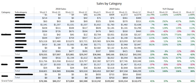
Currently use Tableau, but want to pivot to power BI for more features. I am currently going through tutorials and the documentation to learn power bi, but would appreciate it if someone could tell me if power BI can achieve a basic table below, and perhaps some tips on how to achieve this:
In playing around with BI I noticed these 2 issues:
- Week numbers. I found a way to show the dates below the years by duplicating the date field, and grouping them. But I still cannot display the week numbers.
- In the Matrix view having 2 rows (Category and Subcategory) it can only show one at a time, or the subcategory under each category. I can fix this by disabling Stepped Layout but then the years are no longer on a hierarchy above the weeks.
- I am a bit confused how best to achieve the year over year calculation in power BI.
Thank you.
Solved! Go to Solution.
- Mark as New
- Bookmark
- Subscribe
- Mute
- Subscribe to RSS Feed
- Permalink
- Report Inappropriate Content
I would definitely include a Calendar table, a simple way to do that is to Create a Table using 'New Table' in the Modeling menu. Calendar = CALENDAR(Min([Date Column]), Max([Data Column]))
If you point this at your date column you will get a list of all dates in the range of your data.
Add a Week column where Week = "Week " & WEEKNUM(Data[Date])
Add the Week column to your Matrix visual and filter to the week range you want by using a Slicer.
If you want the column headings exactly as you show then you will need the solution here: https://community.powerbi.com/t5/Desktop/Pivot-Table-Matrix-Can-I-use-values-as-a-column-heading/m-p... - by default power bi will split the measures based on categories, but you will need a category for each of your measures. - However, In my opinion it is better for comparison of the values year on year if the measures are next to each other in the matrix
Helpful resources

Power BI Dataviz World Championships
The Power BI Data Visualization World Championships is back! Get ahead of the game and start preparing now!

Power BI Monthly Update - November 2025
Check out the November 2025 Power BI update to learn about new features.

| User | Count |
|---|---|
| 59 | |
| 46 | |
| 42 | |
| 23 | |
| 18 |
| User | Count |
|---|---|
| 193 | |
| 123 | |
| 99 | |
| 67 | |
| 49 |


