A new Data Days event is coming soon!
This time we’re going bigger than ever. Fabric, Power BI, SQL, AI and more. We're covering it all. You won't want to miss it.
Learn more- Power BI forums
- Get Help with Power BI
- Desktop
- Service
- Report Server
- Power Query
- Mobile Apps
- Developer
- DAX Commands and Tips
- Custom Visuals Development Discussion
- Health and Life Sciences
- Power BI Spanish forums
- Translated Spanish Desktop
- Training and Consulting
- Instructor Led Training
- Dashboard in a Day for Women, by Women
- Galleries
- Data Stories Gallery
- Themes Gallery
- Contests Gallery
- QuickViz Gallery
- Quick Measures Gallery
- Visual Calculations Gallery
- Notebook Gallery
- Translytical Task Flow Gallery
- TMDL Gallery
- R Script Showcase
- Webinars and Video Gallery
- Ideas
- Custom Visuals Ideas (read-only)
- Issues
- Issues
- Events
- Upcoming Events
Did you hear? There's a new SQL AI Developer certification (DP-800). Start preparing now and be one of the first to get certified. Register now
- Power BI forums
- Forums
- Get Help with Power BI
- Desktop
- Re: Pie Chart
- Subscribe to RSS Feed
- Mark Topic as New
- Mark Topic as Read
- Float this Topic for Current User
- Bookmark
- Subscribe
- Printer Friendly Page
- Mark as New
- Bookmark
- Subscribe
- Mute
- Subscribe to RSS Feed
- Permalink
- Report Inappropriate Content
Pie Chart
Hi All
i need some help with a pie chart. I have a data set that contians data that is not equal in value, see image
The outcome i am looking for is:
A 5 segmented Pie chart of equal size even if the data is not
The segment to be blank / white if the value if less than the current values in the above data set
Each segment to be a diffrent colour from the other.
Solved! Go to Solution.
- Mark as New
- Bookmark
- Subscribe
- Mute
- Subscribe to RSS Feed
- Permalink
- Report Inappropriate Content
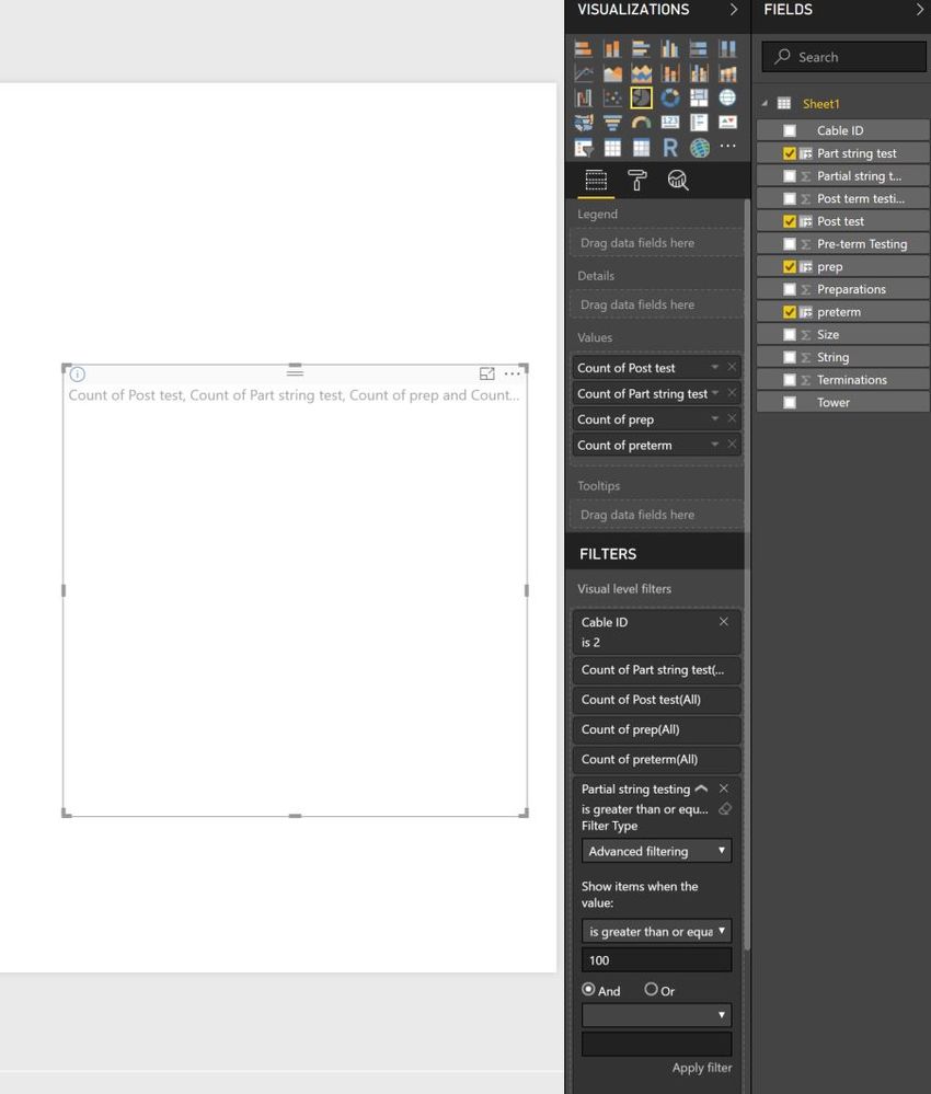
Sorry but i am doning somthing worng here or it is not working for me.
please see below screeen shot.
in this instance i have followed you instructions.
Added a filter to the Pie chart so it only shows CableID 2
then added the filter to Partial string test >100. the value in the filed has been adujsted in the data set to 99 so is should not show. when i apply this filter the whole chart disapears.
- Mark as New
- Bookmark
- Subscribe
- Mute
- Subscribe to RSS Feed
- Permalink
- Report Inappropriate Content
Hi @Colinu
This job can be done with calculated column and IF
What you should is :
1 - Create a calculated column that = 1 (So that every segment will look the same size) and put your real data value in the tooltip area so that when a user wants to see the data he only have to put his mouth hover.
2 - Control on colors are tricky but if you don't want to show it, simple add a visual level filter : Your Value is greater than 'input value' (not exactly what is down below but you will have the option to put greater than)
3 - And you can choose the color in the data color section in Format
- Quentin
- Mark as New
- Bookmark
- Subscribe
- Mute
- Subscribe to RSS Feed
- Permalink
- Report Inappropriate Content
Thanks Qunitin
i am not quite sure i understand.
if all values become equal to 1 then the segments will be equal however i cant then filter on the visual as the values are always 1.
Colin
- Mark as New
- Bookmark
- Subscribe
- Mute
- Subscribe to RSS Feed
- Permalink
- Report Inappropriate Content
I have created the columns but then i cant filter on a count and if i try to sum or a
- Mark as New
- Bookmark
- Subscribe
- Mute
- Subscribe to RSS Feed
- Permalink
- Report Inappropriate Content
- Mark as New
- Bookmark
- Subscribe
- Mute
- Subscribe to RSS Feed
- Permalink
- Report Inappropriate Content
how do i do that?
- Mark as New
- Bookmark
- Subscribe
- Mute
- Subscribe to RSS Feed
- Permalink
- Report Inappropriate Content
You can go to the data tab > Power Query editor and copy the 10 first line of your datas for example
If you have sensitive data, post a dummy sample
- Quentin
- Mark as New
- Bookmark
- Subscribe
- Mute
- Subscribe to RSS Feed
- Permalink
- Report Inappropriate Content
hi thanks
i can share it but i cant see how i attach it to the post on here?
- Mark as New
- Bookmark
- Subscribe
- Mute
- Subscribe to RSS Feed
- Permalink
- Report Inappropriate Content
- Mark as New
- Bookmark
- Subscribe
- Mute
- Subscribe to RSS Feed
- Permalink
- Report Inappropriate Content
| String | Cable ID | Size | Tower | Pre-term Testing | Preparations | Terminations | Post term testing | Partial string testing |
| 2 | 1 | 15.00 | 20.00 | 15.00 | 5.00 | 100.00 | ||
| AB01 - AB05 | AB01 | 7.50 | 15.00 | 5.00 | 100.00 | |||
| AB06 - AB02 | AB02 | 7.50 | 15.00 | 5.00 | 100.00 | |||
| AB02 - AB01 | AB02 | 5.00 | 15.00 | 5.00 | 100.00 | |||
| AB08 - AB03 | AB03 | 5.00 | 15.00 | 5.00 | 100.00 | |||
| AB03 - AB04 | AB03 | 5.00 | 15.00 | 5.00 | 100.00 | |||
| AB03 - AB04 | AB04 | 5.00 | 15.00 | 5.00 | 100.00 | |||
| AB01 - AB05 | AB05 | 15.00 | 5.00 | 100.00 | ||||
| AB11 - AB06 | AB06 | 15.00 | 5.00 | |||||
| AB06 - AB02 | AB06 | 15.00 | 5.00 | |||||
| AB12 - AB07 | AB07 | 15.00 | ||||||
| AB07 - AB08 | AB07 | 15.00 | ||||||
| AB07 - AB08 | AB08 | 15.00 | ||||||
| AB08 - AB03 | AB08 | 15.00 |
- Mark as New
- Bookmark
- Subscribe
- Mute
- Subscribe to RSS Feed
- Permalink
- Report Inappropriate Content
- Mark as New
- Bookmark
- Subscribe
- Mute
- Subscribe to RSS Feed
- Permalink
- Report Inappropriate Content
They are not important for the time being.
- Mark as New
- Bookmark
- Subscribe
- Mute
- Subscribe to RSS Feed
- Permalink
- Report Inappropriate Content
First thing i've did is replace the BLANK value by 0. Then everything that looked like TEXT TYPE I turned it into NUMBER.
Example : 15.00 : 15
Example : 7.50 : 7,5
Then
I went back to the pie chart :
Under Filter : Visual filter level
I add Partial String testing (NOT the number of Partial string testing, only the field)
I choose advanced filter > Superior or equal to > 100
You do that for every other value and it will work fine.
- Quentin
- Mark as New
- Bookmark
- Subscribe
- Mute
- Subscribe to RSS Feed
- Permalink
- Report Inappropriate Content
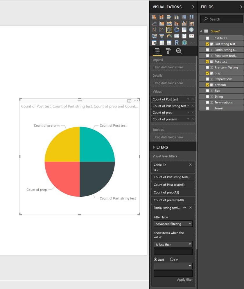
Sorry but i am doning somthing worng here or it is not working for me.
please see below screeen shot.
in this instance i have followed you instructions.
Added a filter to the Pie chart so it only shows CableID 2
then added the filter to Partial string test >100. the value in the filed has been adujsted in the data set to 99 so is should not show. when i apply this filter the whole chart disapears.
- Mark as New
- Bookmark
- Subscribe
- Mute
- Subscribe to RSS Feed
- Permalink
- Report Inappropriate Content
You have to add the real value to the filter, not the new column that's equal to 1
- Quentin
- Mark as New
- Bookmark
- Subscribe
- Mute
- Subscribe to RSS Feed
- Permalink
- Report Inappropriate Content
hey why dont you create a column for the categories defined in different columns so that your pie chart is depicted on the basis of the values
| Category | Value |
| Pre term testing | 5 |
| Preparations | 1 |
| a | 0 |
| b c | 12 |
| d | 4 |
- Mark as New
- Bookmark
- Subscribe
- Mute
- Subscribe to RSS Feed
- Permalink
- Report Inappropriate Content
Thanks.
The data is synced into a SQL table and then brought into Power BI in this format. i can do much in the way of changing it at source.
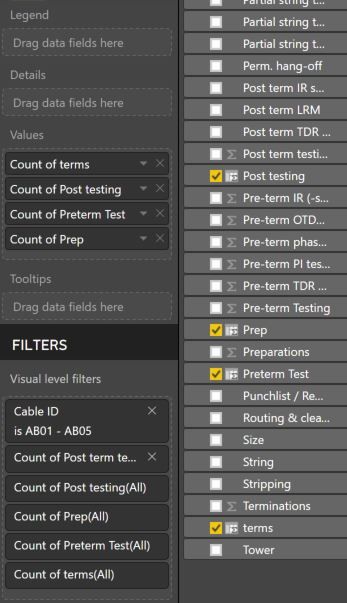
i have managed to get the equal segments now thought a Count of values. However i can seem to apply a filter to this to not show item that are not equal to the maximum amount.
Filter example.
if the value of pre-term-testing is less than 15 then don't show or colour white
Helpful resources

Power BI Monthly Update - April 2026
Check out the April 2026 Power BI update to learn about new features.

Data Days 2026 coming soon!
Sign up to receive a private message when registration opens and key events begin.

New to Fabric Survey
If you have recently started exploring Fabric, we'd love to hear how it's going. Your feedback can help with product improvements.

| User | Count |
|---|---|
| 36 | |
| 32 | |
| 26 | |
| 23 | |
| 17 |
| User | Count |
|---|---|
| 69 | |
| 50 | |
| 30 | |
| 25 | |
| 24 |


