FabCon is coming to Atlanta
Join us at FabCon Atlanta from March 16 - 20, 2026, for the ultimate Fabric, Power BI, AI and SQL community-led event. Save $200 with code FABCOMM.
Register now!- Power BI forums
- Get Help with Power BI
- Desktop
- Service
- Report Server
- Power Query
- Mobile Apps
- Developer
- DAX Commands and Tips
- Custom Visuals Development Discussion
- Health and Life Sciences
- Power BI Spanish forums
- Translated Spanish Desktop
- Training and Consulting
- Instructor Led Training
- Dashboard in a Day for Women, by Women
- Galleries
- Data Stories Gallery
- Themes Gallery
- Contests Gallery
- Quick Measures Gallery
- Notebook Gallery
- Translytical Task Flow Gallery
- TMDL Gallery
- R Script Showcase
- Webinars and Video Gallery
- Ideas
- Custom Visuals Ideas (read-only)
- Issues
- Issues
- Events
- Upcoming Events
To celebrate FabCon Vienna, we are offering 50% off select exams. Ends October 3rd. Request your discount now.
- Power BI forums
- Forums
- Get Help with Power BI
- Desktop
- Re: Pie Chart not filtering
- Subscribe to RSS Feed
- Mark Topic as New
- Mark Topic as Read
- Float this Topic for Current User
- Bookmark
- Subscribe
- Printer Friendly Page
- Mark as New
- Bookmark
- Subscribe
- Mute
- Subscribe to RSS Feed
- Permalink
- Report Inappropriate Content
Pie Chart not filtering
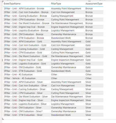
Good afternoon! I am working on a dataflow and I'm not sure why this won't work.... I have two tables: Company and EventType.
Company contains: CompanyName and Event Type contains: EventTypeName, PullarType, AssessmentType.
When I make a table with just the EventType columns it looks like this:
Then, when I add the CompanyName it looks like this:
I want to create a pie chart summing up the AssessmentType column (how many Bronze, Gold, Other, and Silvers).
So, I make a pie chart and bring in the AssessmentType as the Legend and Values. I also want to filter by ONE CompanyName (in this example I will use TMMWV).
When I do that though.... I don't get the right numbers. I shold be getting 1 gold, 1 bronze, 1 other, and 3 silver.
Help!! What am I doing wrong?
- Mark as New
- Bookmark
- Subscribe
- Mute
- Subscribe to RSS Feed
- Permalink
- Report Inappropriate Content
Hi,
What result do you get when you drag this measure to the pie chart visual
Measure = distinctcount(Data[Pillartype])
Hope this helps.
Regards,
Ashish Mathur
http://www.ashishmathur.com
https://www.linkedin.com/in/excelenthusiasts/
- Mark as New
- Bookmark
- Subscribe
- Mute
- Subscribe to RSS Feed
- Permalink
- Report Inappropriate Content
This is what I get.... I need it to be the sum of the assessment types (so all of the bronze grouped together, all of the silver, all of the gold, and all of the other.)
- Mark as New
- Bookmark
- Subscribe
- Mute
- Subscribe to RSS Feed
- Permalink
- Report Inappropriate Content
Hi,
Share the link from where i can download your PBI file.
Regards,
Ashish Mathur
http://www.ashishmathur.com
https://www.linkedin.com/in/excelenthusiasts/
- Mark as New
- Bookmark
- Subscribe
- Mute
- Subscribe to RSS Feed
- Permalink
- Report Inappropriate Content
I would avoid using the page or visual based filters if at all possible, and instead focus on building a data model, connecting DIMs to FACTs and/or transforming your dataset and also writing DAX measures can render the data visual you need with slicers.
- Mark as New
- Bookmark
- Subscribe
- Mute
- Subscribe to RSS Feed
- Permalink
- Report Inappropriate Content
How would I go about creating Measures to render the data visual I need? Since I am using a dataflow, there are limited things I can do. Thanks in advance!


