Join us at FabCon Vienna from September 15-18, 2025
The ultimate Fabric, Power BI, SQL, and AI community-led learning event. Save €200 with code FABCOMM.
Get registered- Power BI forums
- Get Help with Power BI
- Desktop
- Service
- Report Server
- Power Query
- Mobile Apps
- Developer
- DAX Commands and Tips
- Custom Visuals Development Discussion
- Health and Life Sciences
- Power BI Spanish forums
- Translated Spanish Desktop
- Training and Consulting
- Instructor Led Training
- Dashboard in a Day for Women, by Women
- Galleries
- Data Stories Gallery
- Themes Gallery
- Contests Gallery
- Quick Measures Gallery
- Notebook Gallery
- Translytical Task Flow Gallery
- TMDL Gallery
- R Script Showcase
- Webinars and Video Gallery
- Ideas
- Custom Visuals Ideas (read-only)
- Issues
- Issues
- Events
- Upcoming Events
Enhance your career with this limited time 50% discount on Fabric and Power BI exams. Ends August 31st. Request your voucher.
- Power BI forums
- Forums
- Get Help with Power BI
- Desktop
- Re: Period filter with custom date range option
- Subscribe to RSS Feed
- Mark Topic as New
- Mark Topic as Read
- Float this Topic for Current User
- Bookmark
- Subscribe
- Printer Friendly Page
- Mark as New
- Bookmark
- Subscribe
- Mute
- Subscribe to RSS Feed
- Permalink
- Report Inappropriate Content
Period filter with custom date range option
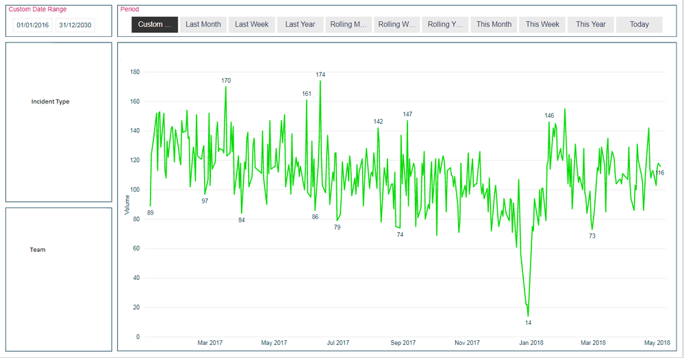
I want to have an option for a custom date range on a report as in the screenshot below.
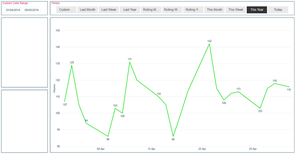
The issue I have is if a user first selects a custom date range (UK based dates), e.g. 01/04/2018 to date (08/05/2018). and then selects a time period e.g. This Year, as in the screenshot below, the Custom Date Range filter still applys when selecting a Period.
What I want to happen is for the visual to only respect the Custom Date Range if Custom Range option in the Period slicer is selected or if nothing is selected in the Period slicer. I have a feeling the answer to this is going to be a no but thought I'd make sure.
I appricaitate that I can use relative date slicers and this ultimately might have to be the way I go but I'm trying to keep this as simple as possible for the end user and the Period slicer seems to be the way based off their feedback.
Solved! Go to Solution.
- Mark as New
- Bookmark
- Subscribe
- Mute
- Subscribe to RSS Feed
- Permalink
- Report Inappropriate Content
The May update resolved the issue (source: https://powerbi.microsoft.com/en-us/blog/power-bi-desktop-may-2018-feature-summary/#slicerSync)
- Mark as New
- Bookmark
- Subscribe
- Mute
- Subscribe to RSS Feed
- Permalink
- Report Inappropriate Content
Hi
As you referred, “the visual to only respect the Custom Date Range if Custom Range option in the Period slicer is selected or if nothing is selected in the Period slicer”
Create a calculated column
Column =
IF ( [PERIOD] = "Custom Range", [date], BLANK () )
Assume the column added to the Custom Date Range slicer is named [date],
Then add this column to the Custom Date Range slicer instead.
Best Regards
Maggie
- Mark as New
- Bookmark
- Subscribe
- Mute
- Subscribe to RSS Feed
- Permalink
- Report Inappropriate Content
Hello Maggie,
Would you be able to attach an example .pbix file? What you suggest isn't working for me.
Thanks
- Mark as New
- Bookmark
- Subscribe
- Mute
- Subscribe to RSS Feed
- Permalink
- Report Inappropriate Content
- Mark as New
- Bookmark
- Subscribe
- Mute
- Subscribe to RSS Feed
- Permalink
- Report Inappropriate Content
Hi Maggie,
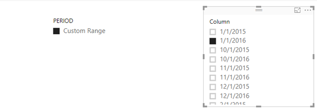
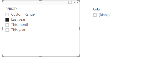
Thanks for that. Your suggestion does not work for me. When selecting Custom Range from the Period slicer the graph visual displays data. However when selecting any of the other options the graph appears blank.
The graph show be displaying data from another table.
- Mark as New
- Bookmark
- Subscribe
- Mute
- Subscribe to RSS Feed
- Permalink
- Report Inappropriate Content
The May update resolved the issue (source: https://powerbi.microsoft.com/en-us/blog/power-bi-desktop-may-2018-feature-summary/#slicerSync)
Helpful resources
| User | Count |
|---|---|
| 77 | |
| 77 | |
| 36 | |
| 30 | |
| 28 |
| User | Count |
|---|---|
| 107 | |
| 100 | |
| 55 | |
| 49 | |
| 45 |


