Fabric Data Days starts November 4th!
Advance your Data & AI career with 50 days of live learning, dataviz contests, hands-on challenges, study groups & certifications and more!
Get registered- Power BI forums
- Get Help with Power BI
- Desktop
- Service
- Report Server
- Power Query
- Mobile Apps
- Developer
- DAX Commands and Tips
- Custom Visuals Development Discussion
- Health and Life Sciences
- Power BI Spanish forums
- Translated Spanish Desktop
- Training and Consulting
- Instructor Led Training
- Dashboard in a Day for Women, by Women
- Galleries
- Data Stories Gallery
- Themes Gallery
- Contests Gallery
- QuickViz Gallery
- Quick Measures Gallery
- Visual Calculations Gallery
- Notebook Gallery
- Translytical Task Flow Gallery
- TMDL Gallery
- R Script Showcase
- Webinars and Video Gallery
- Ideas
- Custom Visuals Ideas (read-only)
- Issues
- Issues
- Events
- Upcoming Events
Get Fabric Certified for FREE during Fabric Data Days. Don't miss your chance! Request now
- Power BI forums
- Forums
- Get Help with Power BI
- Desktop
- Performance of 16 tables in one Page - better if c...
- Subscribe to RSS Feed
- Mark Topic as New
- Mark Topic as Read
- Float this Topic for Current User
- Bookmark
- Subscribe
- Printer Friendly Page
- Mark as New
- Bookmark
- Subscribe
- Mute
- Subscribe to RSS Feed
- Permalink
- Report Inappropriate Content
Performance of 16 tables in one Page - better if conditional column with URLs is used?
Hi Guys,
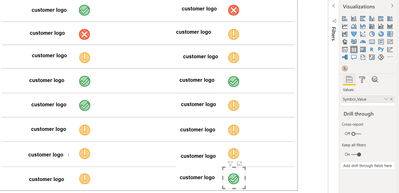
I have a Dashboard with 16 Customers logos and I need to show their situation base on simple Measure that gives me -1, 0, 1. In this way I'm able to create a little table with just the value and transform the number in icon via conditional formatting.
here a screen of the result:
I noticed that this page is too slow, and with the Performance Analyzer I saw that all those tables uses a lot of "calculation power".
I was wondering if would be better to create a conditional column based on my measure, and select a URL in case the values is -1 (and show an image of a red X), another URL if the value is 0 (and show an image of a yellow !) and if i have 1, an image showing a green V.
Do you think performance would improve?
thanks in advance!
- Mark as New
- Bookmark
- Subscribe
- Mute
- Subscribe to RSS Feed
- Permalink
- Report Inappropriate Content
Hi @Anonymous,
If you add too many standalone instances/objects to the report page, they will obviously affect the report performance. (each of them is required to be initiation, loading data, and process the calculation expression)
For your scenario, perhaps you can create a table visual with all custom types and only use one formula in visual with if statement to check current customers and show correspond the logos.
If the above does not help, can you please share some more detail about your operation? It should help us clarify your scenario and test to coding formula.
How to Get Your Question Answered Quickly
Regards,
Xiaoxin Sheng
- Mark as New
- Bookmark
- Subscribe
- Mute
- Subscribe to RSS Feed
- Permalink
- Report Inappropriate Content
@Anonymous each visual you add to the page generates its own DAX query, so in general, one of the most impactful things you can do to improve performance is to reduce the total number of visuals.
The below article explains the concept very well, albeit using a report with many card visuals as an example:
https://www.sqlbi.com/articles/optimizing-card-visuals-in-slow-power-bi-reports/
Helpful resources

Fabric Data Days
Advance your Data & AI career with 50 days of live learning, contests, hands-on challenges, study groups & certifications and more!

Power BI Monthly Update - October 2025
Check out the October 2025 Power BI update to learn about new features.


