FabCon is coming to Atlanta
Join us at FabCon Atlanta from March 16 - 20, 2026, for the ultimate Fabric, Power BI, AI and SQL community-led event. Save $200 with code FABCOMM.
Register now!- Power BI forums
- Get Help with Power BI
- Desktop
- Service
- Report Server
- Power Query
- Mobile Apps
- Developer
- DAX Commands and Tips
- Custom Visuals Development Discussion
- Health and Life Sciences
- Power BI Spanish forums
- Translated Spanish Desktop
- Training and Consulting
- Instructor Led Training
- Dashboard in a Day for Women, by Women
- Galleries
- Data Stories Gallery
- Themes Gallery
- Contests Gallery
- QuickViz Gallery
- Quick Measures Gallery
- Visual Calculations Gallery
- Notebook Gallery
- Translytical Task Flow Gallery
- TMDL Gallery
- R Script Showcase
- Webinars and Video Gallery
- Ideas
- Custom Visuals Ideas (read-only)
- Issues
- Issues
- Events
- Upcoming Events
The Power BI Data Visualization World Championships is back! Get ahead of the game and start preparing now! Learn more
- Power BI forums
- Forums
- Get Help with Power BI
- Desktop
- Re: Percentages for group clustered columns
- Subscribe to RSS Feed
- Mark Topic as New
- Mark Topic as Read
- Float this Topic for Current User
- Bookmark
- Subscribe
- Printer Friendly Page
- Mark as New
- Bookmark
- Subscribe
- Mute
- Subscribe to RSS Feed
- Permalink
- Report Inappropriate Content
Percentages for group clustered columns
Good evening,
Hopefully I can explain this clearly. I've been banging my head against the wall all day.
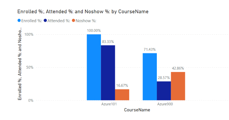
I'm trying to create a clustered column chart with groups. When I try to show percentages it will break out the percentages across all of the groups, but I need it to do the percentage based upon each group. Enrolled, Attended, and NoSHOW are the columns that are grouped by CourseName. HOw can I get the column to break out the percentages based upon the total number of coursename? Basically the first group: enrolled / total of CourseName1, attended / total of CourseName1, noshow / total of CourseName1. And then for the second group enrolled / total of CourseName2, attended / total of CourseName2, noshow / total of CourseName2
Hopefully I made that somewhat clear.
| Enrolled | Attended | NOSHOW | CourseName | |
| Email@somewhere.com1 | 1 | 1 | 0 | Azure101 |
| Email@somewhere.com2 | 1 | 1 | 0 | Azure101 |
| Email@somewhere.com3 | 1 | 1 | 0 | Azure101 |
| Email@somewhere.com4 | 1 | 1 | 0 | Azure101 |
| Email@somewhere.com5 | 1 | 1 | 0 | Azure101 |
| Email@somewhere.com6 | 1 | 0 | 1 | Azure101 |
| Email@somewhere.com7 | 1 | 0 | 1 | Azure900 |
| Email@somewhere.com8 | 1 | 0 | 1 | Azure900 |
| Email@somewhere.com9 | 0 | 0 | 0 | Azure900 |
| Email@somewhere.com10 | 0 | 0 | 0 | Azure900 |
| Email@somewhere.com11 | 1 | 1 | 0 | Azure900 |
| Email@somewhere.com12 | 1 | 0 | 1 | Azure900 |
| Email@somewhere.com13 | 1 | 1 | 0 | Azure900 |
Solved! Go to Solution.
- Mark as New
- Bookmark
- Subscribe
- Mute
- Subscribe to RSS Feed
- Permalink
- Report Inappropriate Content
Hi,
I am not sure how your desired outcome of a visualization looks like, but please check the below picture and the attached pbix file.
If this post helps, then please consider accepting it as the solution to help other members find it faster, and give a big thumbs up.
Click here to visit my LinkedIn page
Click here to schedule a short Teams meeting to discuss your question.
- Mark as New
- Bookmark
- Subscribe
- Mute
- Subscribe to RSS Feed
- Permalink
- Report Inappropriate Content
Thanks! That's perfect!
- Mark as New
- Bookmark
- Subscribe
- Mute
- Subscribe to RSS Feed
- Permalink
- Report Inappropriate Content
Hi,
I am not sure how your desired outcome of a visualization looks like, but please check the below picture and the attached pbix file.
If this post helps, then please consider accepting it as the solution to help other members find it faster, and give a big thumbs up.
Click here to visit my LinkedIn page
Click here to schedule a short Teams meeting to discuss your question.
Helpful resources

Power BI Monthly Update - November 2025
Check out the November 2025 Power BI update to learn about new features.

Fabric Data Days
Advance your Data & AI career with 50 days of live learning, contests, hands-on challenges, study groups & certifications and more!

| User | Count |
|---|---|
| 58 | |
| 45 | |
| 42 | |
| 20 | |
| 18 |
| User | Count |
|---|---|
| 169 | |
| 109 | |
| 91 | |
| 55 | |
| 44 |


