FabCon is coming to Atlanta
Join us at FabCon Atlanta from March 16 - 20, 2026, for the ultimate Fabric, Power BI, AI and SQL community-led event. Save $200 with code FABCOMM.
Register now!- Power BI forums
- Get Help with Power BI
- Desktop
- Service
- Report Server
- Power Query
- Mobile Apps
- Developer
- DAX Commands and Tips
- Custom Visuals Development Discussion
- Health and Life Sciences
- Power BI Spanish forums
- Translated Spanish Desktop
- Training and Consulting
- Instructor Led Training
- Dashboard in a Day for Women, by Women
- Galleries
- Data Stories Gallery
- Themes Gallery
- Contests Gallery
- QuickViz Gallery
- Quick Measures Gallery
- Visual Calculations Gallery
- Notebook Gallery
- Translytical Task Flow Gallery
- TMDL Gallery
- R Script Showcase
- Webinars and Video Gallery
- Ideas
- Custom Visuals Ideas (read-only)
- Issues
- Issues
- Events
- Upcoming Events
Get Fabric Certified for FREE during Fabric Data Days. Don't miss your chance! Request now
- Power BI forums
- Forums
- Get Help with Power BI
- DAX Commands and Tips
- Percentage summary in Timeseries charts
- Subscribe to RSS Feed
- Mark Topic as New
- Mark Topic as Read
- Float this Topic for Current User
- Bookmark
- Subscribe
- Printer Friendly Page
- Mark as New
- Bookmark
- Subscribe
- Mute
- Subscribe to RSS Feed
- Permalink
- Report Inappropriate Content
Percentage summary in Timeseries charts
Hi all,
I'm new to this forum and looking for some help please. I'm working with the free Power bi Desktop version for a while now and usually know my way around. However, I have only basic DAX knowledge and assume I might need some help with exactly that.
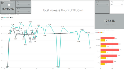
I have two time series graphs and would like to make use of the drill down function. The first displays total hours and works perfectly.
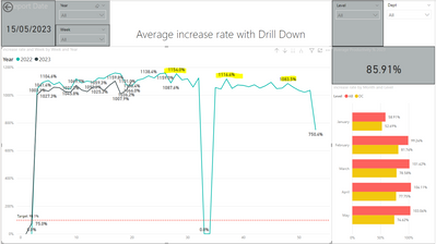
The second relates to the percentage in the table. The problem is, that I only seem to have the choice between "Sum" or "Average".
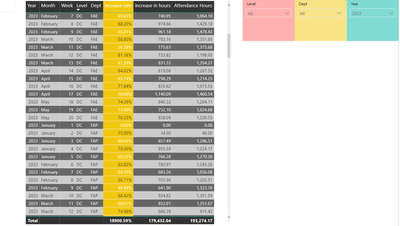
I do not want the percentage to summarize but to show up exactly as in my table in the background according to the level that it shows.
Increase rate = increase in hours/ attendance hours
Thank you for your help.
Sandra
@Need Help
Helpful resources

Power BI Monthly Update - November 2025
Check out the November 2025 Power BI update to learn about new features.

Fabric Data Days
Advance your Data & AI career with 50 days of live learning, contests, hands-on challenges, study groups & certifications and more!

| User | Count |
|---|---|
| 11 | |
| 9 | |
| 9 | |
| 6 | |
| 6 |
| User | Count |
|---|---|
| 26 | |
| 22 | |
| 19 | |
| 17 | |
| 11 |


