Fabric Data Days starts November 4th!
Advance your Data & AI career with 50 days of live learning, dataviz contests, hands-on challenges, study groups & certifications and more!
Get registered- Power BI forums
- Get Help with Power BI
- Desktop
- Service
- Report Server
- Power Query
- Mobile Apps
- Developer
- DAX Commands and Tips
- Custom Visuals Development Discussion
- Health and Life Sciences
- Power BI Spanish forums
- Translated Spanish Desktop
- Training and Consulting
- Instructor Led Training
- Dashboard in a Day for Women, by Women
- Galleries
- Data Stories Gallery
- Themes Gallery
- Contests Gallery
- Quick Measures Gallery
- Visual Calculations Gallery
- Notebook Gallery
- Translytical Task Flow Gallery
- TMDL Gallery
- R Script Showcase
- Webinars and Video Gallery
- Ideas
- Custom Visuals Ideas (read-only)
- Issues
- Issues
- Events
- Upcoming Events
Get Fabric Certified for FREE during Fabric Data Days. Don't miss your chance! Learn more
- Power BI forums
- Forums
- Get Help with Power BI
- Desktop
- Re: Percentage of rows with specific string
- Subscribe to RSS Feed
- Mark Topic as New
- Mark Topic as Read
- Float this Topic for Current User
- Bookmark
- Subscribe
- Printer Friendly Page
- Mark as New
- Bookmark
- Subscribe
- Mute
- Subscribe to RSS Feed
- Permalink
- Report Inappropriate Content
Percentage of rows with specific string
Easy question here (I think, as I haven't done PowerBI in a couple years and all my skills have left me):
I have a table like this
| Team | Status |
| Team1 | Red |
| Team1 | Green |
| Team2 | Red |
| Team2 | Yellow |
| Team2 | Red |
| Team2 | Green |
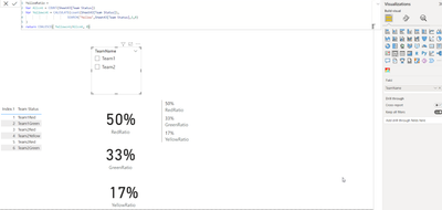
My usecase is that I want to be able to count the number of rows that are of status Red, status Yellow, and status Green...and then have a separate multi-row card that shows percentage in each. It should also be able to change based on what Team is selected, so I'm guessing I need a measure.
So for example, with no filters applied, it should show 50% Red, 17% Yellow, 33% Green
If I filter to only Team2, it should show 50% Red, 25% Yellow, 25% Green
Would also be cool to have a way to show % of a certain color for each team.
Solved! Go to Solution.
- Mark as New
- Bookmark
- Subscribe
- Mute
- Subscribe to RSS Feed
- Permalink
- Report Inappropriate Content
pls create a status table
and create a measure
Measure = CALCULATE(COUNTROWS('Table'),'Table'[Status]=max('Table (2)'[status]))/COUNTROWS('Table')
Did I answer your question? Mark my post as a solution!
Proud to be a Super User!
- Mark as New
- Bookmark
- Subscribe
- Mute
- Subscribe to RSS Feed
- Permalink
- Report Inappropriate Content
This works, thank you!
- Mark as New
- Bookmark
- Subscribe
- Mute
- Subscribe to RSS Feed
- Permalink
- Report Inappropriate Content
Hi,
To show the Teamname add the below column to your table :

- Mark as New
- Bookmark
- Subscribe
- Mute
- Subscribe to RSS Feed
- Permalink
- Report Inappropriate Content
Accepted the other answer since I tried it first, but I'm going to also try this to see if it gives more flexibility. Never used the COALESCE command before. Thanks!
Helpful resources

Fabric Data Days
Advance your Data & AI career with 50 days of live learning, contests, hands-on challenges, study groups & certifications and more!

Power BI Monthly Update - October 2025
Check out the October 2025 Power BI update to learn about new features.

| User | Count |
|---|---|
| 81 | |
| 49 | |
| 35 | |
| 31 | |
| 30 |

