FabCon is coming to Atlanta
Join us at FabCon Atlanta from March 16 - 20, 2026, for the ultimate Fabric, Power BI, AI and SQL community-led event. Save $200 with code FABCOMM.
Register now!- Power BI forums
- Get Help with Power BI
- Desktop
- Service
- Report Server
- Power Query
- Mobile Apps
- Developer
- DAX Commands and Tips
- Custom Visuals Development Discussion
- Health and Life Sciences
- Power BI Spanish forums
- Translated Spanish Desktop
- Training and Consulting
- Instructor Led Training
- Dashboard in a Day for Women, by Women
- Galleries
- Data Stories Gallery
- Themes Gallery
- Contests Gallery
- QuickViz Gallery
- Quick Measures Gallery
- Visual Calculations Gallery
- Notebook Gallery
- Translytical Task Flow Gallery
- TMDL Gallery
- R Script Showcase
- Webinars and Video Gallery
- Ideas
- Custom Visuals Ideas (read-only)
- Issues
- Issues
- Events
- Upcoming Events
The Power BI Data Visualization World Championships is back! Get ahead of the game and start preparing now! Learn more
- Power BI forums
- Forums
- Get Help with Power BI
- Desktop
- Re: Percentage of Category displayed on Bar graph.
- Subscribe to RSS Feed
- Mark Topic as New
- Mark Topic as Read
- Float this Topic for Current User
- Bookmark
- Subscribe
- Printer Friendly Page
- Mark as New
- Bookmark
- Subscribe
- Mute
- Subscribe to RSS Feed
- Permalink
- Report Inappropriate Content
Percentage of Category displayed on Bar graph.
Hello,
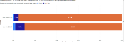
I would like to create a graph like this:
The percentage is the precent "yes" from the seperate categories.
However, on power BI I can only show the percent of grand total or count. For example I only want the "yes" area on this bar chart shown AND it must maintatin the same percentage.
Any ideas would be lovely.
Here is some example data:
| ID | In the last 12 months, was there something that prevented you from getting the medical care you needed? | Does every member in your household currently have health insurance? | On an average day, how many servings of fruit and vegetables do you eat? | On average, how many days per week do you exercise 30 minutes or more? | In the last two weeks, how many days have you felt sad or depressed? | In the last two weeks, how many days have you felt sad or depressed? | Income |
| 3 | No | Yes | 3 | 3-4 | 7-9 | No | More than $25,000 |
| 4 | No | Yes | 4 | 5 or more | None | No | More than $25,000 |
| 5 | No | Yes | 5 or more | None | Almost everyday | No | More than $25,000 |
| 6 | No | Yes | 3 | 2-3 | None | No | More than $25,000 |
| 7 | No | Yes | 1 | 2-3 | None | No | More than $25,000 |
| 8 | No | Yes | 2 | 1-2 | None | No | More than $25,000 |
| 9 | No | Yes | 2 | None | 1-2 | No | Less than $25,000 |
| 10 | No | Yes | 3 | 5 or more | 3-5 | No | Less than $25,000 |
| 11 | No | Yes | 3 | 5 or more | None | No | Less than $25,000 |
| 12 | No | Yes | 3 | 5 or more | None | No | Less than $25,000 |
Solved! Go to Solution.
- Mark as New
- Bookmark
- Subscribe
- Mute
- Subscribe to RSS Feed
- Permalink
- Report Inappropriate Content
@ryan_mayu I added a table to the original post! I figure it out though. I manipulated the ledgend a bit and made a measure.
- Mark as New
- Bookmark
- Subscribe
- Mute
- Subscribe to RSS Feed
- Permalink
- Report Inappropriate Content
where can i see the solution you post?
- Mark as New
- Bookmark
- Subscribe
- Mute
- Subscribe to RSS Feed
- Permalink
- Report Inappropriate Content
have you tried to use DAX to acheive that?
could you pls provide the sample data ?
Did I answer your question? Mark my post as a solution!
Proud to be a Super User!
- Mark as New
- Bookmark
- Subscribe
- Mute
- Subscribe to RSS Feed
- Permalink
- Report Inappropriate Content
@ryan_mayu I have yet to try DAX because I am not sure how to show a measure in this way. I will add example data to the originalpost! Sorry for forgetting to do that. I am looking for the precent of "More than $25,000" and "Less than $25,000". Thank you.
- Mark as New
- Bookmark
- Subscribe
- Mute
- Subscribe to RSS Feed
- Permalink
- Report Inappropriate Content
- Mark as New
- Bookmark
- Subscribe
- Mute
- Subscribe to RSS Feed
- Permalink
- Report Inappropriate Content
could you pls provide some sample data?
Did I answer your question? Mark my post as a solution!
Proud to be a Super User!
- Mark as New
- Bookmark
- Subscribe
- Mute
- Subscribe to RSS Feed
- Permalink
- Report Inappropriate Content
@ryan_mayu I added a table to the original post! I figure it out though. I manipulated the ledgend a bit and made a measure.
Helpful resources

Power BI Dataviz World Championships
The Power BI Data Visualization World Championships is back! Get ahead of the game and start preparing now!

| User | Count |
|---|---|
| 165 | |
| 132 | |
| 118 | |
| 79 | |
| 53 |


