This is best Fabric, Power BI, SQL and AI community event. How do we know? The last event sold out! Save €200 with code FABCMTY200.
Register nowA new Data Days event is coming soon! This time we’re going bigger than ever. Fabric, Power BI, SQL, AI and more. Don't miss out.
Hello,
This is my data set:
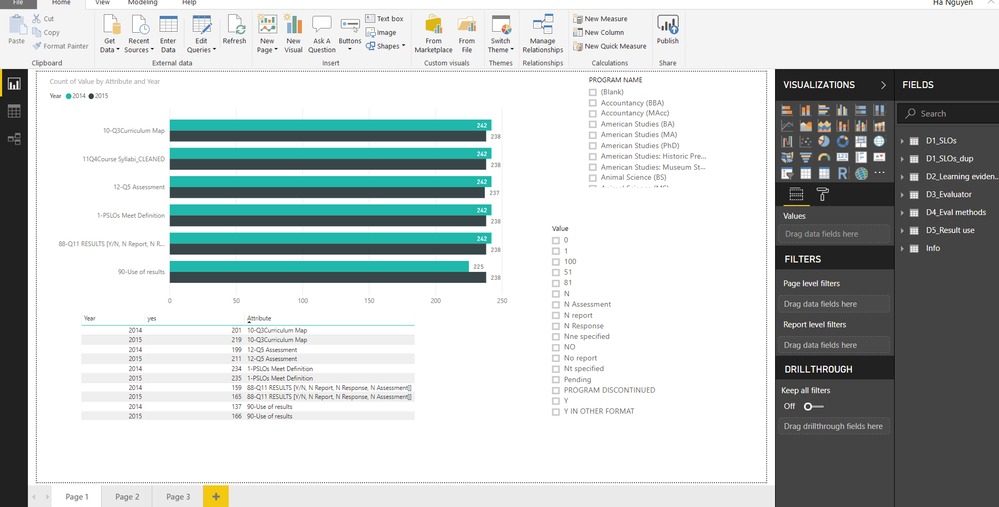
Below is the chart I created. Could anyone show me how I can present the data in the bar chart in form of percentage?
Explanation: Survey include criteria (SLOs, curriculum maps, etc) and answers include Y, N, No report, etc.
The bar chart shows the total number of programs participated in the survey. The table shows the number of programs that meet the criteria (the "y"). I also added a slicer with answers (Y, N, No report, etc.). If I choose "Y" in the slicer, how can I present the data in percentage? For example, in 2014, there were 242 programs surveyed but only 201 had curriculum maps. How can I have a bar chart that shows 83%?
Thanks in advance.
C
From which table/column are you getting the 242 from? Can you share the relevant pbix?
@Anonymous: How can I share my pbix file? Sorry, I don't see the attach function.
Upload it to dropbox or google drive or any such other and then share the link
Check out the May 2026 Power BI update to learn about new features.
Sign up to receive a private message when registration opens and key events begin.
If you have recently started exploring Fabric, we'd love to hear how it's going. Your feedback can help with product improvements.
| User | Count |
|---|---|
| 31 | |
| 26 | |
| 23 | |
| 22 | |
| 13 |
| User | Count |
|---|---|
| 61 | |
| 47 | |
| 27 | |
| 23 | |
| 18 |