- Power BI forums
- Get Help with Power BI
- Desktop
- Service
- Report Server
- Power Query
- Mobile Apps
- Developer
- DAX Commands and Tips
- Custom Visuals Development Discussion
- Health and Life Sciences
- Power BI Spanish forums
- Translated Spanish Desktop
- Training and Consulting
- Instructor Led Training
- Dashboard in a Day for Women, by Women
- Galleries
- Data Stories Gallery
- Themes Gallery
- Contests Gallery
- QuickViz Gallery
- Quick Measures Gallery
- Visual Calculations Gallery
- Notebook Gallery
- Translytical Task Flow Gallery
- TMDL Gallery
- R Script Showcase
- Webinars and Video Gallery
- Ideas
- Custom Visuals Ideas (read-only)
- Issues
- Issues
- Events
- Upcoming Events
Learn from the best! Meet the four finalists headed to the FINALS of the Power BI Dataviz World Championships! Register now
- Power BI forums
- Forums
- Get Help with Power BI
- Desktop
- Percentage Line Chart using Grouping
- Subscribe to RSS Feed
- Mark Topic as New
- Mark Topic as Read
- Float this Topic for Current User
- Bookmark
- Subscribe
- Printer Friendly Page
- Mark as New
- Bookmark
- Subscribe
- Mute
- Subscribe to RSS Feed
- Permalink
- Report Inappropriate Content
Percentage Line Chart using Grouping
I am working on creating a line chart for a report , and I am unsure how to model my current dataset to allow me to plot this as required.
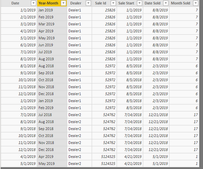
Currently my dataset is structured like this
Dealer
Sale ID(Unique)
Sale Start (Date item went on sale)
Date Sold(Date item actually sold)
Month sold( Difference in months from sale start and date sold)
I need to alter my dataset to show the percentage of items that are sold per month number , while using a slicer to filter the start date and the dealer.
Can anyone help me with shaping this dataset ?
- Mark as New
- Bookmark
- Subscribe
- Mute
- Subscribe to RSS Feed
- Permalink
- Report Inappropriate Content
Hi @Arranafc19 ,
Create a calculated table first.
New table =
FILTER (
    CROSSJOIN (
        ADDCOLUMNS (
            FILTER (
                CALENDAR ( DATE ( 2018, 1, 1 ), DATE ( 2019, 12, 31 ) ),
                DAY ( [Date] ) = 1
            ),
            "Year-Month", FORMAT ( [Date], "MMM YYYY" )
        ),
        Table4
    ),
    (
        YEAR ( [Date] ) > YEAR ( [Sale start] )
            && OR (
                YEAR ( [Date] ) < YEAR ( [Date Sold] ),
                (
                    AND (
                        YEAR ( [Date] ) = YEAR ( [Date Sold] ),
                        MONTH ( [Date] ) <= MONTH ( [Date Sold] )
                    )
                )
            )
            || (
                YEAR ( [Date] ) = YEAR ( [Sale start] )
                    && MONTH ( [Date] ) >= MONTH ( [Sale start] )
                    && OR (
                        YEAR ( [Date] ) < YEAR ( [Date Sold] ),
                        (
                            AND (
                                YEAR ( [Date] ) = YEAR ( [Date Sold] ),
                                MONTH ( [Date] ) <= MONTH ( [Date Sold] )
                            )
                        )
                    )
            )
    )
)
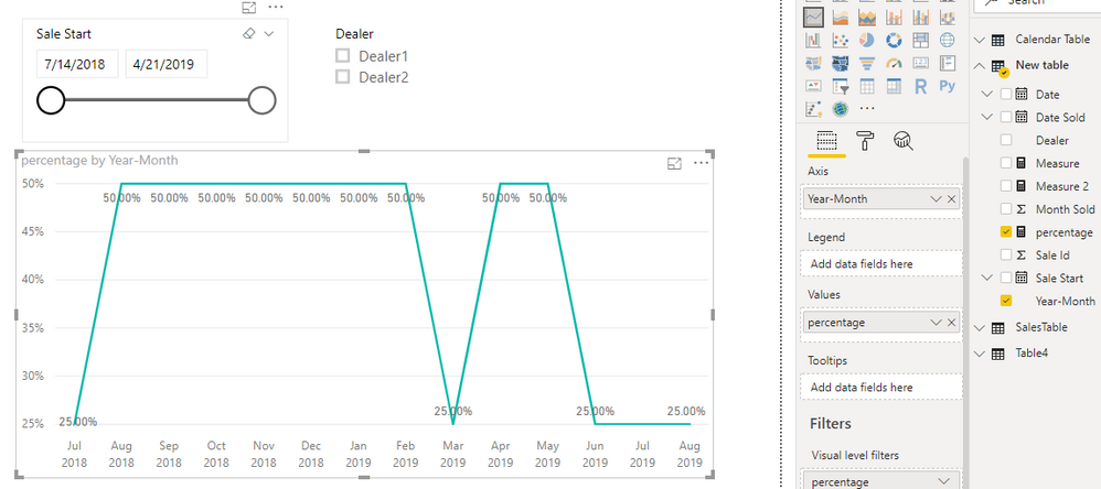
Add below measure and corresponding fields from 'New table' into line chart.
percentage =
DIVIDE (
    COUNT ( 'New table'[Sale Id] ),
    CALCULATE (
        DISTINCTCOUNT ( 'New table'[Sale Id] ),
        ALLSELECTED ( 'New table' )
    )
)
Best regards,
Yuliana Gu
If this post helps, then please consider Accept it as the solution to help the other members find it more quickly.
- Mark as New
- Bookmark
- Subscribe
- Mute
- Subscribe to RSS Feed
- Permalink
- Report Inappropriate Content
thank you for the below explanation , however it is not quite what I was looking for.
I need to be able to group the month sold column and get a percentage of total sales per month. Not all records have a date sold so the idea is to get a percetnage per month of how many actually sold.
The idea for this graph is that I can use the slicer to filter the sale start date, and then my chart would give me a percentage per month sold , from month 1 upwards
Hope this makes sense
Helpful resources
| User | Count |
|---|---|
| 45 | |
| 35 | |
| 26 | |
| 16 | |
| 15 |
| User | Count |
|---|---|
| 59 | |
| 59 | |
| 40 | |
| 22 | |
| 20 |


