Get Fabric certified for FREE!
Don't miss your chance to take the Fabric Data Engineer (DP-600) exam for FREE! Find out how by attending the DP-600 session on April 23rd (pacific time), live or on-demand.
Learn more- Power BI forums
- Get Help with Power BI
- Desktop
- Service
- Report Server
- Power Query
- Mobile Apps
- Developer
- DAX Commands and Tips
- Custom Visuals Development Discussion
- Health and Life Sciences
- Power BI Spanish forums
- Translated Spanish Desktop
- Training and Consulting
- Instructor Led Training
- Dashboard in a Day for Women, by Women
- Galleries
- Data Stories Gallery
- Themes Gallery
- Contests Gallery
- QuickViz Gallery
- Quick Measures Gallery
- Visual Calculations Gallery
- Notebook Gallery
- Translytical Task Flow Gallery
- TMDL Gallery
- R Script Showcase
- Webinars and Video Gallery
- Ideas
- Custom Visuals Ideas (read-only)
- Issues
- Issues
- Events
- Upcoming Events
Next up in the FabCon + SQLCon recap series: The roadmap for Microsoft SQL and Maximizing Developer experiences in Fabric. All sessions are available on-demand after the live show. Register now
- Power BI forums
- Forums
- Get Help with Power BI
- Desktop
- Percentage Calculation
- Subscribe to RSS Feed
- Mark Topic as New
- Mark Topic as Read
- Float this Topic for Current User
- Bookmark
- Subscribe
- Printer Friendly Page
- Mark as New
- Bookmark
- Subscribe
- Mute
- Subscribe to RSS Feed
- Permalink
- Report Inappropriate Content
Percentage Calculation
Hello, anyone to assist on how i can visualize the data below to indicate the % difference using a bar chart? Field highlighted is what I need to show on the bar chart.
| Result Areas | Budget Allocation | Budget Absorption | Variance | % Burn Rate |
| Result 1 | 64,758.94 | 52,660.00 | 12,098.94 | 81% |
| Result 2 | 348,016.94 | 343,141.34 | 4,875.60 | 99% |
| Result 3 | 161,600.00 | 140,720.30 | 20,879.70 | 87% |
| Result 4 | 164,817.97 | 169,930.20 | - 5,112.23 | 103% |
Solved! Go to Solution.
- Mark as New
- Bookmark
- Subscribe
- Mute
- Subscribe to RSS Feed
- Permalink
- Report Inappropriate Content
Hi@sawn,
You can follow these steps to meet your needs:
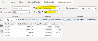
- Create a measure like this:
% Burn Rate = DIVIDE(MAX('Table'[Budget Absorption]),MAX('Table'[Budget Allocation]))
2.Change the format to Percentage, and change the number of decimal places shown from Auto to 2.
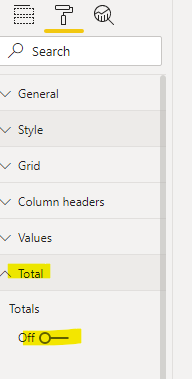
3.Create a table with the measure above, turn off the total in format setting, you will get this:
A demo is attached for your reference.
Best Regards,
Caitlyn Yan
If this post helps then please consider Accept it as the solution to help the other members find it more quickly.
- Mark as New
- Bookmark
- Subscribe
- Mute
- Subscribe to RSS Feed
- Permalink
- Report Inappropriate Content
Hi,
Assuming Budget Absorption and Budget Allocation are measures, write this measure and create a bar chart
% burn rate = divide([budget absorption],[budget allocation])
Hope this helps.
Regards,
Ashish Mathur
http://www.ashishmathur.com
https://www.linkedin.com/in/excelenthusiasts/
Helpful resources

New to Fabric Survey
If you have recently started exploring Fabric, we'd love to hear how it's going. Your feedback can help with product improvements.

Power BI DataViz World Championships - June 2026
A new Power BI DataViz World Championship is coming this June! Don't miss out on submitting your entry.

Join our Fabric User Panel
Share feedback directly with Fabric product managers, participate in targeted research studies and influence the Fabric roadmap.

| User | Count |
|---|---|
| 48 | |
| 45 | |
| 41 | |
| 20 | |
| 17 |
| User | Count |
|---|---|
| 69 | |
| 63 | |
| 32 | |
| 31 | |
| 23 |


