FabCon is coming to Atlanta
Join us at FabCon Atlanta from March 16 - 20, 2026, for the ultimate Fabric, Power BI, AI and SQL community-led event. Save $200 with code FABCOMM.
Register now!- Power BI forums
- Get Help with Power BI
- Desktop
- Service
- Report Server
- Power Query
- Mobile Apps
- Developer
- DAX Commands and Tips
- Custom Visuals Development Discussion
- Health and Life Sciences
- Power BI Spanish forums
- Translated Spanish Desktop
- Training and Consulting
- Instructor Led Training
- Dashboard in a Day for Women, by Women
- Galleries
- Data Stories Gallery
- Themes Gallery
- Contests Gallery
- QuickViz Gallery
- Quick Measures Gallery
- Visual Calculations Gallery
- Notebook Gallery
- Translytical Task Flow Gallery
- TMDL Gallery
- R Script Showcase
- Webinars and Video Gallery
- Ideas
- Custom Visuals Ideas (read-only)
- Issues
- Issues
- Events
- Upcoming Events
The Power BI Data Visualization World Championships is back! Get ahead of the game and start preparing now! Learn more
- Power BI forums
- Forums
- Get Help with Power BI
- Desktop
- Pareto Chart
- Subscribe to RSS Feed
- Mark Topic as New
- Mark Topic as Read
- Float this Topic for Current User
- Bookmark
- Subscribe
- Printer Friendly Page
- Mark as New
- Bookmark
- Subscribe
- Mute
- Subscribe to RSS Feed
- Permalink
- Report Inappropriate Content
Pareto Chart
Hi I want to make Pareto Chart. I have around 8 to 9 columns which get the data from number 0 to 6. Therefore, I wanted to make a pareto chart for those 8 columns category. So, It would be helpful if you could please let me know how can i make a pareto chart so that everytime the number is more than 0 it gets counted and then, we can make a pareto chart.
Sincerely,
Gaurav Paul
Solved! Go to Solution.
- Mark as New
- Bookmark
- Subscribe
- Mute
- Subscribe to RSS Feed
- Permalink
- Report Inappropriate Content
Hi @gauravp,
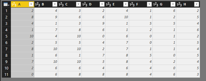
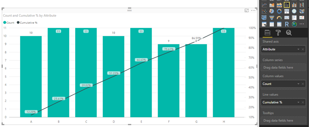
Based on my understanding, you have 8 columns, each column has 0-6 values. You can to count value for each column when values more than 0. Then use counted vales to create Pareto chart, right?
Assume the sample data table like below:
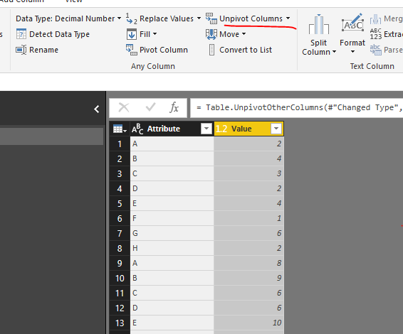
1. Select all columns, then click Unpivot Columns.
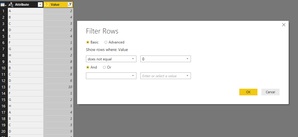
2. Filter out value 0 from Value column.
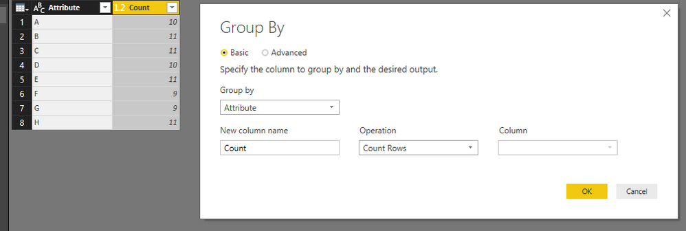
3. Click Group By, return count values.
Apply the change, back to the report, create a calculated column like below:
Cumulative % = var CumulativeCount = SUMX(FILTER('Table2','Table2'[Attribute]<=EARLIER(Table2[Attribute])),'Table2'[Count])
var Total=CALCULATE(SUM(Table2[Count]),ALL(Table2))
return
DIVIDE(CumulativeCount,Total)
You can download attached pbix file to see if it meet your requirements.
Reference:
Best Regards,
QiuyunYu
If this post helps, then please consider Accept it as the solution to help the other members find it more quickly.
Helpful resources

Power BI Dataviz World Championships
The Power BI Data Visualization World Championships is back! Get ahead of the game and start preparing now!

| User | Count |
|---|---|
| 39 | |
| 38 | |
| 38 | |
| 28 | |
| 27 |
| User | Count |
|---|---|
| 124 | |
| 89 | |
| 73 | |
| 66 | |
| 65 |
