Join us at FabCon Vienna from September 15-18, 2025
The ultimate Fabric, Power BI, SQL, and AI community-led learning event. Save €200 with code FABCOMM.
Get registered- Power BI forums
- Get Help with Power BI
- Desktop
- Service
- Report Server
- Power Query
- Mobile Apps
- Developer
- DAX Commands and Tips
- Custom Visuals Development Discussion
- Health and Life Sciences
- Power BI Spanish forums
- Translated Spanish Desktop
- Training and Consulting
- Instructor Led Training
- Dashboard in a Day for Women, by Women
- Galleries
- Data Stories Gallery
- Themes Gallery
- Contests Gallery
- Quick Measures Gallery
- Notebook Gallery
- Translytical Task Flow Gallery
- TMDL Gallery
- R Script Showcase
- Webinars and Video Gallery
- Ideas
- Custom Visuals Ideas (read-only)
- Issues
- Issues
- Events
- Upcoming Events
Enhance your career with this limited time 50% discount on Fabric and Power BI exams. Ends August 31st. Request your voucher.
- Power BI forums
- Forums
- Get Help with Power BI
- Desktop
- Re: Paginated report nested in Desktop
- Subscribe to RSS Feed
- Mark Topic as New
- Mark Topic as Read
- Float this Topic for Current User
- Bookmark
- Subscribe
- Printer Friendly Page
- Mark as New
- Bookmark
- Subscribe
- Mute
- Subscribe to RSS Feed
- Permalink
- Report Inappropriate Content
Paginated report nested in Desktop
Hi,
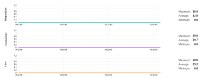
I have a pagineted report nested in my Power BI report (to deal with trends without having to import large amounts of data). It works like a charm in Desktop, but when I published it, it behaves strangely. These are me chosen dates:
As you can see, it's not reflected in the charts.
The statistics to the right are part of the paginated report as well and they are calculated correctly. It's just those charts...
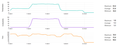
When I click "Show as table", it shows the right timespan"
It's not always a flat line - sometimes it fixes on the values from one of the events and show it for every event:
What is going on here and how can I fix this?
Thanks,
Joanna
- Mark as New
- Bookmark
- Subscribe
- Mute
- Subscribe to RSS Feed
- Permalink
- Report Inappropriate Content
Hi @Kohrinn,
I'd like to suggest you to take a look at the following document limitations part about use paginated report in power bi desktop side if these meets to your scenario:
Create and use the paginated report visual - Power BI | Microsoft Learn
Regards,
Xiaoxin Sheng
- Mark as New
- Bookmark
- Subscribe
- Mute
- Subscribe to RSS Feed
- Permalink
- Report Inappropriate Content
Anyone can help me out?
Helpful resources
| User | Count |
|---|---|
| 78 | |
| 73 | |
| 38 | |
| 30 | |
| 28 |
| User | Count |
|---|---|
| 107 | |
| 100 | |
| 55 | |
| 49 | |
| 45 |


