Get certified for free when you join Fabric Data Days 2026 and dive into Fabric, Power BI, SQL, AI, and other essential data skills.
Join nowJuly 7 - July 17 | Round 2 of the Power BI Dataviz World Championships. Don't miss your chance! Learn more
Hi,
I am looking to pull customer data and present visually in PowerBI.
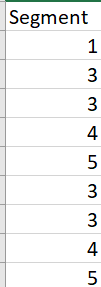
Each customer has been assigned to 5 groups - 1,2,3,4 and 5.
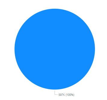
The Column Heading is Segment. When I go to create a pie chart PowerBI does not recognise that each customer has been assigned to an individual group and just counts all of them.
Previously when I have tried to create similar visuals PowerBI automatically recognises this and create the pie chart based on the number of groups and number of customers to fall into each group. I am unsure why it isn't doing it this time.
Thanks,
Andy
Hi @andykbba ,
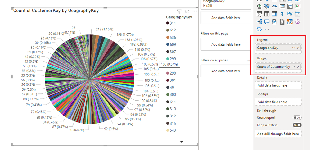
The following figure is an example of the CustomerKey I made counting by GeographyKey, please refer to it:
Best Regards,
Gallen Luo
If this post helps, then please consider Accept it as the solution to help the other members find it more quickly.
Join us in Barcelona for FabCon and SQLCon, the Fabric, Power BI, SQL, and AI community event. Save €200 with code FABCMTY200.
Join Data Days 2026: 60 days of free live/on-demand sessions, challenges, study groups, and certification opportunities.
| User | Count |
|---|---|
| 29 | |
| 27 | |
| 26 | |
| 24 | |
| 16 |
| User | Count |
|---|---|
| 53 | |
| 47 | |
| 39 | |
| 31 | |
| 21 |