- Power BI forums
- Updates
- News & Announcements
- Get Help with Power BI
- Desktop
- Service
- Report Server
- Power Query
- Mobile Apps
- Developer
- DAX Commands and Tips
- Custom Visuals Development Discussion
- Health and Life Sciences
- Power BI Spanish forums
- Translated Spanish Desktop
- Power Platform Integration - Better Together!
- Power Platform Integrations (Read-only)
- Power Platform and Dynamics 365 Integrations (Read-only)
- Training and Consulting
- Instructor Led Training
- Dashboard in a Day for Women, by Women
- Galleries
- Community Connections & How-To Videos
- COVID-19 Data Stories Gallery
- Themes Gallery
- Data Stories Gallery
- R Script Showcase
- Webinars and Video Gallery
- Quick Measures Gallery
- 2021 MSBizAppsSummit Gallery
- 2020 MSBizAppsSummit Gallery
- 2019 MSBizAppsSummit Gallery
- Events
- Ideas
- Custom Visuals Ideas
- Issues
- Issues
- Events
- Upcoming Events
- Community Blog
- Power BI Community Blog
- Custom Visuals Community Blog
- Community Support
- Community Accounts & Registration
- Using the Community
- Community Feedback
Register now to learn Fabric in free live sessions led by the best Microsoft experts. From Apr 16 to May 9, in English and Spanish.
- Power BI forums
- Forums
- Get Help with Power BI
- Desktop
- Re: POWER BI DAX Classification on Measure and Mea...
- Subscribe to RSS Feed
- Mark Topic as New
- Mark Topic as Read
- Float this Topic for Current User
- Bookmark
- Subscribe
- Printer Friendly Page
- Mark as New
- Bookmark
- Subscribe
- Mute
- Subscribe to RSS Feed
- Permalink
- Report Inappropriate Content
POWER BI DAX Classification on Measure and Measures as Visual Legend
Hi Experts,
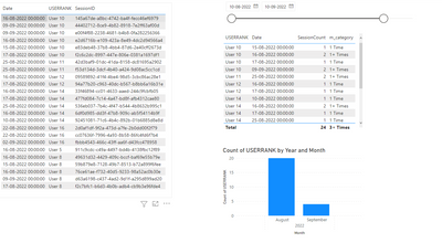
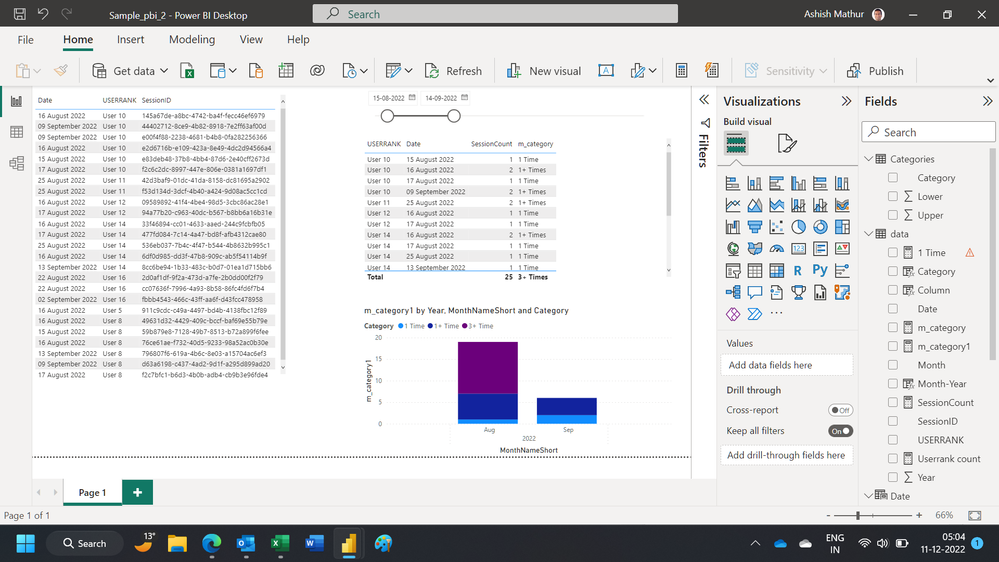
I'm trying to build below kind of visual as an output, but visual legend setting is not taking measure.
Basically, I was created a conditional measure based on below condition and trying to add this measure as visual Legend.
If Users had only one Unique session Id in a specified date range, then 1 Time
If Users had Two Unique Session Id's in a specified date range, then 1+ Times
If Users had Three Unique Session Id's in a specified date range, then 2+ Times
If Users had More than Three Unique Session Id's in a specified date range, then 3+ Times
And also if the user choose a date range in b/w months like from 15-Aug-2022 to 14-Sep-2022, the graph will still show two bars for each month, but the data must be filtered on the specified date range only.
Please check and let me know if you find any other solutions. I've attached a sample .pbix file for your convenience.
https://drive.google.com/file/d/15Uvha9SUvYf5LOJeor2IAe8Hv6Be8VgR/view?usp=share_link
Regards,
Rommala
Solved! Go to Solution.
- Mark as New
- Bookmark
- Subscribe
- Mute
- Subscribe to RSS Feed
- Permalink
- Report Inappropriate Content
Hi Team,
We were able to solve this by using disconnected table like below.
and created the following Measure
Session Count (w Range) =
VAR _MinRange = MIN( 'Range Table'[MIN] )
VAR _MaxRange = MAX( 'Range Table'[MAX] )
RETURN
    IF( [SessionCount] >= _MinRange && [SessionCount] <= _MaxRange,
        [SessionCount],
        BLANK() )
and I added Range (from the new table) to your table visual
For chart, I created this measure (note that it relies on the measure above)
Unique Count =
COUNTX( VALUES( data[USERRANK] ), [Session Count (w Range)] )
and I added the Range column as the chart legend
Regards,
@Anonymous
- Mark as New
- Bookmark
- Subscribe
- Mute
- Subscribe to RSS Feed
- Permalink
- Report Inappropriate Content
Hi,
You may download my solution workbook from here.
Hope this helps.
Regards,
Ashish Mathur
http://www.ashishmathur.com
https://www.linkedin.com/in/excelenthusiasts/
- Mark as New
- Bookmark
- Subscribe
- Mute
- Subscribe to RSS Feed
- Permalink
- Report Inappropriate Content
Hi Team,
We were able to solve this by using disconnected table like below.
and created the following Measure
Session Count (w Range) =
VAR _MinRange = MIN( 'Range Table'[MIN] )
VAR _MaxRange = MAX( 'Range Table'[MAX] )
RETURN
    IF( [SessionCount] >= _MinRange && [SessionCount] <= _MaxRange,
        [SessionCount],
        BLANK() )
and I added Range (from the new table) to your table visual
For chart, I created this measure (note that it relies on the measure above)
Unique Count =
COUNTX( VALUES( data[USERRANK] ), [Session Count (w Range)] )
and I added the Range column as the chart legend
Regards,
@Anonymous
- Mark as New
- Bookmark
- Subscribe
- Mute
- Subscribe to RSS Feed
- Permalink
- Report Inappropriate Content
Hi @Pragati11,
I can not create a calculated column, because I need to apply condition on aggregate value.
- Mark as New
- Bookmark
- Subscribe
- Mute
- Subscribe to RSS Feed
- Permalink
- Report Inappropriate Content
HI @Anonymous ,
What happens when you move this value to the y-axis section of your chart rather than in the legend?
Also can you share a screenhot around what fields you have moved to your chart?
- Mark as New
- Bookmark
- Subscribe
- Mute
- Subscribe to RSS Feed
- Permalink
- Report Inappropriate Content
Hi @Anonymous ,
As per my knowledge, you can't move a measure to the LEGEND section of the visual. It has to be Column.
Unfortunately, you will have to create a calculated column rather than the measure as shown above; and then use it in the LEGEND section of your visual.
Helpful resources

Microsoft Fabric Learn Together
Covering the world! 9:00-10:30 AM Sydney, 4:00-5:30 PM CET (Paris/Berlin), 7:00-8:30 PM Mexico City

Power BI Monthly Update - April 2024
Check out the April 2024 Power BI update to learn about new features.

| User | Count |
|---|---|
| 109 | |
| 105 | |
| 88 | |
| 75 | |
| 67 |
| User | Count |
|---|---|
| 123 | |
| 112 | |
| 96 | |
| 82 | |
| 72 |


