FabCon is coming to Atlanta
Join us at FabCon Atlanta from March 16 - 20, 2026, for the ultimate Fabric, Power BI, AI and SQL community-led event. Save $200 with code FABCOMM.
Register now!- Power BI forums
- Get Help with Power BI
- Desktop
- Service
- Report Server
- Power Query
- Mobile Apps
- Developer
- DAX Commands and Tips
- Custom Visuals Development Discussion
- Health and Life Sciences
- Power BI Spanish forums
- Translated Spanish Desktop
- Training and Consulting
- Instructor Led Training
- Dashboard in a Day for Women, by Women
- Galleries
- Data Stories Gallery
- Themes Gallery
- Contests Gallery
- Quick Measures Gallery
- Notebook Gallery
- Translytical Task Flow Gallery
- TMDL Gallery
- R Script Showcase
- Webinars and Video Gallery
- Ideas
- Custom Visuals Ideas (read-only)
- Issues
- Issues
- Events
- Upcoming Events
To celebrate FabCon Vienna, we are offering 50% off select exams. Ends October 3rd. Request your discount now.
- Power BI forums
- Forums
- Get Help with Power BI
- Desktop
- Re: PBI trick: Making an object disappear after fi...
- Subscribe to RSS Feed
- Mark Topic as New
- Mark Topic as Read
- Float this Topic for Current User
- Bookmark
- Subscribe
- Printer Friendly Page
- Mark as New
- Bookmark
- Subscribe
- Mute
- Subscribe to RSS Feed
- Permalink
- Report Inappropriate Content
PBI trick: Making an object disappear after filter selection
Hi everyone
To clean up my reports and make them more user-friendly and meaningful I usually employ the trick of putting a card over a visual, a text message over the card, and making the card disappear when selecting something from a filter. In this way, the graph will only appear on the report when specific values are filtered. I use two measures on a card that go something like:
-Card Message measure: If there is a value selected in the slicer, "" else show message (translated from dax to human)
-Card Background color measure: If there is a value selected in the slicer, color=transparent else color = white (again, translated from dax to human)
Then I put this two measures in the card, one in the value field and the other in the background with conditional formatting option. When nothing is filtered, the card covers the graphs. When you filter, the card disappears and the data is shown
Now this works perfectly if the user doesn't need to interact with the visual that appears. But as soon as you have a scrollbar or you want to drill down you can't do that, because the card is still there, it's only invisible. When the user click on the report, he is clicking the card, not the charts. I know that I could use an image (like a button) working as a bookmark toggle to make the card disappear, however doing this I will lose the "hide data if you aren't filtering" feature which is the most important because the user could just click on the bookmark and make the card disappear and show meaningless unfiltered data
Therefore, what I need is to find a way to hide data when the slicer isn't filtering anything but without the card trick (or with the card trick but keeping the filtering feature) because I want the user to be able to work with the underliying data.
I hope I was clear enough
Thanks
Solved! Go to Solution.
- Mark as New
- Bookmark
- Subscribe
- Mute
- Subscribe to RSS Feed
- Permalink
- Report Inappropriate Content
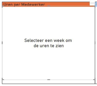
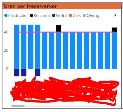
I have a possible solution...when you want people to still interact with the scrollbar, you can do this easy by making the card not cover the whole visual, so they can still click and scroll the bar.
See the pictures as example, i use a shape that isnt filled to make sure the visual cannot be interacted with. It doesnt cover the header/title and doesnt cover the scrollbar. So users can still scroll through the visual.
I guess you could use a drillthrough if the user right clicks on the header or scrollbar area. Maybe inform the user of this "functionality" in the text.


Good luck, hope this helps.
- Mark as New
- Bookmark
- Subscribe
- Mute
- Subscribe to RSS Feed
- Permalink
- Report Inappropriate Content
I have a visual with three line charts based on date and measure (actual turnover, previous month turnover, budget turnover). I want to hide the budget turnover line chart when I click on the (for example) certain bank name because I haven't such a breakdown in my data, I have a breakdown only by sector: bank, utility, and so on.
- Mark as New
- Bookmark
- Subscribe
- Mute
- Subscribe to RSS Feed
- Permalink
- Report Inappropriate Content
Hi, I also have this issue in one of my line graphs - has anyone found a solution?
- Mark as New
- Bookmark
- Subscribe
- Mute
- Subscribe to RSS Feed
- Permalink
- Report Inappropriate Content
Hi friends I saw your interaction in PB forum , maybe you an help me . There's a way that by a conditional I change de transparency value of a card or other object? If a value is selected and is true, the value stay in 100% if the valu is false the value change to 0% hinding a part of the report
- Mark as New
- Bookmark
- Subscribe
- Mute
- Subscribe to RSS Feed
- Permalink
- Report Inappropriate Content
Hi Claudio
I don't think you can act directly on the transparency level (meaning you can't conditionally set the percentage of transparency) but you can obtain a 0/100 behaviour using colors. Take a look at this measure for example:
This measure says: if it's TRUE that there is only one Account Name selected, then the color returned should be transparent, otherwise return white
I can put this measure where I want it (for example in the background of a card or in the color of the data label) and it will act in the way you described
- Mark as New
- Bookmark
- Subscribe
- Mute
- Subscribe to RSS Feed
- Permalink
- Report Inappropriate Content
Thank you so much. I made a measure using the color of transparency #FFFFFF00 . After that, in the cards that a need hide , using in the data label option, I use the Fx button to use the measure like condition to change the colour. In short, it WORKSSSSSS!!! Job is done and the client happy !!! Best to you
- Mark as New
- Bookmark
- Subscribe
- Mute
- Subscribe to RSS Feed
- Permalink
- Report Inappropriate Content
@Anonymous Would you mind sharing your dax for the card background color measure?
- Mark as New
- Bookmark
- Subscribe
- Mute
- Subscribe to RSS Feed
- Permalink
- Report Inappropriate Content
https://exceleratorbi.com.au/show-or-hide-a-power-bi-visual-based-on-selection/
This article pretty much covers it
- Mark as New
- Bookmark
- Subscribe
- Mute
- Subscribe to RSS Feed
- Permalink
- Report Inappropriate Content
I have a possible solution...when you want people to still interact with the scrollbar, you can do this easy by making the card not cover the whole visual, so they can still click and scroll the bar.
See the pictures as example, i use a shape that isnt filled to make sure the visual cannot be interacted with. It doesnt cover the header/title and doesnt cover the scrollbar. So users can still scroll through the visual.
I guess you could use a drillthrough if the user right clicks on the header or scrollbar area. Maybe inform the user of this "functionality" in the text.


Good luck, hope this helps.
- Mark as New
- Bookmark
- Subscribe
- Mute
- Subscribe to RSS Feed
- Permalink
- Report Inappropriate Content
Great solution! Thanks
- Mark as New
- Bookmark
- Subscribe
- Mute
- Subscribe to RSS Feed
- Permalink
- Report Inappropriate Content
Hey @Anonymous
You can try using the SELECTEDVALUE function:
Measure = SELECTEDVALUE( [columnName] , "" )
Then, by adding the measure into the Values field of your visualization, it will dissapear until you select a particular value from your slicer. Just keep in mind that there has to be only one value selected at a time for that particular column.
- Mark as New
- Bookmark
- Subscribe
- Mute
- Subscribe to RSS Feed
- Permalink
- Report Inappropriate Content
One way is you create color measure like these and use in advance control color formatting. You should see that under conditional formatting or after you hover the mouse over the color, you should three dots. You have the option there.
One way is to make both background and font color white.
Color Brand = if(FIRSTNONBLANK('Item'[Brand],BLANK())="Brand 11","red","green")
Color scatter = if(SUM(Sales[Net Sales])>2500 && SUM(Sales[Margin])>400,"green","red")
Other is bookmarks
https://www.youtube.com/watch?v=_Afcj8mT5_Q
https://docs.microsoft.com/en-us/power-bi/desktop-bookmarks
https://radacad.com/bookmarks-and-buttons-making-power-bi-charts-even-more-interactive
Appreciate your Kudos. In case, this is the solution you are looking for, mark it as the Solution.
In case it does not help, please provide additional information and mark me with @
Thanks. My Recent Blogs -Decoding Direct Query - Time Intelligence, Winner Coloring on MAP, HR Analytics, Power BI Working with Non-Standard TimeAnd Comparing Data Across Date Ranges
Proud to be a Datanaut Connect on Linkedin


