- Power BI forums
- Updates
- News & Announcements
- Get Help with Power BI
- Desktop
- Service
- Report Server
- Power Query
- Mobile Apps
- Developer
- DAX Commands and Tips
- Custom Visuals Development Discussion
- Health and Life Sciences
- Power BI Spanish forums
- Translated Spanish Desktop
- Power Platform Integration - Better Together!
- Power Platform Integrations (Read-only)
- Power Platform and Dynamics 365 Integrations (Read-only)
- Training and Consulting
- Instructor Led Training
- Dashboard in a Day for Women, by Women
- Galleries
- Community Connections & How-To Videos
- COVID-19 Data Stories Gallery
- Themes Gallery
- Data Stories Gallery
- R Script Showcase
- Webinars and Video Gallery
- Quick Measures Gallery
- 2021 MSBizAppsSummit Gallery
- 2020 MSBizAppsSummit Gallery
- 2019 MSBizAppsSummit Gallery
- Events
- Ideas
- Custom Visuals Ideas
- Issues
- Issues
- Events
- Upcoming Events
- Community Blog
- Power BI Community Blog
- Custom Visuals Community Blog
- Community Support
- Community Accounts & Registration
- Using the Community
- Community Feedback
Earn a 50% discount on the DP-600 certification exam by completing the Fabric 30 Days to Learn It challenge.
- Power BI forums
- Forums
- Get Help with Power BI
- Desktop
- Overlays on visuals
- Subscribe to RSS Feed
- Mark Topic as New
- Mark Topic as Read
- Float this Topic for Current User
- Bookmark
- Subscribe
- Printer Friendly Page
- Mark as New
- Bookmark
- Subscribe
- Mute
- Subscribe to RSS Feed
- Permalink
- Report Inappropriate Content
Overlays on visuals
What is the best way to overlay events on a visual?
For example I have a chart where the x -axis is date and y axis is some count.
I want to have a vertical marker at specific dates with some text to indicate an occurence of some event like an upgrade released
or a build conference.
Thanks
Gyan
- Mark as New
- Bookmark
- Subscribe
- Mute
- Subscribe to RSS Feed
- Permalink
- Report Inappropriate Content
an example of what you seek can be found in the Guided Learning video:
https://powerbi.microsoft.com/en-us/guided-learning/powerbi-learning-3-10-create-shapes-images/
- Mark as New
- Bookmark
- Subscribe
- Mute
- Subscribe to RSS Feed
- Permalink
- Report Inappropriate Content
Hi gjadal,
Have you tried the custom Visual which MattAllington suggested?
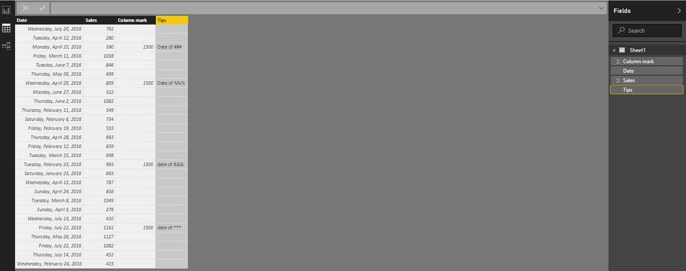
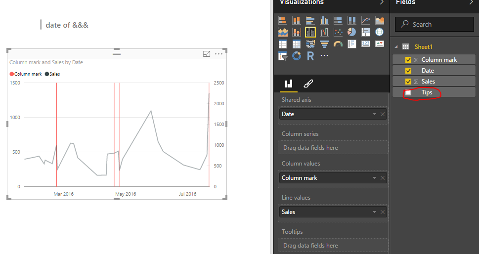
Currently, there is no customize part that I could find out to add special vertical marker with comments using the Power BI listed visuals. Tooltips well only displays number type, so we can't add the comments column and put it in Tooltips well.
From my side I could only think out a workaround:
Take use of clustered column and line Chart, then use column as the vertical marker, with the comments(tips column) showing in Multi-Row card visual, see my result and the testing data:
Regards
- Mark as New
- Bookmark
- Subscribe
- Mute
- Subscribe to RSS Feed
- Permalink
- Report Inappropriate Content
Could this work for you? https://app.powerbi.com/visuals/show/PulseChart1459209850231
Helpful resources
| User | Count |
|---|---|
| 103 | |
| 87 | |
| 78 | |
| 71 | |
| 69 |
| User | Count |
|---|---|
| 113 | |
| 99 | |
| 97 | |
| 72 | |
| 68 |


