Join us at FabCon Vienna from September 15-18, 2025
The ultimate Fabric, Power BI, SQL, and AI community-led learning event. Save €200 with code FABCOMM.
Get registered- Power BI forums
- Get Help with Power BI
- Desktop
- Service
- Report Server
- Power Query
- Mobile Apps
- Developer
- DAX Commands and Tips
- Custom Visuals Development Discussion
- Health and Life Sciences
- Power BI Spanish forums
- Translated Spanish Desktop
- Training and Consulting
- Instructor Led Training
- Dashboard in a Day for Women, by Women
- Galleries
- Data Stories Gallery
- Themes Gallery
- Contests Gallery
- Quick Measures Gallery
- Notebook Gallery
- Translytical Task Flow Gallery
- TMDL Gallery
- R Script Showcase
- Webinars and Video Gallery
- Ideas
- Custom Visuals Ideas (read-only)
- Issues
- Issues
- Events
- Upcoming Events
Enhance your career with this limited time 50% discount on Fabric and Power BI exams. Ends September 15. Request your voucher.
- Power BI forums
- Forums
- Get Help with Power BI
- Desktop
- Re: Overlapping Bar Chart
- Subscribe to RSS Feed
- Mark Topic as New
- Mark Topic as Read
- Float this Topic for Current User
- Bookmark
- Subscribe
- Printer Friendly Page
- Mark as New
- Bookmark
- Subscribe
- Mute
- Subscribe to RSS Feed
- Permalink
- Report Inappropriate Content
Overlapping Bar Chart
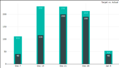
Hi. I'm fairly new to Power BI and I would like to create a bar chart within a bar chart. Is there a visual available for this as I have been unable to find one? For example I would like to show Current Month vs Current Month Last Year using a bar chart, with a small/narrow bar within a current bar. Perhaps this is called an overlapping bar chart? Many thanks.
- Mark as New
- Bookmark
- Subscribe
- Mute
- Subscribe to RSS Feed
- Permalink
- Report Inappropriate Content
If you wish make a Bar plot similar to Power BI's Logo (on Bar coinsiding the other vertically), and not need a lipstick chart, you can create it using a python visual in Power BI. you can easily define, start point of Bars on x-axis, as well as their width.
- Mark as New
- Bookmark
- Subscribe
- Mute
- Subscribe to RSS Feed
- Permalink
- Report Inappropriate Content
Hi @SonyT ,
Perhaps you are needing a lipstick chart:
If so, you can check:
OR
https://pbivizedit.com/gallery/lipstick-column
Thanks,
-R
- Mark as New
- Bookmark
- Subscribe
- Mute
- Subscribe to RSS Feed
- Permalink
- Report Inappropriate Content
Thank you R, that visual looks like just what I need.
- Mark as New
- Bookmark
- Subscribe
- Mute
- Subscribe to RSS Feed
- Permalink
- Report Inappropriate Content
Hi @SonyT you can add the overlapping bar chart visual at the visualization pane from Get more visual. Hope this helps!
- Mark as New
- Bookmark
- Subscribe
- Mute
- Subscribe to RSS Feed
- Permalink
- Report Inappropriate Content
Thank you for your response Fernando. It seems there doesn't seem to be a visual that allows for a bar chart that overlaps. Perhaps we will have to go with your suggestion for now. Thanks.
- Mark as New
- Bookmark
- Subscribe
- Mute
- Subscribe to RSS Feed
- Permalink
- Report Inappropriate Content
I know its not what you are looking for but you could use the line and clustered column chart and plot the same month last year on the line and the current on the bar. (or the other way around)
- Mark as New
- Bookmark
- Subscribe
- Mute
- Subscribe to RSS Feed
- Permalink
- Report Inappropriate Content
Hi @SonyT ,
You could try to use the Clustered Column Chart, where in values you add current revenue and previous year revenue.
Hope it helps.
Regards,
Fernando
Helpful resources
| User | Count |
|---|---|
| 58 | |
| 56 | |
| 53 | |
| 49 | |
| 32 |
| User | Count |
|---|---|
| 172 | |
| 89 | |
| 70 | |
| 46 | |
| 45 |


