FabCon is coming to Atlanta
Join us at FabCon Atlanta from March 16 - 20, 2026, for the ultimate Fabric, Power BI, AI and SQL community-led event. Save $200 with code FABCOMM.
Register now!- Power BI forums
- Get Help with Power BI
- Desktop
- Service
- Report Server
- Power Query
- Mobile Apps
- Developer
- DAX Commands and Tips
- Custom Visuals Development Discussion
- Health and Life Sciences
- Power BI Spanish forums
- Translated Spanish Desktop
- Training and Consulting
- Instructor Led Training
- Dashboard in a Day for Women, by Women
- Galleries
- Data Stories Gallery
- Themes Gallery
- Contests Gallery
- QuickViz Gallery
- Quick Measures Gallery
- Visual Calculations Gallery
- Notebook Gallery
- Translytical Task Flow Gallery
- TMDL Gallery
- R Script Showcase
- Webinars and Video Gallery
- Ideas
- Custom Visuals Ideas (read-only)
- Issues
- Issues
- Events
- Upcoming Events
The Power BI Data Visualization World Championships is back! Get ahead of the game and start preparing now! Learn more
- Power BI forums
- Forums
- Get Help with Power BI
- Desktop
- Re: Opened closed dates
- Subscribe to RSS Feed
- Mark Topic as New
- Mark Topic as Read
- Float this Topic for Current User
- Bookmark
- Subscribe
- Printer Friendly Page
- Mark as New
- Bookmark
- Subscribe
- Mute
- Subscribe to RSS Feed
- Permalink
- Report Inappropriate Content
Opened closed dates
Hello
there are 3 columns in my Excel (Count , OpenedDate , ClosedDate)
I want to create a dash on PowerBi Desktop like this ,
How can I do it ?
Solved! Go to Solution.
- Mark as New
- Bookmark
- Subscribe
- Mute
- Subscribe to RSS Feed
- Permalink
- Report Inappropriate Content
Hi @zgrshn,
According to your description, I made a sample for your reference.
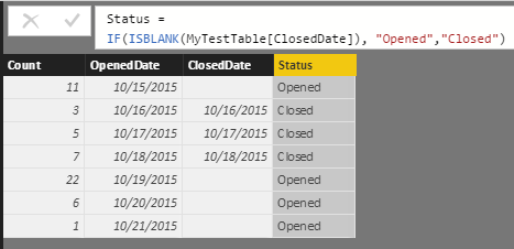
I assume you have a table called "MyTestTable" like below.
1. Add a new table called "StatusTable".
2. Use the formula below to create a calculate column called "Status" in "MyTestTable" table.
Status = IF(ISBLANK(MyTestTable[ClosedDate]), "Opened","Closed")
3. Use the formula below to create a measure called "Value".
Value =
IF (
    ISBLANK (
        CALCULATE (
            COUNTROWS ( MyTestTable ),
            FILTER (
                MyTestTable,
                MyTestTable[Status] = FIRSTNONBLANK ( StatusTable[Status], 1 )
            )
        )
    ),
    IF (
        FIRSTNONBLANK ( StatusTable[Status], 1 ) = "Opened",
        SUM ( MyTestTable[Count] ),
        0
    ),
    SUM ( MyTestTable[Count] )
)
4. Use Matrix and Stacked column chart to show the data on the report.
Here is the sample pbix file for your reference.
Regards
- Mark as New
- Bookmark
- Subscribe
- Mute
- Subscribe to RSS Feed
- Permalink
- Report Inappropriate Content
Can you explain where the numbers are coming from in your result?
Follow on LinkedIn
@ me in replies or I'll lose your thread!!!
Instead of a Kudo, please vote for this idea
Become an expert!: Enterprise DNA
External Tools: MSHGQM
YouTube Channel!: Microsoft Hates Greg
Latest book!: DAX For Humans
DAX is easy, CALCULATE makes DAX hard...
- Mark as New
- Bookmark
- Subscribe
- Mute
- Subscribe to RSS Feed
- Permalink
- Report Inappropriate Content
I write the numbers manually in Excel .
- Mark as New
- Bookmark
- Subscribe
- Mute
- Subscribe to RSS Feed
- Permalink
- Report Inappropriate Content
Hi @zgrshn,
According to your description, I made a sample for your reference.
I assume you have a table called "MyTestTable" like below.
1. Add a new table called "StatusTable".
2. Use the formula below to create a calculate column called "Status" in "MyTestTable" table.
Status = IF(ISBLANK(MyTestTable[ClosedDate]), "Opened","Closed")
3. Use the formula below to create a measure called "Value".
Value =
IF (
    ISBLANK (
        CALCULATE (
            COUNTROWS ( MyTestTable ),
            FILTER (
                MyTestTable,
                MyTestTable[Status] = FIRSTNONBLANK ( StatusTable[Status], 1 )
            )
        )
    ),
    IF (
        FIRSTNONBLANK ( StatusTable[Status], 1 ) = "Opened",
        SUM ( MyTestTable[Count] ),
        0
    ),
    SUM ( MyTestTable[Count] )
)
4. Use Matrix and Stacked column chart to show the data on the report.
Here is the sample pbix file for your reference.
Regards
- Mark as New
- Bookmark
- Subscribe
- Mute
- Subscribe to RSS Feed
- Permalink
- Report Inappropriate Content
Really like what you've done, easy to understand.
Can you help a bit further with that formula (VALUE) if there are 4 status values? I don't have a count column, I just have a status column for each ticket with the following indicator: open, closed, pending and resolved.
(FYI-resolved and closed mean 2 different things)
Thank you in advance!
- Mark as New
- Bookmark
- Subscribe
- Mute
- Subscribe to RSS Feed
- Permalink
- Report Inappropriate Content
Dear JerryLi
Thank you very much
Helpful resources

Power BI Dataviz World Championships
The Power BI Data Visualization World Championships is back! Get ahead of the game and start preparing now!

Power BI Monthly Update - November 2025
Check out the November 2025 Power BI update to learn about new features.

| User | Count |
|---|---|
| 59 | |
| 43 | |
| 42 | |
| 23 | |
| 17 |
| User | Count |
|---|---|
| 190 | |
| 122 | |
| 96 | |
| 66 | |
| 47 |


