FabCon is coming to Atlanta
Join us at FabCon Atlanta from March 16 - 20, 2026, for the ultimate Fabric, Power BI, AI and SQL community-led event. Save $200 with code FABCOMM.
Register now!- Power BI forums
- Get Help with Power BI
- Desktop
- Service
- Report Server
- Power Query
- Mobile Apps
- Developer
- DAX Commands and Tips
- Custom Visuals Development Discussion
- Health and Life Sciences
- Power BI Spanish forums
- Translated Spanish Desktop
- Training and Consulting
- Instructor Led Training
- Dashboard in a Day for Women, by Women
- Galleries
- Data Stories Gallery
- Themes Gallery
- Contests Gallery
- QuickViz Gallery
- Quick Measures Gallery
- Visual Calculations Gallery
- Notebook Gallery
- Translytical Task Flow Gallery
- TMDL Gallery
- R Script Showcase
- Webinars and Video Gallery
- Ideas
- Custom Visuals Ideas (read-only)
- Issues
- Issues
- Events
- Upcoming Events
The Power BI Data Visualization World Championships is back! Get ahead of the game and start preparing now! Learn more
- Power BI forums
- Forums
- Get Help with Power BI
- Desktop
- One vs Rest
- Subscribe to RSS Feed
- Mark Topic as New
- Mark Topic as Read
- Float this Topic for Current User
- Bookmark
- Subscribe
- Printer Friendly Page
- Mark as New
- Bookmark
- Subscribe
- Mute
- Subscribe to RSS Feed
- Permalink
- Report Inappropriate Content
One vs Rest
Hi Community,
I have employee feedback data.
Dataset: EmpID, DeptID, Rating,..
There are 8 departments.
Ratings (1,2,......,10)
Scenario: I want to create bar charts to compare the Average Rating of one department employees vs rest of the department employees. How to achieve this?
Example:
In 1st bar chart, average rating of D1 employees vs average rating of D2,D3,D4,D5,D6,D7,D8 employees together.
In 2nd bar chart, average rating of D2 employees vs average rating of D1,D3,D4,D5,D6,D7,D8 employees together.
Thanks in advance
Solved! Go to Solution.
- Mark as New
- Bookmark
- Subscribe
- Mute
- Subscribe to RSS Feed
- Permalink
- Report Inappropriate Content
Hi @pradeept ,
Please follow these steps:
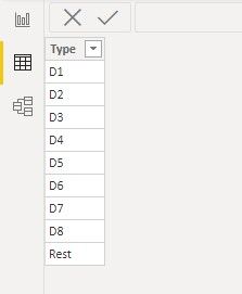
1. Create a table for X-axis by entering data like this:
2. Just need one measure:
Expected output =
var _curr=CALCULATE(SUM('Table'[Rating]),ALLEXCEPT('Table','Table'[Department]))
var _rest=CALCULATE(AVERAGE('Table'[Rating]),FILTER(ALL('Table'),'Table'[Department]<>MAX('Table'[Department])))

return IF(MAX('X-axis'[Type])="Rest",_rest,IF(MAX('Table'[Department]) =MAX('X-axis'[Type]),_curr))
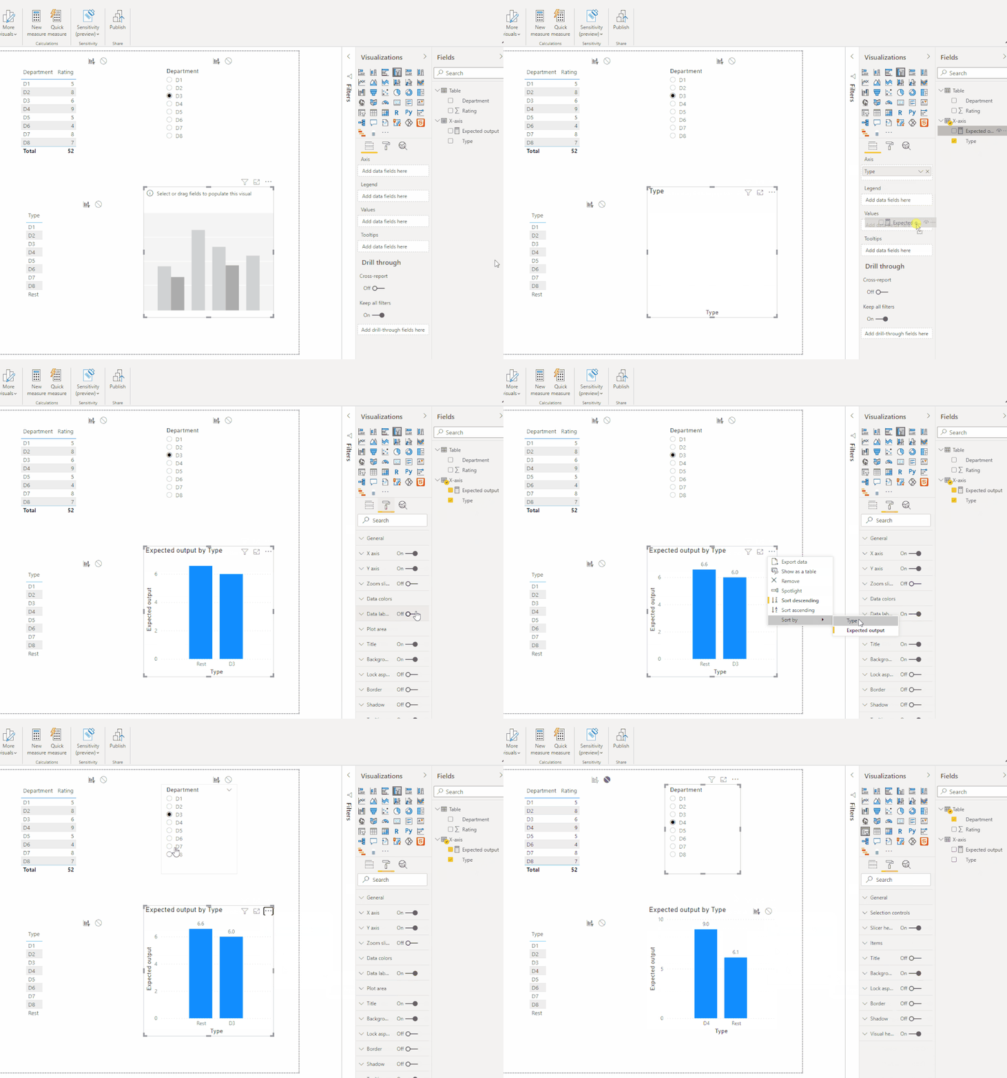
The final output is shown below:
Best Regards,
Eyelyn Qin
If this post helps, then please consider Accept it as the solution to help the other members find it more quickly.
- Mark as New
- Bookmark
- Subscribe
- Mute
- Subscribe to RSS Feed
- Permalink
- Report Inappropriate Content
Hi @pradeept ,
Please try this:
Expected output =
 var _curr= CALCULATE(SUM('Table'[Rating]),FILTER('Table','Table'[Department]=MAX('X-axis'[Type])))
 var _notSele=CALCULATE(DISTINCTCOUNT('Table'[Department]),ALL('Table'))-DISTINCTCOUNT('Table'[Department])
 var _rest=CALCULATE(SUM('Table'[Rating]),FILTER('Table',[Department] in ALLSELECTED('X-axis'[Type])))
return IF(MAX('X-axis'[Type])="Rest",DIVIDE(CALCULATE(SUM('Table'[Rating]),ALL('Table'))-_rest,_notSele),IF(MAX('X-axis'[Type]) in ALLSELECTED('Table'[Department]),_curr))
Best Regards,
Eyelyn Qin
If this post helps, then please consider Accept it as the solution to help the other members find it more quickly.
- Mark as New
- Bookmark
- Subscribe
- Mute
- Subscribe to RSS Feed
- Permalink
- Report Inappropriate Content
Hi @pradeept ,
Please follow these steps:
1. Create a table for X-axis by entering data like this:
2. Just need one measure:
Expected output =
var _curr=CALCULATE(SUM('Table'[Rating]),ALLEXCEPT('Table','Table'[Department]))
var _rest=CALCULATE(AVERAGE('Table'[Rating]),FILTER(ALL('Table'),'Table'[Department]<>MAX('Table'[Department])))

return IF(MAX('X-axis'[Type])="Rest",_rest,IF(MAX('Table'[Department]) =MAX('X-axis'[Type]),_curr))
The final output is shown below:
Best Regards,
Eyelyn Qin
If this post helps, then please consider Accept it as the solution to help the other members find it more quickly.
- Mark as New
- Bookmark
- Subscribe
- Mute
- Subscribe to RSS Feed
- Permalink
- Report Inappropriate Content
@Anonymous this is the solution I am looking for. Thank you so much for your time.👏👏
I tweaked the measure little bit, for the other filters interactivity and working fine. Now I have to create 8 charts and apply the department as visual level filter.
- Mark as New
- Bookmark
- Subscribe
- Mute
- Subscribe to RSS Feed
- Permalink
- Report Inappropriate Content
@amitchandak Thanks for quick response.
the solution you provided will work, if we are we showing all the departments in one chart.
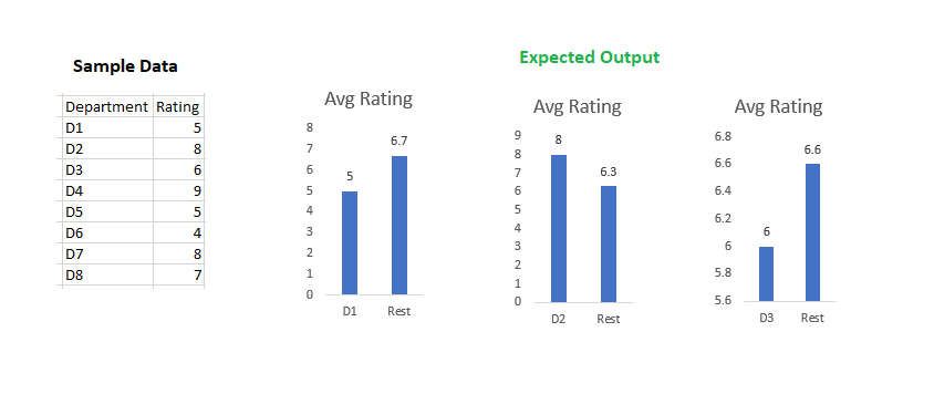
You can see the below expected output (in excel). Any thoughts to achieve this?
In PowerBI, I tried with 2 charts. I created 2 measures for each chart, in total 4 measures. If I go with this approach, I need to create 16 (8 X 2 ) measures in total. After doing this also, I am not able to showcase the Labels on X-axis.
(Later, I am looking for the dynamic solution which we can reduce the number of measures in count, from 16 to 4-6)
- Mark as New
- Bookmark
- Subscribe
- Mute
- Subscribe to RSS Feed
- Permalink
- Report Inappropriate Content
@pradeept , Try two measures like these
Current = average(Table[Rating])
Others = calculate(average(Table[Rating]) , filter(all(Table), table[DeptID] <> max(Table[DeptID])))
Helpful resources

Power BI Dataviz World Championships
The Power BI Data Visualization World Championships is back! Get ahead of the game and start preparing now!

| User | Count |
|---|---|
| 40 | |
| 35 | |
| 34 | |
| 31 | |
| 27 |
| User | Count |
|---|---|
| 135 | |
| 102 | |
| 67 | |
| 65 | |
| 56 |


