cancel
Showing results for 
Search instead for 
Did you mean: 

A new Data Days event is coming soon! This time we’re going bigger than ever. Fabric, Power BI, SQL, AI and more. Don't miss out.

Reply
pradeept
Resolver I
Resolver I

One vs Rest

Hi Community,


I have employee feedback data. 

Dataset: EmpID, DeptID, Rating,..
There are 8 departments.
Ratings (1,2,......,10)

Scenario:  I want to create bar charts to compare the Average Rating of one department employees vs rest of the department employees. How to achieve this?

Example: 

In 1st bar chart,  average rating of D1 employees  vs average rating of D2,D3,D4,D5,D6,D7,D8 employees together.
In 2nd bar chart,  average rating of D2 employees vs average rating of D1,D3,D4,D5,D6,D7,D8 employees together.


Thanks in advance


1 ACCEPTED SOLUTION
Anonymous
Not applicable

Hi @pradeept ,


Please follow these steps:


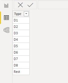
1. Create a table for X-axis by entering data like this:
x-axis table.jpg

2. Just need one measure:

Expected output = 
var _curr=CALCULATE(SUM('Table'[Rating]),ALLEXCEPT('Table','Table'[Department]))
var _rest=CALCULATE(AVERAGE('Table'[Rating]),FILTER(ALL('Table'),'Table'[Department]<>MAX('Table'[Department])))

return IF(MAX('X-axis'[Type])="Rest",_rest,IF(MAX('Table'[Department]) =MAX('X-axis'[Type]),_curr))

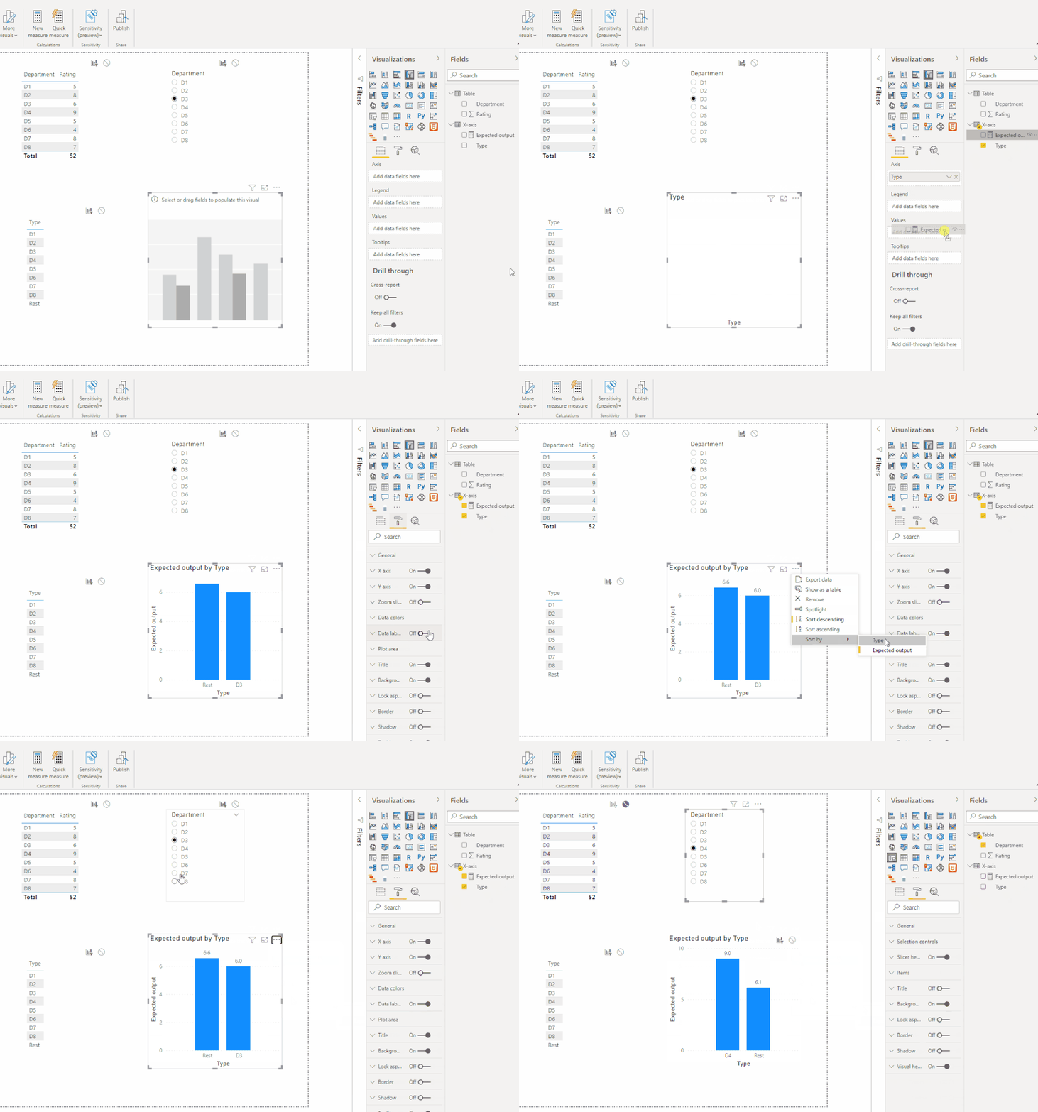
The final output is shown below:

dynaimc output.gif


Best Regards,
Eyelyn Qin
If this post helps, then please consider Accept it as the solution to help the other members find it more quickly.

View solution in original post

5 REPLIES 5
Anonymous
Not applicable

Hi @pradeept ,


Please try this:

Expected output = 
 var _curr= CALCULATE(SUM('Table'[Rating]),FILTER('Table','Table'[Department]=MAX('X-axis'[Type])))  
 var _notSele=CALCULATE(DISTINCTCOUNT('Table'[Department]),ALL('Table'))-DISTINCTCOUNT('Table'[Department])
 var _rest=CALCULATE(SUM('Table'[Rating]),FILTER('Table',[Department] in ALLSELECTED('X-axis'[Type])))
return IF(MAX('X-axis'[Type])="Rest",DIVIDE(CALCULATE(SUM('Table'[Rating]),ALL('Table'))-_rest,_notSele),IF(MAX('X-axis'[Type]) in ALLSELECTED('Table'[Department]),_curr))

output.jpg

Best Regards,
Eyelyn Qin
If this post helps, then please consider Accept it as the solution to help the other members find it more quickly.

Anonymous
Not applicable

Hi @pradeept ,


Please follow these steps:


1. Create a table for X-axis by entering data like this:
x-axis table.jpg

2. Just need one measure:

Expected output = 
var _curr=CALCULATE(SUM('Table'[Rating]),ALLEXCEPT('Table','Table'[Department]))
var _rest=CALCULATE(AVERAGE('Table'[Rating]),FILTER(ALL('Table'),'Table'[Department]<>MAX('Table'[Department])))

return IF(MAX('X-axis'[Type])="Rest",_rest,IF(MAX('Table'[Department]) =MAX('X-axis'[Type]),_curr))

The final output is shown below:

dynaimc output.gif


Best Regards,
Eyelyn Qin
If this post helps, then please consider Accept it as the solution to help the other members find it more quickly.

@Anonymous  this is the solution I am looking for. Thank you so much for your time.👏👏


I tweaked the measure little bit, for the other filters interactivity and working fine. Now I have to create 8 charts and apply the department as visual level filter. 

pradeept
Resolver I
Resolver I

@amitchandak Thanks for quick response.

the solution you provided will work, if we are we showing all the departments in one chart. 


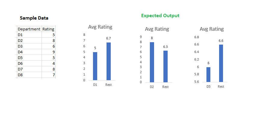
You can see the below expected output (in excel). Any thoughts to achieve this? 
In PowerBI,  I tried with  2 charts. I created 2 measures for each chart, in total  4 measures. If I go with this approach, I need to create 16 (8 X 2 ) measures in total. After doing this also,  I am not able to showcase the Labels on X-axis.

(Later, I am looking for the dynamic solution which we can reduce the number of measures in count, from 16 to 4-6)


One Vs Rest.png

amitchandak
Super User
Super User

@pradeept , Try two measures like these


Current  = average(Table[Rating])


Others = calculate(average(Table[Rating]) , filter(all(Table), table[DeptID] <> max(Table[DeptID])))

Share with Power BI Enthusiasts: Full Power BI Video (20 Hours) YouTube
Microsoft Fabric Series 60+ Videos YouTube
Microsoft Fabric Hindi End to End YouTube

Helpful resources

Announcements
May Power BI Update Carousel

Power BI Monthly Update - May 2026

Check out the May 2026 Power BI update to learn about new features.

Fabric SQL PBI Data Days

Data Days 2026 coming soon!

Sign up to receive a private message when registration opens and key events begin.

New to Fabric survey Carousel

New to Fabric Survey

If you have recently started exploring Fabric, we'd love to hear how it's going. Your feedback can help with product improvements.

Power BI DataViz World Championships carousel

Power BI DataViz World Championships - June 2026

A new Power BI DataViz World Championship is coming this June! Don't miss out on submitting your entry.