Fabric Data Days starts November 4th!
Advance your Data & AI career with 50 days of live learning, dataviz contests, hands-on challenges, study groups & certifications and more!
Get registered- Power BI forums
- Get Help with Power BI
- Desktop
- Service
- Report Server
- Power Query
- Mobile Apps
- Developer
- DAX Commands and Tips
- Custom Visuals Development Discussion
- Health and Life Sciences
- Power BI Spanish forums
- Translated Spanish Desktop
- Training and Consulting
- Instructor Led Training
- Dashboard in a Day for Women, by Women
- Galleries
- Data Stories Gallery
- Themes Gallery
- Contests Gallery
- QuickViz Gallery
- Quick Measures Gallery
- Visual Calculations Gallery
- Notebook Gallery
- Translytical Task Flow Gallery
- TMDL Gallery
- R Script Showcase
- Webinars and Video Gallery
- Ideas
- Custom Visuals Ideas (read-only)
- Issues
- Issues
- Events
- Upcoming Events
Get Fabric Certified for FREE during Fabric Data Days. Don't miss your chance! Request now
- Power BI forums
- Forums
- Get Help with Power BI
- Desktop
- Re: One line chart for different calculations
- Subscribe to RSS Feed
- Mark Topic as New
- Mark Topic as Read
- Float this Topic for Current User
- Bookmark
- Subscribe
- Printer Friendly Page
- Mark as New
- Bookmark
- Subscribe
- Mute
- Subscribe to RSS Feed
- Permalink
- Report Inappropriate Content
One line chart for different calculations
Hi -
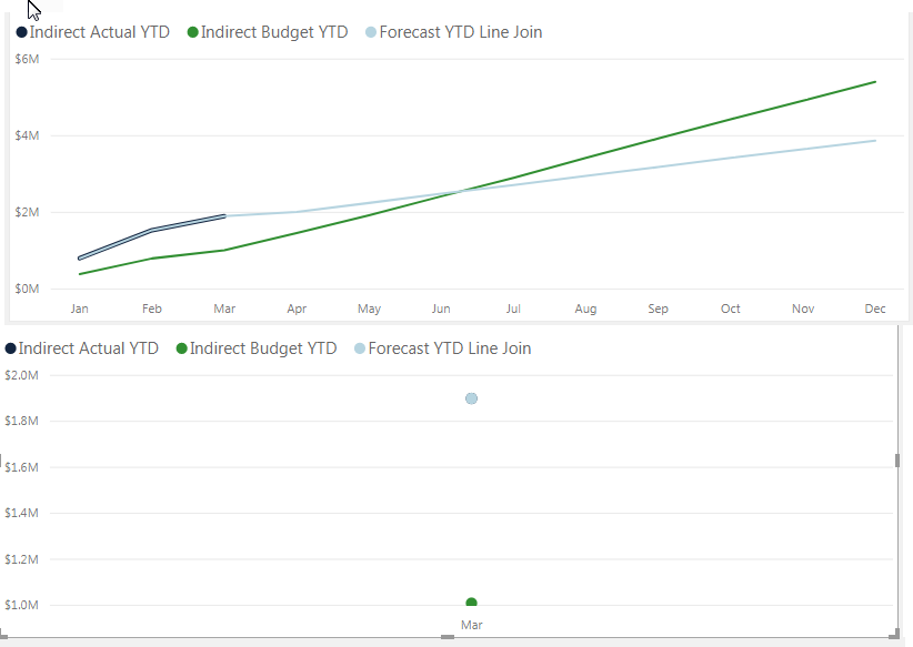
I'm looking for a dax measure for a line chart graph to combine multiple values into one line. Currently it's showing each line for one calculation and when a specific month is selected it truns into a dot for that month, but instead I'd like to display a line for previous months and continuation of the same line to reflect forecast.
- Mark as New
- Bookmark
- Subscribe
- Mute
- Subscribe to RSS Feed
- Permalink
- Report Inappropriate Content
hi, @miii
Do you mean that when you select one specific month, there are still previous month and next month data in the chart? IF so, you don't need to select any month. When you select one month, other month will be filtered in the visual.
If not your case, please share your sample pbix file and expected output not just the formula of measure.
Please see this post regarding How to Get Your Question Answered Quickly: https://community.powerbi.com/t5/Community-Blog/How-to-Get-Your-Question-Answered-Quickly/ba-p/38490
Best Regards,
Lin
If this post helps, then please consider Accept it as the solution to help the other members find it more quickly.
- Mark as New
- Bookmark
- Subscribe
- Mute
- Subscribe to RSS Feed
- Permalink
- Report Inappropriate Content
Can you provide an example of data and your current calculation? How are you doing the forecasting?
Follow on LinkedIn
@ me in replies or I'll lose your thread!!!
Instead of a Kudo, please vote for this idea
Become an expert!: Enterprise DNA
External Tools: MSHGQM
YouTube Channel!: Microsoft Hates Greg
Latest book!: DAX For Humans
DAX is easy, CALCULATE makes DAX hard...
- Mark as New
- Bookmark
- Subscribe
- Mute
- Subscribe to RSS Feed
- Permalink
- Report Inappropriate Content
Thanks for help Greg - This is the code being used for calculations
Indirect Labor Budget YTD:=
CALCULATE(
	[Indirect Labor Budget],
	DATESYTD('Calendar'[Date])
)
Indirect Labor Forecast YTD:=
CALCULATE(
[Indirect Labor Forecast],
DATESYTD('Calendar'[Date])
)Indirect Labor Actual YTD:=
var maxyear = MAX('Calendar'[Relative Year Index])
var _month = MAX(Scenario[SCENARIO_NUM])
return
calculate(
CALCULATE(
[Indirect Labor Actual],
filter(
'Calendar',
and(
'Calendar'[Relative Year Index] = maxyear ,
'Calendar'[Month] <= _month
)
)
),
DATESYTD('Calendar'[Date])
)
Helpful resources

Power BI Monthly Update - November 2025
Check out the November 2025 Power BI update to learn about new features.

Fabric Data Days
Advance your Data & AI career with 50 days of live learning, contests, hands-on challenges, study groups & certifications and more!


