- Power BI forums
- Get Help with Power BI
- Desktop
- Service
- Report Server
- Power Query
- Mobile Apps
- Developer
- DAX Commands and Tips
- Custom Visuals Development Discussion
- Health and Life Sciences
- Power BI Spanish forums
- Translated Spanish Desktop
- Training and Consulting
- Instructor Led Training
- Dashboard in a Day for Women, by Women
- Galleries
- Data Stories Gallery
- Themes Gallery
- Contests Gallery
- QuickViz Gallery
- Quick Measures Gallery
- Visual Calculations Gallery
- Notebook Gallery
- Translytical Task Flow Gallery
- TMDL Gallery
- R Script Showcase
- Webinars and Video Gallery
- Ideas
- Custom Visuals Ideas (read-only)
- Issues
- Issues
- Events
- Upcoming Events
We've captured the moments from FabCon & SQLCon that everyone is talking about, and we are bringing them to the community, live and on-demand. Starts on April 14th. Register now
- Power BI forums
- Forums
- Get Help with Power BI
- Desktop
- Re: Numerical Ranges
- Subscribe to RSS Feed
- Mark Topic as New
- Mark Topic as Read
- Float this Topic for Current User
- Bookmark
- Subscribe
- Printer Friendly Page
- Mark as New
- Bookmark
- Subscribe
- Mute
- Subscribe to RSS Feed
- Permalink
- Report Inappropriate Content
Numerical Ranges
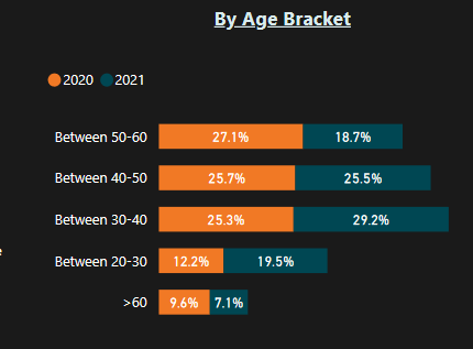
I have a practice dataset which has two tables. one for 2020 and one for 2021, they are just practice survey data for remote work. i am trying to create a visualization where i can show the number of people by an age range like no of people in 20-30,then 30-40 and so on. i have grouped the column and created bins but i am clueless about what i should do next. i was trying to replicate this kind of visualization.

can anyone suggest something?
Solved! Go to Solution.
- Mark as New
- Bookmark
- Subscribe
- Mute
- Subscribe to RSS Feed
- Permalink
- Report Inappropriate Content
Hi @Aryaja96 ,
It depends on your data and the model you are using, but if were you heading for something like this, I can show you how I did it 🙂
I used the following sample data:
YearAgeBin
| 2020 | 21 | Between 20-30 |
| 2020 | 27 | Between 20-30 |
| 2020 | 31 | Between 30-40 |
| 2020 | 22 | Between 20-30 |
| 2020 | 25 | Between 20-30 |
| 2020 | 39 | Between 30-40 |
| 2020 | 35 | Between 30-40 |
| 2020 | 42 | Between 40-50 |
| 2020 | 58 | Between 50-60 |
| 2021 | 61 | > 60 |
| 2021 | 67 | > 60 |
| 2021 | 62 | > 60 |
| 2021 | 80 | > 60 |
| 2021 | 22 | Between 20-30 |
| 2021 | 30 | Between 30-40 |
| 2021 | 31 | Between 30-40 |
| 2021 | 32 | Between 30-40 |
| 2021 | 25 | Between 20-30 |
| 2021 | 27 | Between 20-30 |
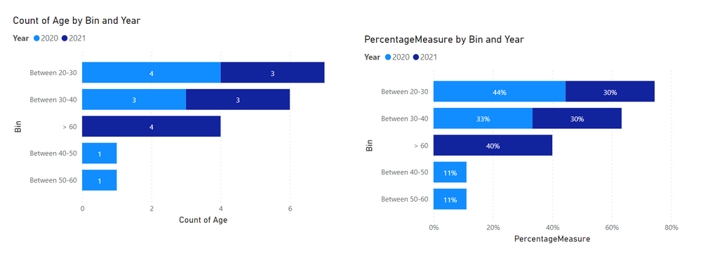
And then what I did was the following for the left graph:
And for the right graph, I created a separate measure called PercentageMeasure with the following DAX:
PercentageMeasure =
VAR _overallCountPerYear = CALCULATE ( COUNTROWS ( Table ), ALLEXCEPT (Table, Table[Year] ) )
RETURN
DIVIDE ( COUNTROWS ( Table ), _overallCountPerYear )
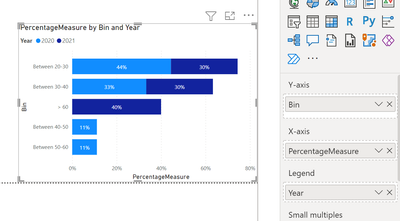
The graph had the following settings:
For both graphs I chose the stocked bar chart
Let me know if this helps 🙂
/Tom
https://www.tackytech.blog/
https://www.instagram.com/tackytechtom/
| Did I answer your question❓➡️ Please, mark my post as a solution ✔️ |
| Also happily accepting Kudos 🙂 |
| Feel free to connect with me on LinkedIn! | |
| #proudtobeasuperuser |  |
- Mark as New
- Bookmark
- Subscribe
- Mute
- Subscribe to RSS Feed
- Permalink
- Report Inappropriate Content
thank you for the reply, i am going to try it out and let you know if it helps! 🙂
- Mark as New
- Bookmark
- Subscribe
- Mute
- Subscribe to RSS Feed
- Permalink
- Report Inappropriate Content
Hi @Aryaja96 ,
It depends on your data and the model you are using, but if were you heading for something like this, I can show you how I did it 🙂
I used the following sample data:
YearAgeBin
| 2020 | 21 | Between 20-30 |
| 2020 | 27 | Between 20-30 |
| 2020 | 31 | Between 30-40 |
| 2020 | 22 | Between 20-30 |
| 2020 | 25 | Between 20-30 |
| 2020 | 39 | Between 30-40 |
| 2020 | 35 | Between 30-40 |
| 2020 | 42 | Between 40-50 |
| 2020 | 58 | Between 50-60 |
| 2021 | 61 | > 60 |
| 2021 | 67 | > 60 |
| 2021 | 62 | > 60 |
| 2021 | 80 | > 60 |
| 2021 | 22 | Between 20-30 |
| 2021 | 30 | Between 30-40 |
| 2021 | 31 | Between 30-40 |
| 2021 | 32 | Between 30-40 |
| 2021 | 25 | Between 20-30 |
| 2021 | 27 | Between 20-30 |
And then what I did was the following for the left graph:
And for the right graph, I created a separate measure called PercentageMeasure with the following DAX:
PercentageMeasure =
VAR _overallCountPerYear = CALCULATE ( COUNTROWS ( Table ), ALLEXCEPT (Table, Table[Year] ) )
RETURN
DIVIDE ( COUNTROWS ( Table ), _overallCountPerYear )
The graph had the following settings:
For both graphs I chose the stocked bar chart
Let me know if this helps 🙂
/Tom
https://www.tackytech.blog/
https://www.instagram.com/tackytechtom/
| Did I answer your question❓➡️ Please, mark my post as a solution ✔️ |
| Also happily accepting Kudos 🙂 |
| Feel free to connect with me on LinkedIn! | |
| #proudtobeasuperuser |  |
Helpful resources

New to Fabric Survey
If you have recently started exploring Fabric, we'd love to hear how it's going. Your feedback can help with product improvements.

Power BI DataViz World Championships - June 2026
A new Power BI DataViz World Championship is coming this June! Don't miss out on submitting your entry.

Join our Fabric User Panel
Share feedback directly with Fabric product managers, participate in targeted research studies and influence the Fabric roadmap.

| User | Count |
|---|---|
| 57 | |
| 38 | |
| 33 | |
| 19 | |
| 16 |
| User | Count |
|---|---|
| 68 | |
| 66 | |
| 41 | |
| 34 | |
| 25 |


