FabCon is coming to Atlanta
Join us at FabCon Atlanta from March 16 - 20, 2026, for the ultimate Fabric, Power BI, AI and SQL community-led event. Save $200 with code FABCOMM.
Register now!- Power BI forums
- Get Help with Power BI
- Desktop
- Service
- Report Server
- Power Query
- Mobile Apps
- Developer
- DAX Commands and Tips
- Custom Visuals Development Discussion
- Health and Life Sciences
- Power BI Spanish forums
- Translated Spanish Desktop
- Training and Consulting
- Instructor Led Training
- Dashboard in a Day for Women, by Women
- Galleries
- Data Stories Gallery
- Themes Gallery
- Contests Gallery
- QuickViz Gallery
- Quick Measures Gallery
- Visual Calculations Gallery
- Notebook Gallery
- Translytical Task Flow Gallery
- TMDL Gallery
- R Script Showcase
- Webinars and Video Gallery
- Ideas
- Custom Visuals Ideas (read-only)
- Issues
- Issues
- Events
- Upcoming Events
View all the Fabric Data Days sessions on demand. View schedule
- Power BI forums
- Forums
- Get Help with Power BI
- Desktop
- Number formatting in Multi-Row Card
- Subscribe to RSS Feed
- Mark Topic as New
- Mark Topic as Read
- Float this Topic for Current User
- Bookmark
- Subscribe
- Printer Friendly Page
- Mark as New
- Bookmark
- Subscribe
- Mute
- Subscribe to RSS Feed
- Permalink
- Report Inappropriate Content
Number formatting in Multi-Row Card
Hi,
I'm presenting some headline performance stats within multi-row cards (I had used indiviual cards, however they don't show the headers on mobile view), but I cannot find anywhere to change the number format.
Format options on the visualisations tab does not contain any options for number formatting and the Modelling tab has data type and formatting options greyed out.
This is how I have arranged the cards to show my data:
Any help would be much appreciated!
Matt
- Mark as New
- Bookmark
- Subscribe
- Mute
- Subscribe to RSS Feed
- Permalink
- Report Inappropriate Content
This feature it's not supported yet.
My sugestion it's to create many single cards and a text box at the top to display the title that you need.
Please vote in this idea below to let the guys include in the next implentations.
Regards.
- Mark as New
- Bookmark
- Subscribe
- Mute
- Subscribe to RSS Feed
- Permalink
- Report Inappropriate Content
Hi,
I found the solution here.
- Mark as New
- Bookmark
- Subscribe
- Mute
- Subscribe to RSS Feed
- Permalink
- Report Inappropriate Content
If you are using an SSAS TDM you can format the data there, once it is pushed and your report refreshed, those changesd will be reflected in the visualization. In know this is an old post but maybe it'll help someone.
- Mark as New
- Bookmark
- Subscribe
- Mute
- Subscribe to RSS Feed
- Permalink
- Report Inappropriate Content
@mattymc1984 wrote:
Hi,
I'm presenting some headline performance stats within multi-row cards (I had used indiviual cards, however they don't show the headers on mobile view), but I cannot find anywhere to change the number format.
Format options on the visualisations tab does not contain any options for number formatting and the Modelling tab has data type and formatting options greyed out.
This is how I have arranged the cards to show my data:
Any help would be much appreciated!
Matt
Your description is not clear for me, I'm still not getting what is your problem.
By the way, you can format individual measures in the modeling tab(click on a measure->go to modeling tab->format), other than format the whole card visual, see different formats in below card visual.
- Mark as New
- Bookmark
- Subscribe
- Mute
- Subscribe to RSS Feed
- Permalink
- Report Inappropriate Content
Hi Eric,
Thanks for the response.
I don't want to create a "blanket" formatting for a whole measure. In my summary I want to show in #.##M, but in a table I would want to show as #,###,###.
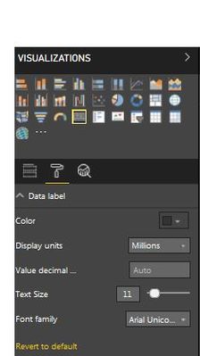
A standard "Card" visualisation gives you the following formatting options:
I was hoping to find I similar set of options for the multi-row card.
In the meantime, I have found a workaround by creating a custom measure:
=CONCATENATE(TRUNC([value name])/1000000,2),"M")
This however, is not ideal as it means I need to create a custom measure for every value I wish to summarise in a multi-row card.
As I said, I would prefer to use a standard card, but at the moment these don't show headings on mobile view (already raised in another post).
Thanks,
Matt
- Mark as New
- Bookmark
- Subscribe
- Mute
- Subscribe to RSS Feed
- Permalink
- Report Inappropriate Content
I have exactly the same issue if anybody does find a solution.
Many thanks,
Neil
- Mark as New
- Bookmark
- Subscribe
- Mute
- Subscribe to RSS Feed
- Permalink
- Report Inappropriate Content
I am using a metric of type text in a multi-row card visual. But the formatting isn't working for it. The formatting works when the metric type used is numeric.
Is this a limitation of this visual?
Helpful resources

Power BI Monthly Update - November 2025
Check out the November 2025 Power BI update to learn about new features.

Fabric Data Days
Advance your Data & AI career with 50 days of live learning, contests, hands-on challenges, study groups & certifications and more!


