Win a 3 Day Ticket to FabCon Vienna
We're giving away 30 tickets for FREE! Share your story, your vision, or your hustle and tell us why YOU deserve a ticket.
Apply nowGo To
- Power BI forums
- Get Help with Power BI
- Desktop
- Service
- Report Server
- Power Query
- Mobile Apps
- Developer
- DAX Commands and Tips
- Custom Visuals Development Discussion
- Health and Life Sciences
- Power BI Spanish forums
- Translated Spanish Desktop
- Training and Consulting
- Instructor Led Training
- Dashboard in a Day for Women, by Women
- Galleries
- Data Stories Gallery
- Themes Gallery
- Contests Gallery
- Quick Measures Gallery
- Notebook Gallery
- Translytical Task Flow Gallery
- TMDL Gallery
- R Script Showcase
- Webinars and Video Gallery
- Ideas
- Custom Visuals Ideas (read-only)
- Issues
- Issues
- Events
- Upcoming Events
Turn on suggestions
Auto-suggest helps you quickly narrow down your search results by suggesting possible matches as you type.
Showing results for
Win a FREE 3 Day Ticket to FabCon Vienna. Apply now
- Power BI forums
- Forums
- Get Help with Power BI
- Desktop
- Re: Normal Distribution Curve in Power Bi
Reply
Topic Options
- Subscribe to RSS Feed
- Mark Topic as New
- Mark Topic as Read
- Float this Topic for Current User
- Bookmark
- Subscribe
- Printer Friendly Page
Anonymous
Not applicable
- Mark as New
- Bookmark
- Subscribe
- Mute
- Subscribe to RSS Feed
- Permalink
- Report Inappropriate Content
Normal Distribution Curve in Power Bi
09-03-2020
02:17 PM
Hi,
I'm trying to create a normal distribution curve in Power BI. I was able to create a bell shape with a simple line chart but I'm not sure how to add mean and sigma values within the chart.
4 REPLIES 4
- Mark as New
- Bookmark
- Subscribe
- Mute
- Subscribe to RSS Feed
- Permalink
- Report Inappropriate Content
09-05-2020
06:47 AM
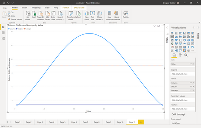
@Anonymous - Check out the attached PBIX file below sig. Page 11. I created the bell curve and then these two measures:
Average = AVERAGEX(ALL('Table 2'),[Column])

StdDev = STDEVX.S(ALL('Table 2'),[Column])
Follow on LinkedIn
@ me in replies or I'll lose your thread!!!
Instead of a Kudo, please vote for this idea
Become an expert!: Enterprise DNA
External Tools: MSHGQM
YouTube Channel!: Microsoft Hates Greg
Latest book!: DAX For Humans
DAX is easy, CALCULATE makes DAX hard...
- Mark as New
- Bookmark
- Subscribe
- Mute
- Subscribe to RSS Feed
- Permalink
- Report Inappropriate Content
09-07-2020
09:48 AM
@Anonymous - Did this solve your issue?
Follow on LinkedIn
@ me in replies or I'll lose your thread!!!
Instead of a Kudo, please vote for this idea
Become an expert!: Enterprise DNA
External Tools: MSHGQM
YouTube Channel!: Microsoft Hates Greg
Latest book!: DAX For Humans
DAX is easy, CALCULATE makes DAX hard...
- Mark as New
- Bookmark
- Subscribe
- Mute
- Subscribe to RSS Feed
- Permalink
- Report Inappropriate Content
09-03-2020
07:42 PM
@Anonymous , refer if these can help
https://www.youtube.com/watch?v=5bPVMFrUnrU
https://www.mssqltips.com/sqlservertip/4076/power-bi-histogram-example-using-dax/
- Mark as New
- Bookmark
- Subscribe
- Mute
- Subscribe to RSS Feed
- Permalink
- Report Inappropriate Content
09-03-2020
02:27 PM
@Anonymous - You can do it with additional lines?
Follow on LinkedIn
@ me in replies or I'll lose your thread!!!
Instead of a Kudo, please vote for this idea
Become an expert!: Enterprise DNA
External Tools: MSHGQM
YouTube Channel!: Microsoft Hates Greg
Latest book!: DAX For Humans
DAX is easy, CALCULATE makes DAX hard...
Helpful resources
Featured Topics
Top Solution Authors
| User | Count |
|---|---|
| 67 | |
| 61 | |
| 47 | |
| 35 | |
| 32 |
Top Kudoed Authors
| User | Count |
|---|---|
| 87 | |
| 72 | |
| 57 | |
| 51 | |
| 45 |


