Get Fabric certified for FREE!
Don't miss your chance to take the Fabric Data Engineer (DP-600) exam for FREE! Find out how by watching the DP-600 session on-demand now through April 28th.
Learn more- Power BI forums
- Get Help with Power BI
- Desktop
- Service
- Report Server
- Power Query
- Mobile Apps
- Developer
- DAX Commands and Tips
- Custom Visuals Development Discussion
- Health and Life Sciences
- Power BI Spanish forums
- Translated Spanish Desktop
- Training and Consulting
- Instructor Led Training
- Dashboard in a Day for Women, by Women
- Galleries
- Data Stories Gallery
- Themes Gallery
- Contests Gallery
- QuickViz Gallery
- Quick Measures Gallery
- Visual Calculations Gallery
- Notebook Gallery
- Translytical Task Flow Gallery
- TMDL Gallery
- R Script Showcase
- Webinars and Video Gallery
- Ideas
- Custom Visuals Ideas (read-only)
- Issues
- Issues
- Events
- Upcoming Events
Join the FabCon + SQLCon recap series. Up next: Power BI, Real-Time Intelligence, IQ and AI, and Data Factory take center stage. All sessions are available on-demand after the live show. Register now
- Power BI forums
- Forums
- Get Help with Power BI
- Desktop
- Non-continuous line chart data
- Subscribe to RSS Feed
- Mark Topic as New
- Mark Topic as Read
- Float this Topic for Current User
- Bookmark
- Subscribe
- Printer Friendly Page
- Mark as New
- Bookmark
- Subscribe
- Mute
- Subscribe to RSS Feed
- Permalink
- Report Inappropriate Content
Non-continuous line chart data
Hi,
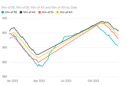
I have a table consisting of a date with four value columns which I've charted. Here:
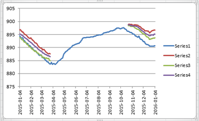
I may not have all four values for every date, and when this happens, I don't want that part of the line to render. Excel handles this as I would like:
Is there any way of configuring Power BI not to interpolate and render a line for missing data?
Also; I've noticed that the 'values' for a chart always have some sort of aggregation (Sum, Count, Avg, etc). Is it possible to just chart the raw data values?
Thanks,
Ciarán
- Mark as New
- Bookmark
- Subscribe
- Mute
- Subscribe to RSS Feed
- Permalink
- Report Inappropriate Content
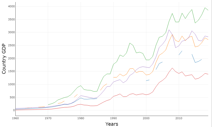
Here, is a Non-continuous line chart where you can put your broken data in a line chart and get an appropriate result.
Download link for the custom visual file on this page,
https://pbivizedit.com/gallery/non-continuous-line-chart
This was made with our Custom Visual creator tool PBIVizEdit.com. With this tool,
- anyone, irrespective of technical skills, can create their visuals
- 15 minutes to create a visual from scratch
- opens up many additional attributes to edit (e.g. labels, tooltips, legends position, etc)
Give this a shot and let us know if you face any problems/errors.
You can use the editor to modify your visual further (some modifications cannot be done in the Power BI window and have to be in the editor).
Thanks,
Team PBIVizEdit
- Mark as New
- Bookmark
- Subscribe
- Mute
- Subscribe to RSS Feed
- Permalink
- Report Inappropriate Content
I have not found a solution that works for large non-continuous time data sets.
x-axis to categorical is not a solution for large data sets. scrolling is not a solution if one is trying to print an output.
creating additonal rows in database to fill in the gaps with 0's is not an efficient of cheap solution either.
Based on number of votes on Idea below very few PowerBI users are working with large non-continuos data sets and impacted by this. Frustrating but only real option may be to look at another tool other than PowerBI.
http://community.powerbi.com/t5/Desktop/Non-continuous-line-chart-data/m-p/13746
- Mark as New
- Bookmark
- Subscribe
- Mute
- Subscribe to RSS Feed
- Permalink
- Report Inappropriate Content
@ciarangreene I think what you are looking for is Categorical axis. You can open the format tab while selecting the visual and in X-Axis change the type from continious to categorical. I hope this helps you.
- Mark as New
- Bookmark
- Subscribe
- Mute
- Subscribe to RSS Feed
- Permalink
- Report Inappropriate Content
@HarrisMalik Ah! Sweet. It's an improvement, thank you, but this results in a scroll bar appearing for the X-Axis whereas I'd like to see everything at a glance.
- Mark as New
- Bookmark
- Subscribe
- Mute
- Subscribe to RSS Feed
- Permalink
- Report Inappropriate Content
@ciarangreene The scroll bar normally appears when you have too many members on an axis. Can you share a screenshot?
- Mark as New
- Bookmark
- Subscribe
- Mute
- Subscribe to RSS Feed
- Permalink
- Report Inappropriate Content
@HarrisMalik Unfortunately I can't share a screenshot... I'm getting an error message: "Uploading PowerBIScreenshot.jpg resulted in the following error: You have already uploaded 1,000 images during this 24-hour window. You can try to upload more images later." This comes as a bit of a surprise as I've only uploaded 2... ever. This isn't a PowerBI issue... its just kind of funny.
The scrollbar only appears when I altered the axis to categorical. I could potentially average by week which would reduce the rows to 52, but I'm loosing granularity. Is this my only option?
The data table I'm using has 366 rows, a date column from 2015-01-04 to 2016-01-04 inclusive which serves as the X-Axis and then the four value columns.
- Mark as New
- Bookmark
- Subscribe
- Mute
- Subscribe to RSS Feed
- Permalink
- Report Inappropriate Content
Have you tried the advanced time slicer here - https://app.powerbi.com/visuals/
May solve the scale issues as you can dynamically select periods and the axis adjusts automatically. Not sure if it will give an issue with categorical side of things though.
Edit - sorry just realised this visual only seems to accomodate one data series so probably not suitable
- Mark as New
- Bookmark
- Subscribe
- Mute
- Subscribe to RSS Feed
- Permalink
- Report Inappropriate Content
@HarrisMalik,@itchyeyeballs; thanks for the help guys. The solution I think is to aggregate (weekly) and then to have the more detailed daily chart elsewhere so a user can drill into it. It's that or I could try to create a custom visual which handles my data set a bit better. This simple test has already taken a chunk of time more that I thought it would!
Thanks again,
/C
- Mark as New
- Bookmark
- Subscribe
- Mute
- Subscribe to RSS Feed
- Permalink
- Report Inappropriate Content
- Mark as New
- Bookmark
- Subscribe
- Mute
- Subscribe to RSS Feed
- Permalink
- Report Inappropriate Content
- Mark as New
- Bookmark
- Subscribe
- Mute
- Subscribe to RSS Feed
- Permalink
- Report Inappropriate Content
Hi everyone. At the moment, when you're using a continuous axis, Power BI always interpolates a straight line between points in the same series. We don't have an option to turn that off, but it's a good suggestion! Please post it on http://ideas.powerbi.com and we'll consider it for a future version!
Thanks
- Mark as New
- Bookmark
- Subscribe
- Mute
- Subscribe to RSS Feed
- Permalink
- Report Inappropriate Content
This question/feature request was posted on January 2016, do we have a solution for this now? Can you share the solution if this was implemented?
Thanks
- Mark as New
- Bookmark
- Subscribe
- Mute
- Subscribe to RSS Feed
- Permalink
- Report Inappropriate Content
Hi, has this issue been addressed? I'm struggling with the same thing.
- Mark as New
- Bookmark
- Subscribe
- Mute
- Subscribe to RSS Feed
- Permalink
- Report Inappropriate Content
- Mark as New
- Bookmark
- Subscribe
- Mute
- Subscribe to RSS Feed
- Permalink
- Report Inappropriate Content
@ciarangreene 366 unique values for date cannnot fit in one frame and still readable. Power BI is intelligent enough to put a scroll bar underneath.
There are couple of options you can try:
1. Change the data type of date column to Date if it is text, Power BI will automatically rollup the dates labels to months but you can still see the values per day by hovering over the chart.
2. You can also use the custom visual "Advanced Time Slicer" and interactively scroll through your selected range.
Regards
Harris
Helpful resources

Power BI Monthly Update - April 2026
Check out the April 2026 Power BI update to learn about new features.

New to Fabric Survey
If you have recently started exploring Fabric, we'd love to hear how it's going. Your feedback can help with product improvements.

Power BI DataViz World Championships - June 2026
A new Power BI DataViz World Championship is coming this June! Don't miss out on submitting your entry.

| User | Count |
|---|---|
| 41 | |
| 37 | |
| 34 | |
| 21 | |
| 16 |
| User | Count |
|---|---|
| 65 | |
| 59 | |
| 31 | |
| 26 | |
| 25 |


