Join us at the 2025 Microsoft Fabric Community Conference
Microsoft Fabric Community Conference 2025, March 31 - April 2, Las Vegas, Nevada. Use code FABINSIDER for a $400 discount.
Register now- Power BI forums
- Get Help with Power BI
- Desktop
- Service
- Report Server
- Power Query
- Mobile Apps
- Developer
- DAX Commands and Tips
- Custom Visuals Development Discussion
- Health and Life Sciences
- Power BI Spanish forums
- Translated Spanish Desktop
- Training and Consulting
- Instructor Led Training
- Dashboard in a Day for Women, by Women
- Galleries
- Webinars and Video Gallery
- Data Stories Gallery
- Themes Gallery
- Power BI DataViz World Championships Gallery
- Quick Measures Gallery
- R Script Showcase
- COVID-19 Data Stories Gallery
- Community Connections & How-To Videos
- 2021 MSBizAppsSummit Gallery
- 2020 MSBizAppsSummit Gallery
- 2019 MSBizAppsSummit Gallery
- Events
- Ideas
- Custom Visuals Ideas (read-only)
- Issues
- Issues
- Events
- Upcoming Events
The Power BI DataViz World Championships are on! With four chances to enter, you could win a spot in the LIVE Grand Finale in Las Vegas. Show off your skills.
- Power BI forums
- Forums
- Get Help with Power BI
- Desktop
- No data value for 0 in highlight mode of Donut(Rin...
- Subscribe to RSS Feed
- Mark Topic as New
- Mark Topic as Read
- Float this Topic for Current User
- Bookmark
- Subscribe
- Printer Friendly Page
- Mark as New
- Bookmark
- Subscribe
- Mute
- Subscribe to RSS Feed
- Permalink
- Report Inappropriate Content
No data value for 0 in highlight mode of Donut(Ring)/Pie Chart
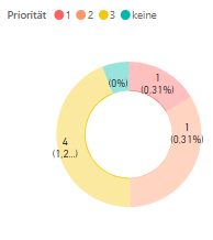
If you make a selection in another visual, and the interaction mode for your Donut or Pie chart is "Highlight", the data value 0 is not shown in the Donut chart, while this works fine for e.g. Bar charts, see screenshot.
I find it a bit inconsistent, because the small bar chart (bottom right of the screenshot) works fine, so it seems to depend on the type of chart.
Interestingly, it works if you display the percentage value instead of the data value in the Donut chart, but the 0 data value itself is never shown in the Donut/Pie charts.
Can anyone help in this matter? Thanks!
- Mark as New
- Bookmark
- Subscribe
- Mute
- Subscribe to RSS Feed
- Permalink
- Report Inappropriate Content
@kashia , Try changing interaction to cross filter.
https://docs.microsoft.com/en-us/power-bi/service-reports-visual-interactions
- Mark as New
- Bookmark
- Subscribe
- Mute
- Subscribe to RSS Feed
- Permalink
- Report Inappropriate Content
Thanks @amitchandak , but cross filtering is not what we (our customer) want. We want to have a "cross highlighting" for the Donut chart! It works for other types of charts, so this seems to be an issue with the Donut/Pie chart ...
- Mark as New
- Bookmark
- Subscribe
- Mute
- Subscribe to RSS Feed
- Permalink
- Report Inappropriate Content
HI @kashia,
In fact, these visuals not contain highlight interaction mode for a long time. Perhaps you can submit an idea with highlight interaction mode.
Regards,
Xiaoxin Sheng
If this post helps, please consider accept as solution to help other members find it more quickly.
- Mark as New
- Bookmark
- Subscribe
- Mute
- Subscribe to RSS Feed
- Permalink
- Report Inappropriate Content
@v-shex-msfthmm, I think the highlight interaction works fine for the Donut/Pie chart in principle, it is just that the data value for 0 is not being displayed while all other data values are shown and e.g. percentage zero values (0%) are also shown. I don't see a reason, why this is not implemented for the 0 data value, as it could be done the same way as it is done for other data values and it already works for e.g. bar charts ...
Helpful resources

Join us at the Microsoft Fabric Community Conference
March 31 - April 2, 2025, in Las Vegas, Nevada. Use code MSCUST for a $150 discount!

Power BI Monthly Update - February 2025
Check out the February 2025 Power BI update to learn about new features.

| User | Count |
|---|---|
| 86 | |
| 78 | |
| 54 | |
| 39 | |
| 35 |
| User | Count |
|---|---|
| 102 | |
| 84 | |
| 48 | |
| 48 | |
| 48 |


