Fabric Data Days starts November 4th!
Advance your Data & AI career with 50 days of live learning, dataviz contests, hands-on challenges, study groups & certifications and more!
Get registered- Power BI forums
- Get Help with Power BI
- Desktop
- Service
- Report Server
- Power Query
- Mobile Apps
- Developer
- DAX Commands and Tips
- Custom Visuals Development Discussion
- Health and Life Sciences
- Power BI Spanish forums
- Translated Spanish Desktop
- Training and Consulting
- Instructor Led Training
- Dashboard in a Day for Women, by Women
- Galleries
- Data Stories Gallery
- Themes Gallery
- Contests Gallery
- QuickViz Gallery
- Quick Measures Gallery
- Visual Calculations Gallery
- Notebook Gallery
- Translytical Task Flow Gallery
- TMDL Gallery
- R Script Showcase
- Webinars and Video Gallery
- Ideas
- Custom Visuals Ideas (read-only)
- Issues
- Issues
- Events
- Upcoming Events
Get Fabric Certified for FREE during Fabric Data Days. Don't miss your chance! Request now
- Power BI forums
- Forums
- Get Help with Power BI
- Desktop
- Re: New to Data Modelling and Power BI - Basic 3 Q...
- Subscribe to RSS Feed
- Mark Topic as New
- Mark Topic as Read
- Float this Topic for Current User
- Bookmark
- Subscribe
- Printer Friendly Page
- Mark as New
- Bookmark
- Subscribe
- Mute
- Subscribe to RSS Feed
- Permalink
- Report Inappropriate Content
New to Data Modelling and Power BI - Basic 3 Question Survey Data & Reporting Issue
Hi,
I am relatively new to Power BI, I have learnt the layout and where options are. But now I am trying to manipulate some custom data and gain some insights from it, I have included my excel data table.
There are 3 questions in my survey, Favourite Colour, Favourite Mode of Transport and Age Range. I can produce static non-linked graphs for each question and response values. But I am now trying to learn how to link the graphs together, for example I would like to know (be able to show in a report) 'The most popular mode of transport for over 50s' or 'Favourite mode of transport for respondants who like pink'.
I beleive it can be done so that the graphs for Q2 and Q3 change in real time once I click on 'Pink' in the Q1 graph or clicking on any answer from any graph will isolate the answers for that selection on the other graphs.
I am struggling to visualise or research how to acheive this. I apologise if this is not the correct forum or if my explanation is not sufficient, if you need anymore information feel free to ask. If anyone could point me in the right direction for setting up my data table and models. I appreciate any help given and thank you for your time in advance.
Link to data file (Google Drive/Sheets): https://shorturl.at/fDEUY
Thanks in Advance
Joe
- Mark as New
- Bookmark
- Subscribe
- Mute
- Subscribe to RSS Feed
- Permalink
- Report Inappropriate Content
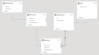
You are trying to use a fact (age range response) as a dimension (the age slicer). That won't work as by doing that you are filtering away all other facts. Rethink your data model, normalize the age response into its own table.
Ages = calculatetable(distinct(DimAnswers[response_value]),DimAnswers[question_no]=2)use that table to feed the slicer
Create another table that joins the respondent IDs to the ages
Ageresponses = SUMMARIZE(filter(Responses,[question_no]=2),[id],[response_value])Wire them in the data model
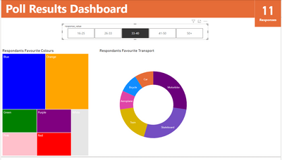
And you get your desired result. See attached.
- Mark as New
- Bookmark
- Subscribe
- Mute
- Subscribe to RSS Feed
- Permalink
- Report Inappropriate Content
Thanks @lbendlin , im not sure I explained myself very well.
I have attached my PBIX file, for easier access to help assist me with this. I have basic visualisations in place, but when I click on them they aren't adapting to the selection and giving me any insights.
For example if I was to click on any of the age ranges in the top slicer, I want my visualations below to adapt to that selection and show more about that age range.
Like I said totally new and in the deep end so any help is appreciated.
Link (Google Drive): PBIX File
- Mark as New
- Bookmark
- Subscribe
- Mute
- Subscribe to RSS Feed
- Permalink
- Report Inappropriate Content
Consider using a scatterplot chart type, or a treemap type. Think of your questions as dimensions. A standard flat canvas has two dimensions. To add more you need to either use a 3D visualization or you need to add colors, shapes and other ornamentations to visualize the additional dimensions.
Helpful resources

Power BI Monthly Update - November 2025
Check out the November 2025 Power BI update to learn about new features.

Fabric Data Days
Advance your Data & AI career with 50 days of live learning, contests, hands-on challenges, study groups & certifications and more!

| User | Count |
|---|---|
| 96 | |
| 70 | |
| 50 | |
| 42 | |
| 40 |


