FabCon is coming to Atlanta
Join us at FabCon Atlanta from March 16 - 20, 2026, for the ultimate Fabric, Power BI, AI and SQL community-led event. Save $200 with code FABCOMM.
Register now!- Power BI forums
- Get Help with Power BI
- Desktop
- Service
- Report Server
- Power Query
- Mobile Apps
- Developer
- DAX Commands and Tips
- Custom Visuals Development Discussion
- Health and Life Sciences
- Power BI Spanish forums
- Translated Spanish Desktop
- Training and Consulting
- Instructor Led Training
- Dashboard in a Day for Women, by Women
- Galleries
- Data Stories Gallery
- Themes Gallery
- Contests Gallery
- QuickViz Gallery
- Quick Measures Gallery
- Visual Calculations Gallery
- Notebook Gallery
- Translytical Task Flow Gallery
- TMDL Gallery
- R Script Showcase
- Webinars and Video Gallery
- Ideas
- Custom Visuals Ideas (read-only)
- Issues
- Issues
- Events
- Upcoming Events
The Power BI Data Visualization World Championships is back! Get ahead of the game and start preparing now! Learn more
- Power BI forums
- Forums
- Get Help with Power BI
- Desktop
- Net Change for Status/Milestone Changes in Report
- Subscribe to RSS Feed
- Mark Topic as New
- Mark Topic as Read
- Float this Topic for Current User
- Bookmark
- Subscribe
- Printer Friendly Page
- Mark as New
- Bookmark
- Subscribe
- Mute
- Subscribe to RSS Feed
- Permalink
- Report Inappropriate Content
Net Change for Status/Milestone Changes in Report
Hi all. I am trying to show the net change for every day for each milestone (currently using DevOps to retrieve the data).
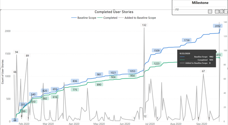
Below is an image of my overall data and the count of the new IDs added. The X-axis is the created date from DevOps. If an ID changes from one milestone to another, the "added" counts will account for the change (will implement remove soon).
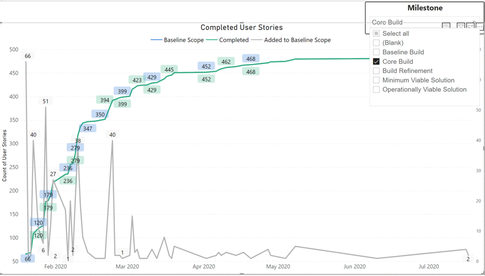
My main issue is when I view data for a particular milestone and there is a net negative change.
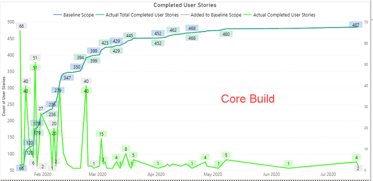
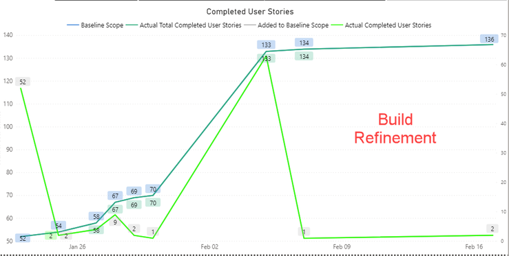
For example, today the "Core Build" has 468 IDs and then tomorrow, the 8 IDs are moved to a different milestone (Build Refinement), which brings the "Core Build" numbers to 460. So for tomorrow, my tooltip for Build Refinement will show a net positive change.
How can I show net negative (-8) in my tooltip for "Core Build"?
Please let me know if you need more details!
Best,
Maria
- Mark as New
- Bookmark
- Subscribe
- Mute
- Subscribe to RSS Feed
- Permalink
- Report Inappropriate Content
Hi @marsvyl1004 ,
First create 1 slicer tables,such as below:(It is used to record the values selected at the first time)
slicer table 1 = VALUES('fact table'[ID])Then create a measure as below:
Measure = CALCULATE(MAX('fact table'[value]),FILTER(ALL('fact table'),'fact table'[ID]=SELECTEDVALUE('slicer table 1'[ID])))-CALCULATE(MAX('fact table'[value]),FILTER(ALL('fact table'),'fact table'[ID]=SELECTEDVALUE('fact table'[ID])))Put the measure in a card visual,you will see the result as you need.
Here is a sample .pbix file,pls see attached.
Best Regards,
Kelly
Did I answer your question? Mark my post as a solution!
- Mark as New
- Bookmark
- Subscribe
- Mute
- Subscribe to RSS Feed
- Permalink
- Report Inappropriate Content
@v-kelly-msft Thank you for the response! I looked through the solution and understand what is happening, but its not what I'm looking for exactly.
Hopefully this is a better explanation of my issue: Let's say today, my chart data has the following information:
___9/28/2020___ | _________
Build Refinement | 136
Core Build | 487
_______________________________
In the backend, I complete a count for each milestone. Hypothetically speaking, tomorrow, 09/29/2020, my data shows that 7 Core Build was changed to Build Refinement. My graph will show the correct numbers since it is a count (below), however, I want a measure in the tooltip to show -7 for Core Build and 7 for Build Refinement.
___9/29/2020___ | _________
Build Refinement | 143
Core Build | 480
_______________________________
- Mark as New
- Bookmark
- Subscribe
- Mute
- Subscribe to RSS Feed
- Permalink
- Report Inappropriate Content
Hi @marsvyl1004 ,
Yes,I understand your point,my suggestion is a workaround for you,as in desktop,the previous values cant be stored (It will be overwritten)and then used for calculation,my suggestion is to use a slicer to select the previous values then use the values to calculate out the result you need.
Best Regards,
Kelly
Did I answer your question? Mark my post as a solution!
Helpful resources

Power BI Dataviz World Championships
The Power BI Data Visualization World Championships is back! Get ahead of the game and start preparing now!

Power BI Monthly Update - November 2025
Check out the November 2025 Power BI update to learn about new features.

| User | Count |
|---|---|
| 59 | |
| 46 | |
| 42 | |
| 23 | |
| 18 |
| User | Count |
|---|---|
| 193 | |
| 124 | |
| 101 | |
| 67 | |
| 49 |


