New Offer! Become a Certified Fabric Data Engineer
Check your eligibility for this 50% exam voucher offer and join us for free live learning sessions to get prepared for Exam DP-700.
Get Started- Power BI forums
- Get Help with Power BI
- Desktop
- Service
- Report Server
- Power Query
- Mobile Apps
- Developer
- DAX Commands and Tips
- Custom Visuals Development Discussion
- Health and Life Sciences
- Power BI Spanish forums
- Translated Spanish Desktop
- Training and Consulting
- Instructor Led Training
- Dashboard in a Day for Women, by Women
- Galleries
- Community Connections & How-To Videos
- COVID-19 Data Stories Gallery
- Themes Gallery
- Data Stories Gallery
- R Script Showcase
- Webinars and Video Gallery
- Quick Measures Gallery
- 2021 MSBizAppsSummit Gallery
- 2020 MSBizAppsSummit Gallery
- 2019 MSBizAppsSummit Gallery
- Events
- Ideas
- Custom Visuals Ideas
- Issues
- Issues
- Events
- Upcoming Events
Don't miss out! 2025 Microsoft Fabric Community Conference, March 31 - April 2, Las Vegas, Nevada. Use code MSCUST for a $150 discount. Prices go up February 11th. Register now.
- Power BI forums
- Forums
- Get Help with Power BI
- Desktop
- Need to create measure that calculates percentile
- Subscribe to RSS Feed
- Mark Topic as New
- Mark Topic as Read
- Float this Topic for Current User
- Bookmark
- Subscribe
- Printer Friendly Page
- Mark as New
- Bookmark
- Subscribe
- Mute
- Subscribe to RSS Feed
- Permalink
- Report Inappropriate Content
Need to create measure that calculates percentile
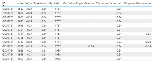
Hi, I'm trying to create a measure that will calculate the percentile based on a measure value. I have slicers based on which the measure value changes. The percentile value should change dynamically with the slicers applied. I tried to use the percentilex.inc function but is giving incorrect results. Can anyone suggest me approach for solving the issue.
I have calculated 5th percentile in a column which gives values as expected but does not change with slicers. I need to create a percentile measure which will change dynamically with slicer selection.
The calculated column is
5th percentile correct =
var temp =
    SUMMARIZE(
        Sheet1,
        Sheet1[ID],
        "max value single column",
        [Max Value Single Measure]
    )
return
    PERCENTILEX.INC(
        temp,
        [max value single column],
        0.05
    )
The 5th percentile created using a measure is giving incorrect results and also is not dynamic.
Can anyone please suggest how do I write percentile measure which would change with slicer selection and give correct results.
This is the power bi file
https://drive.google.com/file/d/1d-eS40GPGilrB1cN2BdAdVIn3oIQAmaO/view?usp=sharing
Solved! Go to Solution.
- Mark as New
- Bookmark
- Subscribe
- Mute
- Subscribe to RSS Feed
- Permalink
- Report Inappropriate Content
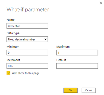
You can create a What-if parameter to control the percentile.
1. Create a What-if parameter:
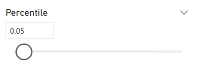
2. Set the percentile:
3. Create measure:
5th percentile measure =
VAR vTableID =
    CALCULATETABLE ( VALUES ( Sheet1[ID] ), ALLSELECTED ( Sheet1 ) )
VAR vTableWithMeasure =
    ADDCOLUMNS ( vTableID, "max value single column", [Max Value Single Measure] )
VAR vResult =
    PERCENTILEX.INC (
        vTableWithMeasure,
        [max value single column],
        [Percentile Value]
    )
RETURN
    vResult
The measure [Percentile Value] is automatically created when you create the What-if parameter.
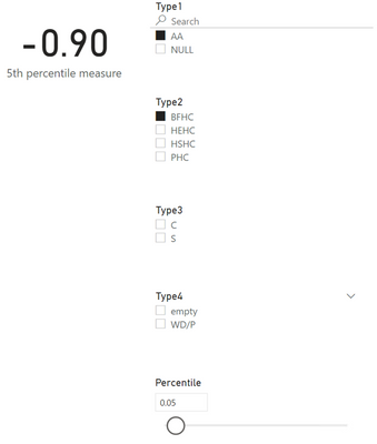
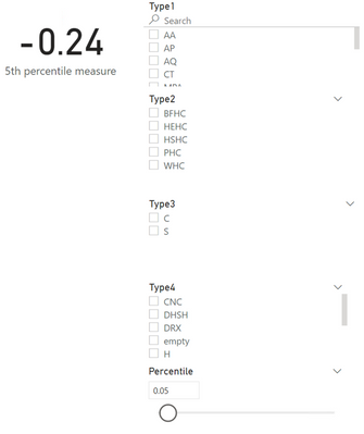
4. Display the measure in a visual. Adding it to a table visual as shown in your example produces incorrect results due to the measure being sliced by other columns in the table visual. It works correctly in a card, however, as shown below.
Filtered:
---------------------------------------------------
Not filtered:
Did I answer your question? Mark my post as a solution!
Proud to be a Super User!
- Mark as New
- Bookmark
- Subscribe
- Mute
- Subscribe to RSS Feed
- Permalink
- Report Inappropriate Content
I have created a scatter plot & created 25th,50th,75th &100th percentiles for both x & y axes. So now my data is into 16 grids. I have created calculated column which assigns each row a grid value based on the percentile values. The problem I am facing is that in my dashboard any filters or slicers are applied the percentile line values are not changing. For ex I have a month slicer if I select particular month the percentile line values not changing & also grid slicer(which I have enabled to filter the data) is also not working properly
- Mark as New
- Bookmark
- Subscribe
- Mute
- Subscribe to RSS Feed
- Permalink
- Report Inappropriate Content
Hi @DataInsights ,
Thank you so much. It worked for me. Although, without creating parameter and passing in value directly works as well. Thanks a lot!
- Mark as New
- Bookmark
- Subscribe
- Mute
- Subscribe to RSS Feed
- Permalink
- Report Inappropriate Content
You can create a What-if parameter to control the percentile.
1. Create a What-if parameter:
2. Set the percentile:
3. Create measure:
5th percentile measure =
VAR vTableID =
    CALCULATETABLE ( VALUES ( Sheet1[ID] ), ALLSELECTED ( Sheet1 ) )
VAR vTableWithMeasure =
    ADDCOLUMNS ( vTableID, "max value single column", [Max Value Single Measure] )
VAR vResult =
    PERCENTILEX.INC (
        vTableWithMeasure,
        [max value single column],
        [Percentile Value]
    )
RETURN
    vResult
The measure [Percentile Value] is automatically created when you create the What-if parameter.
4. Display the measure in a visual. Adding it to a table visual as shown in your example produces incorrect results due to the measure being sliced by other columns in the table visual. It works correctly in a card, however, as shown below.
Filtered:
---------------------------------------------------
Not filtered:
Did I answer your question? Mark my post as a solution!
Proud to be a Super User!
Helpful resources

Join us at the Microsoft Fabric Community Conference
March 31 - April 2, 2025, in Las Vegas, Nevada. Use code MSCUST for a $150 discount! Prices go up Feb. 11th.

Join our Community Sticker Challenge 2025
If you love stickers, then you will definitely want to check out our Community Sticker Challenge!

Power BI Monthly Update - January 2025
Check out the January 2025 Power BI update to learn about new features in Reporting, Modeling, and Data Connectivity.

| User | Count |
|---|---|
| 144 | |
| 76 | |
| 63 | |
| 51 | |
| 48 |
| User | Count |
|---|---|
| 204 | |
| 86 | |
| 64 | |
| 59 | |
| 56 |
