Fabric Data Days starts November 4th!
Advance your Data & AI career with 50 days of live learning, dataviz contests, hands-on challenges, study groups & certifications and more!
Get registered- Power BI forums
- Get Help with Power BI
- Desktop
- Service
- Report Server
- Power Query
- Mobile Apps
- Developer
- DAX Commands and Tips
- Custom Visuals Development Discussion
- Health and Life Sciences
- Power BI Spanish forums
- Translated Spanish Desktop
- Training and Consulting
- Instructor Led Training
- Dashboard in a Day for Women, by Women
- Galleries
- Data Stories Gallery
- Themes Gallery
- Contests Gallery
- Quick Measures Gallery
- Visual Calculations Gallery
- Notebook Gallery
- Translytical Task Flow Gallery
- TMDL Gallery
- R Script Showcase
- Webinars and Video Gallery
- Ideas
- Custom Visuals Ideas (read-only)
- Issues
- Issues
- Events
- Upcoming Events
Get Fabric Certified for FREE during Fabric Data Days. Don't miss your chance! Learn more
- Power BI forums
- Forums
- Get Help with Power BI
- Desktop
- Re: Need to build a visual to show Pending Items b...
- Subscribe to RSS Feed
- Mark Topic as New
- Mark Topic as Read
- Float this Topic for Current User
- Bookmark
- Subscribe
- Printer Friendly Page
- Mark as New
- Bookmark
- Subscribe
- Mute
- Subscribe to RSS Feed
- Permalink
- Report Inappropriate Content
Need to build a visual to show Pending Items based on start and end dates
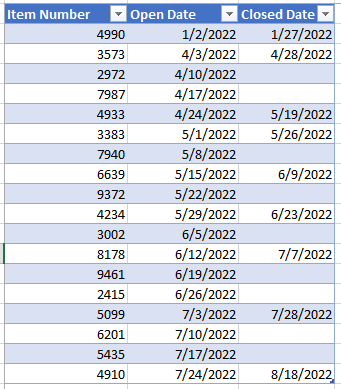
I have a large fact table with three important columns:
A unique identifier columns (Item Number)
An Open Date Column
A Closed Date Column.
I want to create a simple bar chart that counts BY Day for 365 days of the year what activity is happening. There are three bars I would like to plot on the Day X Axis.... Opened, Closed, or Pending.
Easy to plot open and closed since I can see the dates below and that activity happend on a specific day, question is how do I create another status "pending" for those ietms that have yet to close? AND have it show up each day on the x axis until it closed.
For example looking at the table example below this is what I would expect to see each day of the year...
1/1/2022 I have ZERO activity (So no bars)
1/2/2022 I had one open order (Item 4990)
1/3/2022 I have one pending...(Item 4990) *Item has not closed yet**
1/4/2022 I have one pending...(Item 4990)
1/5/2022 I have one pending...(Item 4990)
1/6/2022 I have one pending...(Item 4990)
...
1/27/2022 I have one closed...(Item 4990)
...
4/3/2022 I have one open...(Item 3573)
etc...
...This would go on for each day of the year
Below is a quick view of a sample table, as you can see below some items have opened and closed and some have opened and not closed... These that are not closed are "pending"
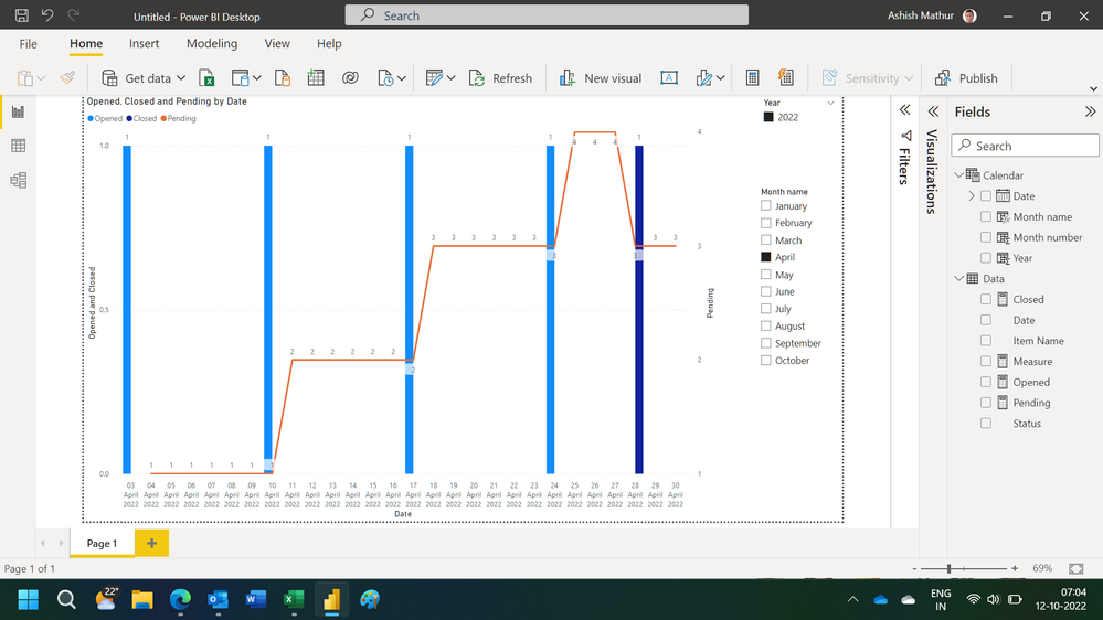
Visually this is something I am looking for, and you can see below I only show 1-10 days of the year, but this would go on till end of year. Dark blue would be the closed order counts that day, Light blue would be the number of open orders that day, and orange line (Or Bar) would show the number of pending still during all other days of the year, until those items are closed. Note visual below is a sample view and not built off the sample dataset above...
- Mark as New
- Bookmark
- Subscribe
- Mute
- Subscribe to RSS Feed
- Permalink
- Report Inappropriate Content
Hi,
I hope you have calendar table called Calendar and a column Date in that which is used for the x-axis of your Line clustered column chart. There is no relationship of this with your data table.
I created the data table named as Data1.Replace Data1 by your table name.
Create the following measures
1.
3.
-- All that opened on or before selected date and Closed date is blank or greater than selected date
- Mark as New
- Bookmark
- Subscribe
- Mute
- Subscribe to RSS Feed
- Permalink
- Report Inappropriate Content
Hi,
I have used only the first 4 rows of data to create the visual. Add more data. You may download my PBI file from here.
Hope this helps.
Regards,
Ashish Mathur
http://www.ashishmathur.com
https://www.linkedin.com/in/excelenthusiasts/
Helpful resources

Fabric Data Days
Advance your Data & AI career with 50 days of live learning, contests, hands-on challenges, study groups & certifications and more!

Power BI Monthly Update - October 2025
Check out the October 2025 Power BI update to learn about new features.


