Huge last-minute discounts for FabCon Vienna from September 15-18, 2025
Supplies are limited. Contact info@espc.tech right away to save your spot before the conference sells out.
Get your discount- Power BI forums
- Get Help with Power BI
- Desktop
- Service
- Report Server
- Power Query
- Mobile Apps
- Developer
- DAX Commands and Tips
- Custom Visuals Development Discussion
- Health and Life Sciences
- Power BI Spanish forums
- Translated Spanish Desktop
- Training and Consulting
- Instructor Led Training
- Dashboard in a Day for Women, by Women
- Galleries
- Data Stories Gallery
- Themes Gallery
- Contests Gallery
- Quick Measures Gallery
- Notebook Gallery
- Translytical Task Flow Gallery
- TMDL Gallery
- R Script Showcase
- Webinars and Video Gallery
- Ideas
- Custom Visuals Ideas (read-only)
- Issues
- Issues
- Events
- Upcoming Events
Score big with last-minute savings on the final tickets to FabCon Vienna. Secure your discount
- Power BI forums
- Forums
- Get Help with Power BI
- Desktop
- Re: Need help with report filter.
- Subscribe to RSS Feed
- Mark Topic as New
- Mark Topic as Read
- Float this Topic for Current User
- Bookmark
- Subscribe
- Printer Friendly Page
- Mark as New
- Bookmark
- Subscribe
- Mute
- Subscribe to RSS Feed
- Permalink
- Report Inappropriate Content
Need help with report filter.
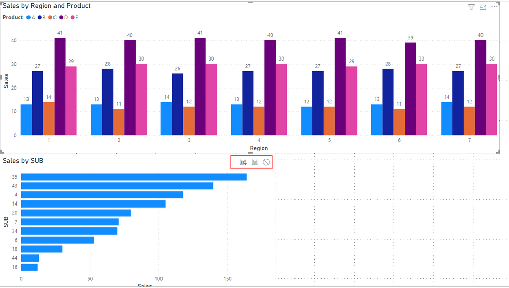
Trying to figure out something that should be simple. The chart on the top is showing goods sold for 5 different products in 7 different regions. Each region has 7 to 10 stores. When I click on product B in region 2 in the chart above is there a way to then populate sales by store in region 2 for product B in the smaller chart below when I select that bar above. I have incorporated into my data model a table that lists the store numbers in each region. Many thanks for anyone that can point me in the right direction.
Solved! Go to Solution.
- Mark as New
- Bookmark
- Subscribe
- Mute
- Subscribe to RSS Feed
- Permalink
- Report Inappropriate Content
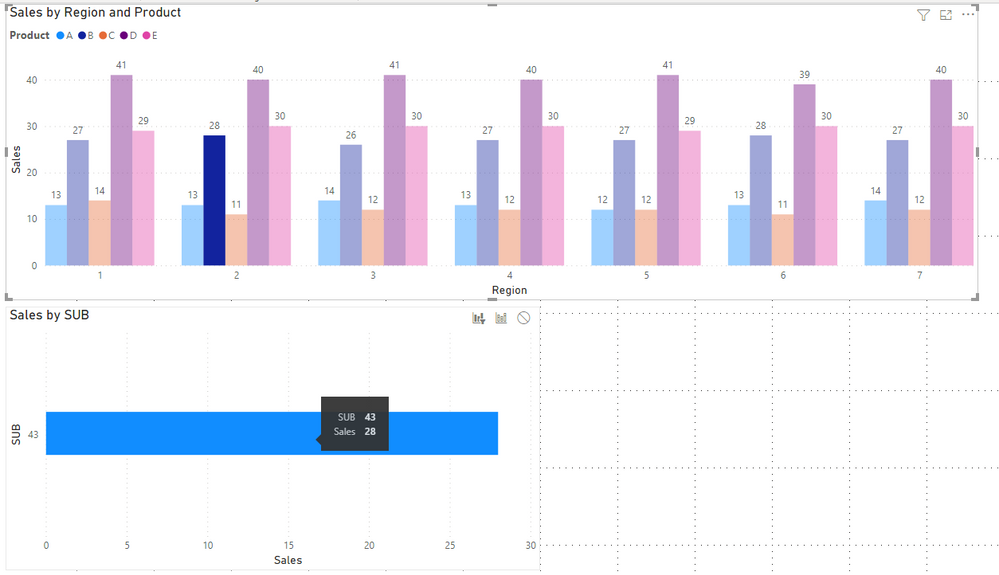
Thanks for your help. I was able to get that working, but above you have selected one column of the cluster (Product B for region 2) That's exaclty what I want to do but I don't have the ability to select the individual columns in region 2. I must have missed something. Thanks.
- Mark as New
- Bookmark
- Subscribe
- Mute
- Subscribe to RSS Feed
- Permalink
- Report Inappropriate Content
Hi @nhale
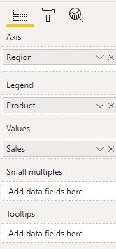
Check your visual format. Add Region in Axis, Product in Legend and Sales in Values in your cluster column chart.
Download the latest version of Power BI Desktop and try again.
You can download my sample file and check the differences between you and mine.
Best Regards,
Rico Zhou
If this post helps, then please consider Accept it as the solution to help the other members find it more quickly.
- Mark as New
- Bookmark
- Subscribe
- Mute
- Subscribe to RSS Feed
- Permalink
- Report Inappropriate Content
Hi @nhale
In addition to lbendlin 's reply, use Edit interactions in Format Tab and change cross-highlighting in small visual to cross-filtering.
I build a sample to have a test.
Build two visuals like yours. Click on Edit interactions.
Then select cluster column chart and select left icon(Cross-filter) in small visual.
Result is as below.
For reference: Change how visuals interact in a Power BI report
Best Regards,
Rico Zhou
If this post helps, then please consider Accept it as the solution to help the other members find it more quickly.
- Mark as New
- Bookmark
- Subscribe
- Mute
- Subscribe to RSS Feed
- Permalink
- Report Inappropriate Content
Thanks for your help. I was able to get that working, but above you have selected one column of the cluster (Product B for region 2) That's exaclty what I want to do but I don't have the ability to select the individual columns in region 2. I must have missed something. Thanks.
- Mark as New
- Bookmark
- Subscribe
- Mute
- Subscribe to RSS Feed
- Permalink
- Report Inappropriate Content
Hi @nhale
Check your visual format. Add Region in Axis, Product in Legend and Sales in Values in your cluster column chart.
Download the latest version of Power BI Desktop and try again.
You can download my sample file and check the differences between you and mine.
Best Regards,
Rico Zhou
If this post helps, then please consider Accept it as the solution to help the other members find it more quickly.
- Mark as New
- Bookmark
- Subscribe
- Mute
- Subscribe to RSS Feed
- Permalink
- Report Inappropriate Content
Change the default behavior from cross highlighting to cross filtering.


