FabCon is coming to Atlanta
Join us at FabCon Atlanta from March 16 - 20, 2026, for the ultimate Fabric, Power BI, AI and SQL community-led event. Save $200 with code FABCOMM.
Register now!- Power BI forums
- Get Help with Power BI
- Desktop
- Service
- Report Server
- Power Query
- Mobile Apps
- Developer
- DAX Commands and Tips
- Custom Visuals Development Discussion
- Health and Life Sciences
- Power BI Spanish forums
- Translated Spanish Desktop
- Training and Consulting
- Instructor Led Training
- Dashboard in a Day for Women, by Women
- Galleries
- Data Stories Gallery
- Themes Gallery
- Contests Gallery
- QuickViz Gallery
- Quick Measures Gallery
- Visual Calculations Gallery
- Notebook Gallery
- Translytical Task Flow Gallery
- TMDL Gallery
- R Script Showcase
- Webinars and Video Gallery
- Ideas
- Custom Visuals Ideas (read-only)
- Issues
- Issues
- Events
- Upcoming Events
Get Fabric Certified for FREE during Fabric Data Days. Don't miss your chance! Request now
- Power BI forums
- Forums
- Get Help with Power BI
- Desktop
- Need help to design a map based powerbi report wit...
- Subscribe to RSS Feed
- Mark Topic as New
- Mark Topic as Read
- Float this Topic for Current User
- Bookmark
- Subscribe
- Printer Friendly Page
- Mark as New
- Bookmark
- Subscribe
- Mute
- Subscribe to RSS Feed
- Permalink
- Report Inappropriate Content
Need help to design a map based powerbi report with slider
Hi
Looking for an expert help to build a map based powerbi report with slider
What I have as raw excel data are:
In the column headings, the asset name, the location ie postal code, month (i.e. Jan-21, Feb-21, etc)
In the rows are the various assets
An example is:
| Asset Name | Location | Jan-21 | Feb-21 |
| A | Singapore 2222 | 10% | 25% |
| B | Singapore 1111 | 20% | 15% |
How can I create a map whereby there is a slider to show the monthly performance i.e. On Jan-21 it shows both assets performance in bubbles then sliding to see Feb-21 data in a different bubble size depending on the performance?
Thank you
Solved! Go to Solution.
- Mark as New
- Bookmark
- Subscribe
- Mute
- Subscribe to RSS Feed
- Permalink
- Report Inappropriate Content
Hi, @Anonymous
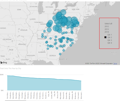
I'm not sure I understand you very well, do you want to create a date slicer like this?
if so then just create a slicer visual object.
Best Regards,
Community Support Team _ Zeon Zheng
If this post helps, then please consider Accept it as the solution to help the other members find it more quickly.
- Mark as New
- Bookmark
- Subscribe
- Mute
- Subscribe to RSS Feed
- Permalink
- Report Inappropriate Content
Thanks Zeon but sorry doesnt seem to work for me. The columns Jan-2021, Feb 2021 appears to become independent variables in powerbi rather than calendar months which runs along. Not sure if I need to do something in the columns to adjust.
Helpful resources

Power BI Monthly Update - November 2025
Check out the November 2025 Power BI update to learn about new features.

Fabric Data Days
Advance your Data & AI career with 50 days of live learning, contests, hands-on challenges, study groups & certifications and more!

| User | Count |
|---|---|
| 101 | |
| 76 | |
| 56 | |
| 51 | |
| 46 |

