Fabric Data Days starts November 4th!
Advance your Data & AI career with 50 days of live learning, dataviz contests, hands-on challenges, study groups & certifications and more!
Get registered- Power BI forums
- Get Help with Power BI
- Desktop
- Service
- Report Server
- Power Query
- Mobile Apps
- Developer
- DAX Commands and Tips
- Custom Visuals Development Discussion
- Health and Life Sciences
- Power BI Spanish forums
- Translated Spanish Desktop
- Training and Consulting
- Instructor Led Training
- Dashboard in a Day for Women, by Women
- Galleries
- Data Stories Gallery
- Themes Gallery
- Contests Gallery
- Quick Measures Gallery
- Visual Calculations Gallery
- Notebook Gallery
- Translytical Task Flow Gallery
- TMDL Gallery
- R Script Showcase
- Webinars and Video Gallery
- Ideas
- Custom Visuals Ideas (read-only)
- Issues
- Issues
- Events
- Upcoming Events
Get Fabric Certified for FREE during Fabric Data Days. Don't miss your chance! Learn more
- Power BI forums
- Forums
- Get Help with Power BI
- Desktop
- Re: Need help to create Matrix table in the form o...
- Subscribe to RSS Feed
- Mark Topic as New
- Mark Topic as Read
- Float this Topic for Current User
- Bookmark
- Subscribe
- Printer Friendly Page
- Mark as New
- Bookmark
- Subscribe
- Mute
- Subscribe to RSS Feed
- Permalink
- Report Inappropriate Content
Need help to create Matrix table in the form of Gantt
Hi Team
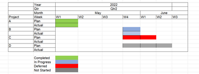
I urgently need help to create a matrix table in the form of gantt which shows Project Plan vs actual with respect to Complted In Progress Defered Not started. Any suggestions are appreciated to bring plan vs actual in a gantt format.
Sample data
| Project | Team Member | Planned Start | Planned Finish | Actual Start | Actual Finish | Status |
| A | Roy | 12-May-22 | 19-May-22 | 12-May-22 | 14-May-22 | Completed |
| B | Pam | 20-May-22 | 31-May-22 | 21-May-22 | In Progress | |
| C | Tim | 23-May-22 | 1-Jun-22 | Deferred | ||
| D | Ken | 25-May-22 | 15-06-2022 | Not Started |
Output needed as:
Solved! Go to Solution.
- Mark as New
- Bookmark
- Subscribe
- Mute
- Subscribe to RSS Feed
- Permalink
- Report Inappropriate Content
Hi @Anonymous
These blogs and videos have provided some ideas and solutions. See if they can be applied to your scenario.
Creating A Gantt Chart In Power BI Using Matrix
Create A Gantt Chart In Power BI With A Matrix Visual
GANTT-LIKE CHART IN POWERBI USING CONDITIONAL FORMATTING IN THE MATRIX VISUAL
Matrix chart to Gantt chart in Power BI
From the expected output, you have Week as the smallest level. How do you want to specify the start date and end date of every week? Some weeks may cover two calendar months.
Best Regards,
Community Support Team _ Jing
If this post helps, please Accept it as Solution to help other members find it.
- Mark as New
- Bookmark
- Subscribe
- Mute
- Subscribe to RSS Feed
- Permalink
- Report Inappropriate Content
it doesnt work with custom visual, as most of my columns are measures, thats why am looking for matrix table to convert in a bar style timeline.
- Mark as New
- Bookmark
- Subscribe
- Mute
- Subscribe to RSS Feed
- Permalink
- Report Inappropriate Content
Hi
There are a few custom visuals that display gantt visualizations.
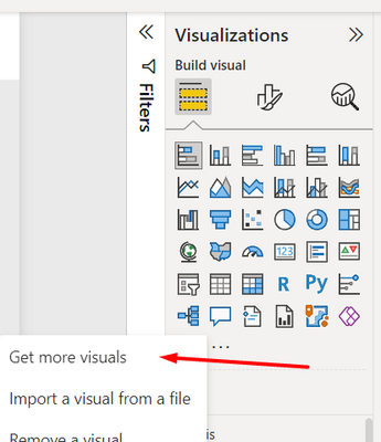
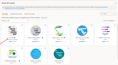
Click on the three dots under visualizations and chose "Get more visuals" and search for Gantt
I've tried the first one, and it seems that it could help you, you just need to transform your data accordingly
Kind regards,
José
Please mark this answer as the solution if it resolves your issue.
Appreciate your kudos! 🙂
Helpful resources

Fabric Data Days
Advance your Data & AI career with 50 days of live learning, contests, hands-on challenges, study groups & certifications and more!

Power BI Monthly Update - October 2025
Check out the October 2025 Power BI update to learn about new features.


