Join us at the 2025 Microsoft Fabric Community Conference
Microsoft Fabric Community Conference 2025, March 31 - April 2, Las Vegas, Nevada. Use code MSCUST for a $150 discount.
Register now- Power BI forums
- Get Help with Power BI
- Desktop
- Service
- Report Server
- Power Query
- Mobile Apps
- Developer
- DAX Commands and Tips
- Custom Visuals Development Discussion
- Health and Life Sciences
- Power BI Spanish forums
- Translated Spanish Desktop
- Training and Consulting
- Instructor Led Training
- Dashboard in a Day for Women, by Women
- Galleries
- Webinars and Video Gallery
- Data Stories Gallery
- Themes Gallery
- Power BI DataViz World Championships Gallery
- Quick Measures Gallery
- R Script Showcase
- COVID-19 Data Stories Gallery
- Community Connections & How-To Videos
- 2021 MSBizAppsSummit Gallery
- 2020 MSBizAppsSummit Gallery
- 2019 MSBizAppsSummit Gallery
- Events
- Ideas
- Custom Visuals Ideas
- Issues
- Issues
- Events
- Upcoming Events
The Power BI DataViz World Championships are on! With four chances to enter, you could win a spot in the LIVE Grand Finale in Las Vegas. Show off your skills.
- Power BI forums
- Forums
- Get Help with Power BI
- Desktop
- Need help to create 2 line chart in Power BI
- Subscribe to RSS Feed
- Mark Topic as New
- Mark Topic as Read
- Float this Topic for Current User
- Bookmark
- Subscribe
- Printer Friendly Page
- Mark as New
- Bookmark
- Subscribe
- Mute
- Subscribe to RSS Feed
- Permalink
- Report Inappropriate Content
Need help to create 2 line chart in Power BI
Hello Experts,
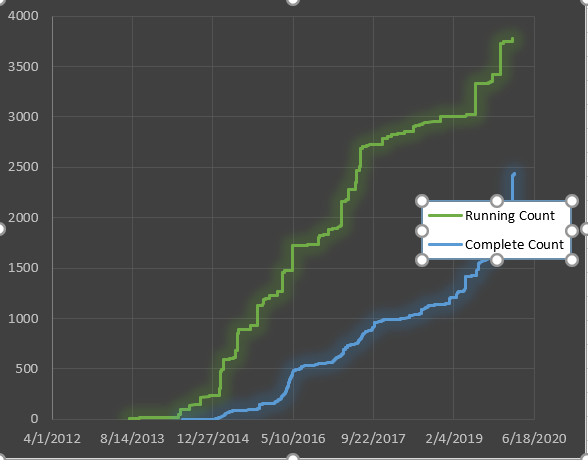
I need to create Burn Chart, which has 2 lines in a Line chart. Sample data as below, I need to create 2 lines, one with open time and running count, other with completion date and complete count. With single line , it works as expected, but i need to see both the data/lines in single chart.
| Open Time | Running Count | Completion Date | Complete Count |
| 7/24/13 10:23 | 1 | 6/20/14 7:00 | 1 |
| 7/24/13 10:23 | 2 | 11/3/14 8:00 | 2 |
| 7/24/13 10:23 | 3 | 1/6/15 0:00 | 3 |
| 7/24/14 10:23 | 4 | 1/11/15 0:00 | 4 |
| 7/24/14 10:23 | 5 | 1/11/16 0:00 | 5 |
| 9/26/15 11:00 | 6 | 1/19/16 0:00 | 6 |
| 9/26/15 11:00 | 7 | 1/19/17 0:00 | 7 |
| 9/26/16 11:00 | 8 | 1/20/17 0:00 | 8 |
| 9/26/16 11:00 | 9 | ||
| 9/26/16 11:00 | 10 | ||
| 9/26/17 11:00 | 11 |
I tried with Line chart in power BI, but it didnt work correct using multiple values. I need the graph as below,
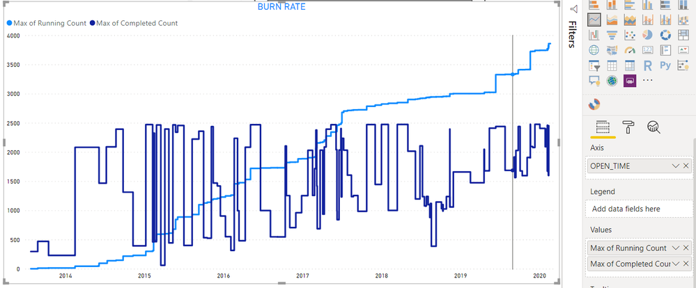
But in Power BI, its coming different,
Solved! Go to Solution.
- Mark as New
- Bookmark
- Subscribe
- Mute
- Subscribe to RSS Feed
- Permalink
- Report Inappropriate Content
You are on a good way to solve your problem!
You need to create three tables:
- Date Table - this table just has dates, you can create it directly in Power BI;
- "Running Count" Table - this table has 2 columns: Open Time and Running Count;
- "Complete Count" Table - this table has also 2 columns: Completion Time and Complete Count.
After that, you connect "Running Count" Table and "Complete Count" Table to the Date Table using relationships and use the date field from the Date Table to your X-axis.
Any doubt let me know!
- Mark as New
- Bookmark
- Subscribe
- Mute
- Subscribe to RSS Feed
- Permalink
- Report Inappropriate Content
Hi @Anonymous ,
You can refer to this:https://community.powerbi.com/t5/Desktop/Displaying-multiple-dates-across-a-single-x-axis/td-p/130323
Best Regards,
Liang
If this post helps, then please consider Accept it as the solution to help the other members find it more quickly.
- Mark as New
- Bookmark
- Subscribe
- Mute
- Subscribe to RSS Feed
- Permalink
- Report Inappropriate Content
Hi @Anonymous!
Both lines are cummulative, right?
- Mark as New
- Bookmark
- Subscribe
- Mute
- Subscribe to RSS Feed
- Permalink
- Report Inappropriate Content
- Mark as New
- Bookmark
- Subscribe
- Mute
- Subscribe to RSS Feed
- Permalink
- Report Inappropriate Content
You are using the MAX of the two variables, so you are getting the wrong values.
You need to create a measure that get the cummulative vallues for the graphic
- Mark as New
- Bookmark
- Subscribe
- Mute
- Subscribe to RSS Feed
- Permalink
- Report Inappropriate Content
its not cumulatve. I mean the incremental count is used. i.e., Running count. (1 to total rows) and completed count (1 to completed items count). the first graph is done in EXCel, which uses open time and running count data for 1st line and complete date and complete count for second line. But in power BI we dont have option to select individual data for each line. Is It possible to achieve through any measures or formulas.
In second chart, you can see the sky blue line is correct, beacuse i am using open time in axis. If I use close time in axis, then the sky blue is showing wrong and dark blue will show correct. not sure how to reslove this.
- Mark as New
- Bookmark
- Subscribe
- Mute
- Subscribe to RSS Feed
- Permalink
- Report Inappropriate Content
Reading what you said, I presume that you just have the table that you present in your model.
You didn't have a date table (like a dimension)?
- Mark as New
- Bookmark
- Subscribe
- Mute
- Subscribe to RSS Feed
- Permalink
- Report Inappropriate Content
Yes, Exactly. @guiggs But still i tried to create a new Table with date colum and tried with userelationship, but it didnt work.
Regards,
Shalini R
- Mark as New
- Bookmark
- Subscribe
- Mute
- Subscribe to RSS Feed
- Permalink
- Report Inappropriate Content
You are on a good way to solve your problem!
You need to create three tables:
- Date Table - this table just has dates, you can create it directly in Power BI;
- "Running Count" Table - this table has 2 columns: Open Time and Running Count;
- "Complete Count" Table - this table has also 2 columns: Completion Time and Complete Count.
After that, you connect "Running Count" Table and "Complete Count" Table to the Date Table using relationships and use the date field from the Date Table to your X-axis.
Any doubt let me know!
- Mark as New
- Bookmark
- Subscribe
- Mute
- Subscribe to RSS Feed
- Permalink
- Report Inappropriate Content
- Mark as New
- Bookmark
- Subscribe
- Mute
- Subscribe to RSS Feed
- Permalink
- Report Inappropriate Content
You're welcome!
Best regards
Helpful resources

Join us at the Microsoft Fabric Community Conference
March 31 - April 2, 2025, in Las Vegas, Nevada. Use code MSCUST for a $150 discount!

Join our Community Sticker Challenge 2025
If you love stickers, then you will definitely want to check out our Community Sticker Challenge!

| User | Count |
|---|---|
| 102 | |
| 68 | |
| 66 | |
| 52 | |
| 41 |
| User | Count |
|---|---|
| 159 | |
| 82 | |
| 65 | |
| 64 | |
| 61 |


