Join the Fabric User Panel to shape the future of Fabric.
Share feedback directly with Fabric product managers, participate in targeted research studies and influence the Fabric roadmap.
Sign up now- Power BI forums
- Get Help with Power BI
- Desktop
- Service
- Report Server
- Power Query
- Mobile Apps
- Developer
- DAX Commands and Tips
- Custom Visuals Development Discussion
- Health and Life Sciences
- Power BI Spanish forums
- Translated Spanish Desktop
- Training and Consulting
- Instructor Led Training
- Dashboard in a Day for Women, by Women
- Galleries
- Data Stories Gallery
- Themes Gallery
- Contests Gallery
- QuickViz Gallery
- Quick Measures Gallery
- Visual Calculations Gallery
- Notebook Gallery
- Translytical Task Flow Gallery
- TMDL Gallery
- R Script Showcase
- Webinars and Video Gallery
- Ideas
- Custom Visuals Ideas (read-only)
- Issues
- Issues
- Events
- Upcoming Events
Get Fabric certified for FREE! Don't miss your chance! Learn more
- Power BI forums
- Forums
- Get Help with Power BI
- Desktop
- Need help on Time Line chart
- Subscribe to RSS Feed
- Mark Topic as New
- Mark Topic as Read
- Float this Topic for Current User
- Bookmark
- Subscribe
- Printer Friendly Page
- Mark as New
- Bookmark
- Subscribe
- Mute
- Subscribe to RSS Feed
- Permalink
- Report Inappropriate Content
Need help on Time Line chart
I need to create a Line chart of average time per month. I have a table that has month and year in one column and in another column i have hour, minute and second H:MM:SS ie, 0:01:55 format. I need to create a line chart that will give average of time per month and the time in the line chart should show in the below format,
H:MM:SS ie, 0:01:55.
when i create a line chart i am getting count of Average time and i not able to change to Dont Summarise also. this option itself is not showing.
Could anyone help me on this ?
I am new to power Bi, Step by step process of explanation will be much helpful.
Thanks in Advance 😀
Solved! Go to Solution.
- Mark as New
- Bookmark
- Subscribe
- Mute
- Subscribe to RSS Feed
- Permalink
- Report Inappropriate Content
Hi, @Akshay_Aso- ;
Unfortunately, that seems unlikely at the moment. The problem is that metrics that do not return integer or decimal values cannot be used as values in bar/line charts.
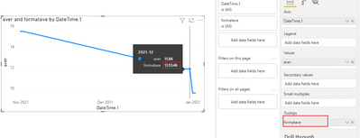
The best thing you can do right now is to add metrics as a tooltip.
So, given a metric [Duration in Seconds] that returns an integer or decimal value, create a new metric:
1.change to seconds
second = var _hour= CONVERT( LEFT(MAX('Table'[DateTime.2]), FIND(":",MAX('Table'[DateTime.2]),1)-1),INTEGER)
var _min= MID( MAX('Table'[DateTime.2]), FIND(":",MAX('Table'[DateTime.2]),1)+1,2)
var _sec= RIGHT(MAX('Table'[DateTime.2]),2)
return _hour*3600+_min*60+_sec
2.averge the seconds every month. then change it to hour.
aver = AVERAGEX(FILTER(ALL('Table'),EOMONTH([DateTime.1],0)=EOMONTH(MAX('Table'[DateTime.1]),0)),[second]) /36003.format it to hh:mm:ss as tooltip
formatave =
INT([aver])
&":"&INT(([aver]*3600-INT([aver])*3600)/60)
&":"&FORMAT( INT( MOD([aver]*3600,60)),"00")
The final output is shown below:
Best Regards,
Community Support Team_ Yalan Wu
If this post helps, then please consider Accept it as the solution to help the other members find it more quickly.
- Mark as New
- Bookmark
- Subscribe
- Mute
- Subscribe to RSS Feed
- Permalink
- Report Inappropriate Content
Helpful resources

Join our Community Sticker Challenge 2026
If you love stickers, then you will definitely want to check out our Community Sticker Challenge!

Power BI Monthly Update - January 2026
Check out the January 2026 Power BI update to learn about new features.

| User | Count |
|---|---|
| 65 | |
| 65 | |
| 48 | |
| 21 | |
| 18 |
| User | Count |
|---|---|
| 119 | |
| 117 | |
| 38 | |
| 36 | |
| 27 |

