FabCon is coming to Atlanta
Join us at FabCon Atlanta from March 16 - 20, 2026, for the ultimate Fabric, Power BI, AI and SQL community-led event. Save $200 with code FABCOMM.
Register now!- Power BI forums
- Get Help with Power BI
- Desktop
- Service
- Report Server
- Power Query
- Mobile Apps
- Developer
- DAX Commands and Tips
- Custom Visuals Development Discussion
- Health and Life Sciences
- Power BI Spanish forums
- Translated Spanish Desktop
- Training and Consulting
- Instructor Led Training
- Dashboard in a Day for Women, by Women
- Galleries
- Data Stories Gallery
- Themes Gallery
- Contests Gallery
- Quick Measures Gallery
- Notebook Gallery
- Translytical Task Flow Gallery
- TMDL Gallery
- R Script Showcase
- Webinars and Video Gallery
- Ideas
- Custom Visuals Ideas (read-only)
- Issues
- Issues
- Events
- Upcoming Events
Calling all Data Engineers! Fabric Data Engineer (Exam DP-700) live sessions are back! Starting October 16th. Sign up.
- Power BI forums
- Forums
- Get Help with Power BI
- Desktop
- Need help in finding ratio per month and plot the ...
- Subscribe to RSS Feed
- Mark Topic as New
- Mark Topic as Read
- Float this Topic for Current User
- Bookmark
- Subscribe
- Printer Friendly Page
- Mark as New
- Bookmark
- Subscribe
- Mute
- Subscribe to RSS Feed
- Permalink
- Report Inappropriate Content
Need help in finding ratio per month and plot the month wise trend.
I have two tables, 1st table which gives month wise waste weight for the range of products and 2nd table contains the tonnage produced per month. I would like to find the % waste per month against the tonnage produced and plot the trend month wise.
For example:
Total waste weight in Jan 2021 is 5624kg & Tonnage produced in Jan 1386000 .
% waste for Jan= 5.624 tons / 1386 tons = 0.40%, Like this need for each month and plot the trend month wise.
I am new to powerbi, support will help me.
| Table1 waste weight | ||||
| Product | Month | Year | weight | |
| Blackmix | Jan | 2021 | 3158 | |
| labscrap | Jan | 2021 | 1104 | |
| carbonblack | Jan | 2021 | 862 | |
| Gpmix | Jan | 2021 | 170 | |
| Elastomer | Jan | 2021 | 0 | |
| Blocs | Jan | 2021 | 18 | |
| BU | Jan | 2021 | 73 | |
| Chemical | Jan | 2021 | 0 | |
| silica | Jan | 2021 | 239 | |
| Blackmix | Feb | 2021 | 2552.4 | |
| labscrap | Feb | 2021 | 1303.6 | |
| carbonblack | Feb | 2021 | 1249 | |
| Gpmix | Feb | 2021 | 1395 | |
| Elastomer | Feb | 2021 | 109 | |
| Blocs | Feb | 2021 | 14 | |
| BU | Feb | 2021 | 55 | |
| Chemical | Feb | 2021 | 8 | |
| silica | Feb | 2021 | 4 | |
| Blackmix | Mar | 2021 | 1832.5 | |
| labscrap | Mar | 2021 | 1216.5 | |
| carbonblack | Mar | 2021 | 1547 | |
| Gpmix | Mar | 2021 | 1126 | |
| Elastomer | Mar | 2021 | 704 | |
| Blocs | Mar | 2021 | 237 | |
| BU | Mar | 2021 | 115 | |
| Chemical | Mar | 2021 | 286 | |
| silica | Mar | 2021 | 7 | |
| Blackmix | Apr | 2021 | 3390.4 | |
| labscrap | Apr | 2021 | 1311.5 | |
| carbonblack | Apr | 2021 | 1224 | |
| Gpmix | Apr | 2021 | 414 | |
| Elastomer | Apr | 2021 | 199 | |
| Blocs | Apr | 2021 | 9 | |
| BU | Apr | 2021 | 111 | |
| Chemical | Apr | 2021 | 26 | |
| silica | Apr | 2021 | 18 |
| Table 2 tonnage | ||
| Month | Weight | |
| Jan | 1386000 | |
| Feb | 1726000 | |
| Mar | 2079000 | |
| apr | 2205000 | |
| may | 1436000 | |
| Jun | 1637000 | |
| Jul | 1760000 | |
| Aug | 2200000 |
Solved! Go to Solution.
- Mark as New
- Bookmark
- Subscribe
- Mute
- Subscribe to RSS Feed
- Permalink
- Report Inappropriate Content
Hi @Anonymous
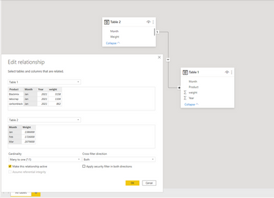
Please change the Cross filter Direction from Single to Both [relation between those 2 tables]and check the chart again.
Did I answer your question? Mark my post as a solution!
Appreciate your Kudos !!
- Mark as New
- Bookmark
- Subscribe
- Mute
- Subscribe to RSS Feed
- Permalink
- Report Inappropriate Content
@Anonymous
According to this function:
Measure =
DIVIDE(SUM('Table1'[weight]),SUM('Table2'[Weight]))
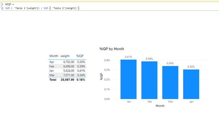
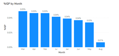
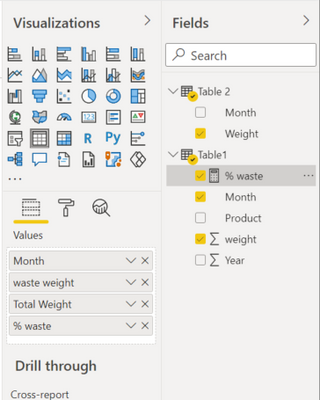
In the clustered column chart, do you use the column [Month] in Table1 instead of the column [Month] in Table2. Using the column [Month] of different tables will produce different results:
Best Regards,
If this post helps, then please consider Accept it as the solution to help the other members find it more quickly
- Mark as New
- Bookmark
- Subscribe
- Mute
- Subscribe to RSS Feed
- Permalink
- Report Inappropriate Content
@VahidDM Hi..
I got the table now.
But when i put that in clustered coloumn chart for the month wise trend. the value changes.
Any mistake i am making. Kindly guide.
- Mark as New
- Bookmark
- Subscribe
- Mute
- Subscribe to RSS Feed
- Permalink
- Report Inappropriate Content
hi @Anonymous
hqve you changed the Cross filter Direction from Single to Both [relation between those 2 tables] and check the chart again.
Did I answer your question? Mark my post as a solution!
Appreciate your Kudos !!
- Mark as New
- Bookmark
- Subscribe
- Mute
- Subscribe to RSS Feed
- Permalink
- Report Inappropriate Content
Hi @Anonymous
Please change the Cross filter Direction from Single to Both [relation between those 2 tables]and check the chart again.
Did I answer your question? Mark my post as a solution!
Appreciate your Kudos !!
- Mark as New
- Bookmark
- Subscribe
- Mute
- Subscribe to RSS Feed
- Permalink
- Report Inappropriate Content
Hi @Anonymous
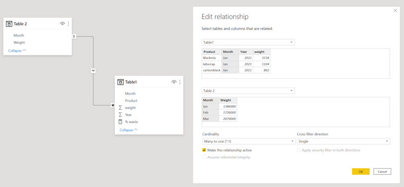
Make sure your there is a relation between your tables:
Then try this measure:
% waste =
SUM ( Table1[weight] ) / SUM ( 'Table 2'[Weight] )
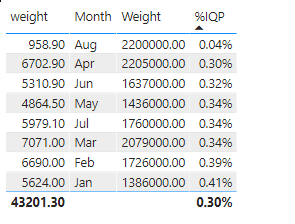
Use this measure and Month column to create a table like this:
Download this file for your reference: https://gofile.io/d/3NcsBq
Did I answer your question? Mark my post as a solution!
Appreciate your Kudos !!
- Mark as New
- Bookmark
- Subscribe
- Mute
- Subscribe to RSS Feed
- Permalink
- Report Inappropriate Content
Hi, Thanks for your help.
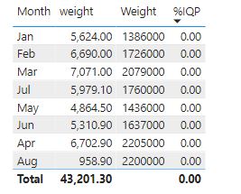
I tried creating a table, whereas the % waste ( %IQP ) is displaying 0.
am i making any mistake ?
- Mark as New
- Bookmark
- Subscribe
- Mute
- Subscribe to RSS Feed
- Permalink
- Report Inappropriate Content
Hi @Anonymous
Change the type of %IQP value to the percentage.
Did I answer your question? Mark my post as a solution!
Appreciate your Kudos 
- Mark as New
- Bookmark
- Subscribe
- Mute
- Subscribe to RSS Feed
- Permalink
- Report Inappropriate Content
and also pls help me to make a Month wise %Waste trend chart.
Helpful resources

FabCon Global Hackathon
Join the Fabric FabCon Global Hackathon—running virtually through Nov 3. Open to all skill levels. $10,000 in prizes!

Power BI Monthly Update - September 2025
Check out the September 2025 Power BI update to learn about new features.


