- Power BI forums
- Updates
- News & Announcements
- Get Help with Power BI
- Desktop
- Service
- Report Server
- Power Query
- Mobile Apps
- Developer
- DAX Commands and Tips
- Custom Visuals Development Discussion
- Health and Life Sciences
- Power BI Spanish forums
- Translated Spanish Desktop
- Power Platform Integration - Better Together!
- Power Platform Integrations (Read-only)
- Power Platform and Dynamics 365 Integrations (Read-only)
- Training and Consulting
- Instructor Led Training
- Dashboard in a Day for Women, by Women
- Galleries
- Community Connections & How-To Videos
- COVID-19 Data Stories Gallery
- Themes Gallery
- Data Stories Gallery
- R Script Showcase
- Webinars and Video Gallery
- Quick Measures Gallery
- 2021 MSBizAppsSummit Gallery
- 2020 MSBizAppsSummit Gallery
- 2019 MSBizAppsSummit Gallery
- Events
- Ideas
- Custom Visuals Ideas
- Issues
- Issues
- Events
- Upcoming Events
- Community Blog
- Power BI Community Blog
- Custom Visuals Community Blog
- Community Support
- Community Accounts & Registration
- Using the Community
- Community Feedback
Register now to learn Fabric in free live sessions led by the best Microsoft experts. From Apr 16 to May 9, in English and Spanish.
- Power BI forums
- Forums
- Get Help with Power BI
- Desktop
- Re: My forecast is constant each year!
- Subscribe to RSS Feed
- Mark Topic as New
- Mark Topic as Read
- Float this Topic for Current User
- Bookmark
- Subscribe
- Printer Friendly Page
- Mark as New
- Bookmark
- Subscribe
- Mute
- Subscribe to RSS Feed
- Permalink
- Report Inappropriate Content
My forecast is constant each year!
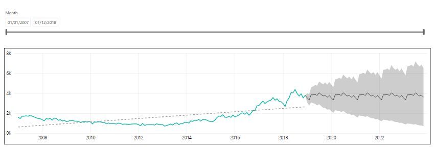
Hi all! I'm using Power BI to produce a forecast for the next 5 years, based on monthly volume data since 2007. My chart of the forecast looks like this (green line is actual monthly data, dotted black line is trend line and solid black line is forecast):
As you can see, a trendline on the data shows a gradual upward trend. However the 5 year forecast shows the exact same values each month for each year - e.g. Jan-19, 20, 21, 22, 23 all show the same forecast value. All the Februarys show the same forecast value, etc. It's just the same pattern repeated 5 times. Is this what is meant to be shown? Unless I'm missing something obvious, I would think that Power BI would show the forecast data increasing each year based on the existing trend?
PS I have set seasonality to '12' as my data is monthly.
Regards,
Lee
- Mark as New
- Bookmark
- Subscribe
- Mute
- Subscribe to RSS Feed
- Permalink
- Report Inappropriate Content
I am having the same issue even with 4 months of data and only forecasting one month of data. If I use the Anamolies option istead of forecase, it gives a bit more accurate results when it analyses the sales histroical data. The forecase option is far from reailty, I think the problem lies with the type of data we are feeding into Power BI, it might less fluctuations in the data to be able to tell the real forecast.
- Mark as New
- Bookmark
- Subscribe
- Mute
- Subscribe to RSS Feed
- Permalink
- Report Inappropriate Content
Hi @PowerBI_77,
Please leave the "Seasonality" option empty for a test.
Regards,
Yuliana Gu
If this post helps, then please consider Accept it as the solution to help the other members find it more quickly.
- Mark as New
- Bookmark
- Subscribe
- Mute
- Subscribe to RSS Feed
- Permalink
- Report Inappropriate Content
Hi Yuliana. Thanks for your reply. If I leave the Seasonality option blank (so it resorts to the 'auto' setting), I get the following chart:
This forecast seems to more closely match the trend of the data, but I now lose any variation in the data and I just get a straight line!
Regards,
Lee
- Mark as New
- Bookmark
- Subscribe
- Mute
- Subscribe to RSS Feed
- Permalink
- Report Inappropriate Content
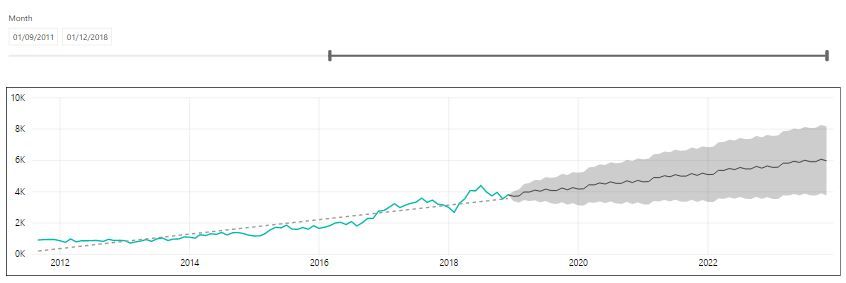
Hi All. Just a small update on this issue. I've now tried experimenting with a date slicer on the dataset and I've noticed that if I exclude a portion of the early data, at a certain point Power BI will give me a forecast which looks more sensible. For example if I only look at monthly volumes from Sep-2011 onwards, I get the following chart:
At least now, my forecast is showing variation and is following the trendline (dotted line). My theory is that Power BI will only apply a similar trend to the forecast data if the R-squared value is above a certain value? Or if the correlation coefficient is above a certain value?
Just for comparison, here again is what the forecast looks like if I reset the slicer (using the entire dataset):
Does this seem consistent with anyone elses experience with forecasting in Power BI please?
Regards,
Lee
- Mark as New
- Bookmark
- Subscribe
- Mute
- Subscribe to RSS Feed
- Permalink
- Report Inappropriate Content
Hmm, any chance you could share some data, would be interesting to play around with this.
@ me in replies or I'll lose your thread!!!
Instead of a Kudo, please vote for this idea
Become an expert!: Enterprise DNA
External Tools: MSHGQM
YouTube Channel!: Microsoft Hates Greg
Latest book!: The Definitive Guide to Power Query (M)
DAX is easy, CALCULATE makes DAX hard...
- Mark as New
- Bookmark
- Subscribe
- Mute
- Subscribe to RSS Feed
- Permalink
- Report Inappropriate Content
Hi Greg. Thanks for your reply. Unfortunately I'm unable to share that data although it's just based on a simple table of month names, e.g. Jan-07, Feb-07, etc and a figure for each month. Are you able to replicate something similar to see if you get the same strange forecast, i.e, is the forecast the same pattern for each projected year?
Regards,
Lee
- Mark as New
- Bookmark
- Subscribe
- Mute
- Subscribe to RSS Feed
- Permalink
- Report Inappropriate Content
Seems like a lot of typing...
@ me in replies or I'll lose your thread!!!
Instead of a Kudo, please vote for this idea
Become an expert!: Enterprise DNA
External Tools: MSHGQM
YouTube Channel!: Microsoft Hates Greg
Latest book!: The Definitive Guide to Power Query (M)
DAX is easy, CALCULATE makes DAX hard...
Helpful resources

Microsoft Fabric Learn Together
Covering the world! 9:00-10:30 AM Sydney, 4:00-5:30 PM CET (Paris/Berlin), 7:00-8:30 PM Mexico City

Power BI Monthly Update - April 2024
Check out the April 2024 Power BI update to learn about new features.

| User | Count |
|---|---|
| 106 | |
| 97 | |
| 80 | |
| 67 | |
| 63 |
| User | Count |
|---|---|
| 147 | |
| 110 | |
| 108 | |
| 85 | |
| 64 |


