FabCon is coming to Atlanta
Join us at FabCon Atlanta from March 16 - 20, 2026, for the ultimate Fabric, Power BI, AI and SQL community-led event. Save $200 with code FABCOMM.
Register now!- Power BI forums
- Get Help with Power BI
- Desktop
- Service
- Report Server
- Power Query
- Mobile Apps
- Developer
- DAX Commands and Tips
- Custom Visuals Development Discussion
- Health and Life Sciences
- Power BI Spanish forums
- Translated Spanish Desktop
- Training and Consulting
- Instructor Led Training
- Dashboard in a Day for Women, by Women
- Galleries
- Data Stories Gallery
- Themes Gallery
- Contests Gallery
- QuickViz Gallery
- Quick Measures Gallery
- Visual Calculations Gallery
- Notebook Gallery
- Translytical Task Flow Gallery
- TMDL Gallery
- R Script Showcase
- Webinars and Video Gallery
- Ideas
- Custom Visuals Ideas (read-only)
- Issues
- Issues
- Events
- Upcoming Events
The Power BI Data Visualization World Championships is back! Get ahead of the game and start preparing now! Learn more
- Power BI forums
- Forums
- Get Help with Power BI
- Desktop
- Multiple tables
- Subscribe to RSS Feed
- Mark Topic as New
- Mark Topic as Read
- Float this Topic for Current User
- Bookmark
- Subscribe
- Printer Friendly Page
- Mark as New
- Bookmark
- Subscribe
- Mute
- Subscribe to RSS Feed
- Permalink
- Report Inappropriate Content
Multiple tables
I have 2 tables that I want to incorporate into 1 combo bar/line graph that can be maniplulated using slicers for date ranges and particular User IDs. My intent is to have bars showing counts for each user and a line showing the goal for each user. One is a massive database of entries that has 50+ attribute fields. My issue is the many to many relationship. I cannot figure out how to write a DAX function to make this work.
Simplified large database columns:
- ID (unique)
- User ID (many)
- Month-Year (many)
- Type(binary)
The other table is the goals for each User ID that changes each month:
- User ID (many)
- Month-Year (many)
- Goal (many)
I cannot attach the pbix file because it is proprietary information. Please help me!
- Mark as New
- Bookmark
- Subscribe
- Mute
- Subscribe to RSS Feed
- Permalink
- Report Inappropriate Content
Hi @mtp03
Just create a bridge table containg all the unique user Id's and link it 1 to n with both tables. Then you can use to slice by in you visual. You can create this table using DAX but to avoid any chance of circular dependancy I preffer to have it created in power query or from source.
- Mark as New
- Bookmark
- Subscribe
- Mute
- Subscribe to RSS Feed
- Permalink
- Report Inappropriate Content
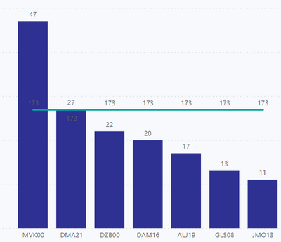
I did this but the problem is the line for goals is just the sum of all for the month (so the bars show the actual entries person but the line is just straight across). I want the line to show the value per User ID. How do I make it reflect that?
- Mark as New
- Bookmark
- Subscribe
- Mute
- Subscribe to RSS Feed
- Permalink
- Report Inappropriate Content
- Mark as New
- Bookmark
- Subscribe
- Mute
- Subscribe to RSS Feed
- Permalink
- Report Inappropriate Content
This is what it looks like filtered for 1 month. Se ehow the goal line is a sum of everone's goal instead of going up and down to show each person's specific goal?
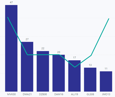
I want it to look like this, but keep in mind each month the goals change for each person. I tried doing a table for a single month's goals but then there is no historical data captured:
- Mark as New
- Bookmark
- Subscribe
- Mute
- Subscribe to RSS Feed
- Permalink
- Report Inappropriate Content
I tried this but I also need to be able to slice by month. So I need 2 seperate tables, one for month and one for user id?
- Mark as New
- Bookmark
- Subscribe
- Mute
- Subscribe to RSS Feed
- Permalink
- Report Inappropriate Content
Helpful resources

Power BI Dataviz World Championships
The Power BI Data Visualization World Championships is back! Get ahead of the game and start preparing now!

| User | Count |
|---|---|
| 40 | |
| 36 | |
| 34 | |
| 31 | |
| 27 |
| User | Count |
|---|---|
| 136 | |
| 103 | |
| 66 | |
| 65 | |
| 56 |


