
This is best Fabric, Power BI, SQL and AI community event. How do we know? The last event sold out! Save €200 with code FABCMTY200.
Register nowA new Data Days event is coming soon! This time we’re going bigger than ever. Fabric, Power BI, SQL, AI and more. Don't miss out.
Hi everyone,
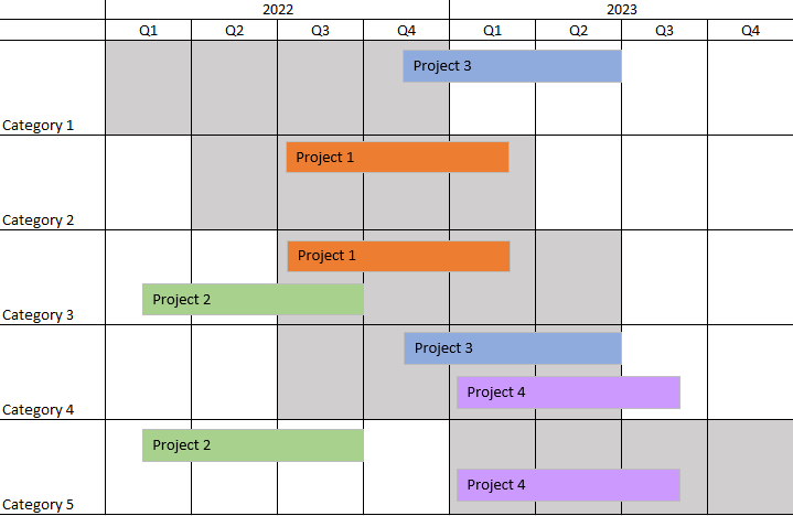
I would like to create a timeline visualization with multiple dimensions like in the printscreen below:
With the 2 tables below:
But I have searched for some visuals, but didn't find one like that. Do you know which visual could help me to visualize it?
Thank you very much for your help !
Best
Solved! Go to Solution.
@Anonymous , check if matrix visual like
Matrix as Project plan Visual: https://youtu.be/R25QoiyoSVs
Thank you very much ! It is not exactly what I needed, but I adapted it to my case. Thanks 🙂
@Anonymous , check if matrix visual like
Matrix as Project plan Visual: https://youtu.be/R25QoiyoSVs
Check out the May 2026 Power BI update to learn about new features.
Sign up to receive a private message when registration opens and key events begin.
If you have recently started exploring Fabric, we'd love to hear how it's going. Your feedback can help with product improvements.
| User | Count |
|---|---|
| 27 | |
| 25 | |
| 25 | |
| 21 | |
| 14 |
| User | Count |
|---|---|
| 50 | |
| 44 | |
| 20 | |
| 18 | |
| 18 |