Join the Fabric User Panel to shape the future of Fabric.
Share feedback directly with Fabric product managers, participate in targeted research studies and influence the Fabric roadmap.
Sign up now- Power BI forums
- Get Help with Power BI
- Desktop
- Service
- Report Server
- Power Query
- Mobile Apps
- Developer
- DAX Commands and Tips
- Custom Visuals Development Discussion
- Health and Life Sciences
- Power BI Spanish forums
- Translated Spanish Desktop
- Training and Consulting
- Instructor Led Training
- Dashboard in a Day for Women, by Women
- Galleries
- Data Stories Gallery
- Themes Gallery
- Contests Gallery
- QuickViz Gallery
- Quick Measures Gallery
- Visual Calculations Gallery
- Notebook Gallery
- Translytical Task Flow Gallery
- TMDL Gallery
- R Script Showcase
- Webinars and Video Gallery
- Ideas
- Custom Visuals Ideas (read-only)
- Issues
- Issues
- Events
- Upcoming Events
Get Fabric certified for FREE! Don't miss your chance! Learn more
- Power BI forums
- Forums
- Get Help with Power BI
- Desktop
- Re: Multiple dates on x-axis
- Subscribe to RSS Feed
- Mark Topic as New
- Mark Topic as Read
- Float this Topic for Current User
- Bookmark
- Subscribe
- Printer Friendly Page
- Mark as New
- Bookmark
- Subscribe
- Mute
- Subscribe to RSS Feed
- Permalink
- Report Inappropriate Content
Multiple dates on x-axis
Hello community!
I am trying to build an area chart that should look something like below:
I would like to overlay 3 sets of data - Each set has a dollar amount and a corresponding date (Ex. Amount paid & paid date, Bill amount & bill date etc). I would like the X-axis to show a general timeline, and the corresponding data points to be plotted for each day. The goal is to see for each time period (day/week/month) how much I have billed & been paid (Ex. 1Jan I billed $100 but I got paid $50).
Could you guide me how to achieve this using area charts
Solved! Go to Solution.
- Mark as New
- Bookmark
- Subscribe
- Mute
- Subscribe to RSS Feed
- Permalink
- Report Inappropriate Content
Hi @nm1729 ,
In your scenario, we can create a date table with Hierarchy, please refer to the following example:
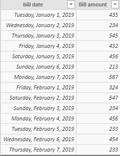
Assume that we have tables like below:
Then we can use the following DAX query to create a date table:
date =
ADDCOLUMNS (
    CALENDAR ( DATE ( 2019, 1, 1 ), DATE ( 2019, 2, 20 ) ),
    "week", WEEKNUM ( [Date], 1 ),
    "month", MONTH ( [Date] )
)
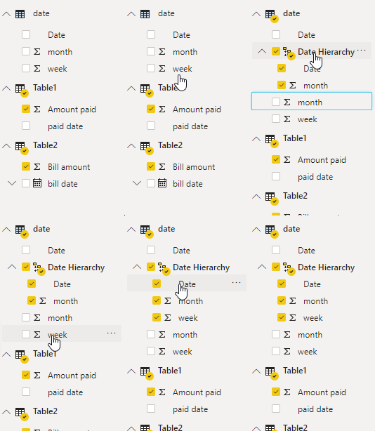
Create relationship between date table with these two tables, then drag the week and month to the date creating the date Hierarchy:
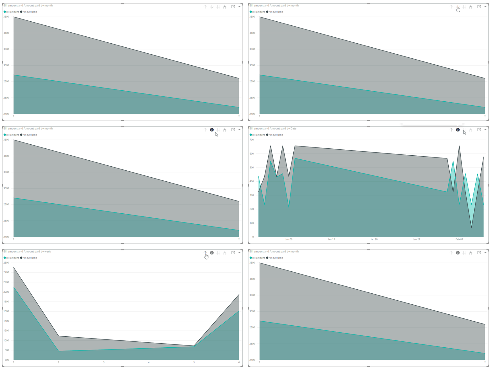
Then we can create the visual, after that, we can drill down the data from month to week to day:
Best Regards,
Teige
Helpful resources

Join our Fabric User Panel
Share feedback directly with Fabric product managers, participate in targeted research studies and influence the Fabric roadmap.

| User | Count |
|---|---|
| 68 | |
| 59 | |
| 44 | |
| 19 | |
| 15 |
| User | Count |
|---|---|
| 108 | |
| 105 | |
| 37 | |
| 26 | |
| 26 |


