FabCon is coming to Atlanta
Join us at FabCon Atlanta from March 16 - 20, 2026, for the ultimate Fabric, Power BI, AI and SQL community-led event. Save $200 with code FABCOMM.
Register now!- Power BI forums
- Get Help with Power BI
- Desktop
- Service
- Report Server
- Power Query
- Mobile Apps
- Developer
- DAX Commands and Tips
- Custom Visuals Development Discussion
- Health and Life Sciences
- Power BI Spanish forums
- Translated Spanish Desktop
- Training and Consulting
- Instructor Led Training
- Dashboard in a Day for Women, by Women
- Galleries
- Data Stories Gallery
- Themes Gallery
- Contests Gallery
- Quick Measures Gallery
- Notebook Gallery
- Translytical Task Flow Gallery
- TMDL Gallery
- R Script Showcase
- Webinars and Video Gallery
- Ideas
- Custom Visuals Ideas (read-only)
- Issues
- Issues
- Events
- Upcoming Events
Calling all Data Engineers! Fabric Data Engineer (Exam DP-700) live sessions are back! Starting October 16th. Sign up.
- Power BI forums
- Forums
- Get Help with Power BI
- Desktop
- Multiple copies of visual, each filtered by date r...
- Subscribe to RSS Feed
- Mark Topic as New
- Mark Topic as Read
- Float this Topic for Current User
- Bookmark
- Subscribe
- Printer Friendly Page
- Mark as New
- Bookmark
- Subscribe
- Mute
- Subscribe to RSS Feed
- Permalink
- Report Inappropriate Content
Multiple copies of visual, each filtered by date relative to slicer
Hi there--
I'm looking at using the "at Timeline" visual from Pragmatic Works to show eight days worth of status logs. I'd like to select a single date in a slicer and have the top visual display data for the selected date, visual #2 to display data for one day after the selected date, visual #3 for two days after the selected date and so on...
I managed to create a dynamic column which contains the number of days between that row's date and the date selected in the slicer, but using that column as a visual-level filter doesn't seem to override the existing filter to show all start / end dates. (These columns are used in the visual, and so can't be removed from the visual-level filters.)
Is there any way to make this work?
Solved! Go to Solution.
- Mark as New
- Bookmark
- Subscribe
- Mute
- Subscribe to RSS Feed
- Permalink
- Report Inappropriate Content
Hi @northshorehiker ,
As we know, the data in calculated column is not dynamic based on the slicer value. So it is hard to achieve your goal. Here I create a sample for your reference as a workaround.
1. Cretae a slicer calculated table.
Slicer = CALENDARAUTO()
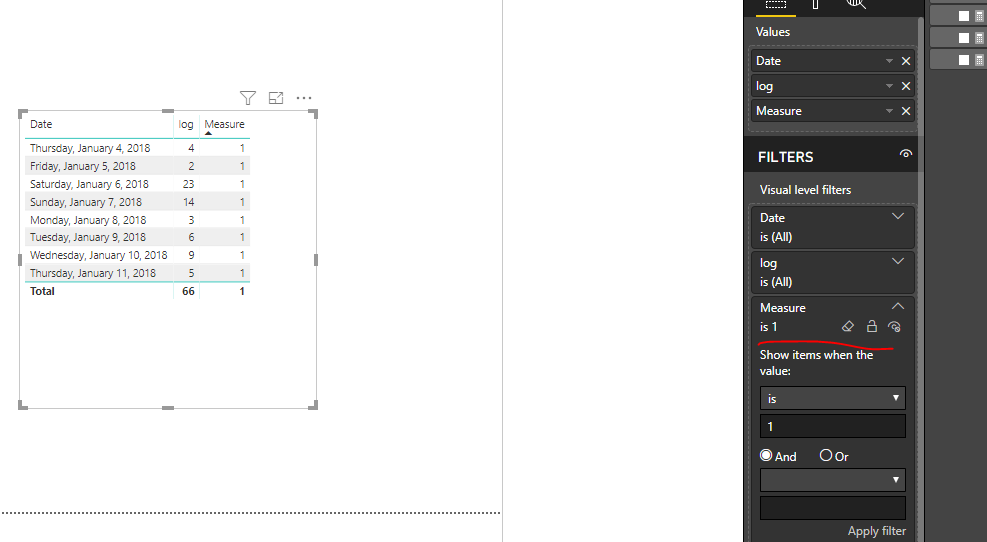
2. Create a measure as below and make the visual filtered by the measure.
Measure = var _sele = SELECTEDVALUE('Slicer'[Date])
var _date1 = MAX('Table1'[Date])
return
IF(_date1>=_sele && _date1<=(_sele+7),1,0)
Regards,
Frank
If this post helps, then please consider Accept it as the solution to help the others find it more quickly.


