A new Data Days event is coming soon!
This time we’re going bigger than ever. Fabric, Power BI, SQL, AI and more. We're covering it all. You won't want to miss it.
Learn more- Power BI forums
- Get Help with Power BI
- Desktop
- Service
- Report Server
- Power Query
- Mobile Apps
- Developer
- DAX Commands and Tips
- Custom Visuals Development Discussion
- Health and Life Sciences
- Power BI Spanish forums
- Translated Spanish Desktop
- Training and Consulting
- Instructor Led Training
- Dashboard in a Day for Women, by Women
- Galleries
- Data Stories Gallery
- Themes Gallery
- Contests Gallery
- QuickViz Gallery
- Quick Measures Gallery
- Visual Calculations Gallery
- Notebook Gallery
- Translytical Task Flow Gallery
- TMDL Gallery
- R Script Showcase
- Webinars and Video Gallery
- Ideas
- Custom Visuals Ideas (read-only)
- Issues
- Issues
- Events
- Upcoming Events
Did you hear? There's a new SQL AI Developer certification (DP-800). Start preparing now and be one of the first to get certified. Register now
- Power BI forums
- Forums
- Get Help with Power BI
- Desktop
- Multiple columns for map graph
- Subscribe to RSS Feed
- Mark Topic as New
- Mark Topic as Read
- Float this Topic for Current User
- Bookmark
- Subscribe
- Printer Friendly Page
- Mark as New
- Bookmark
- Subscribe
- Mute
- Subscribe to RSS Feed
- Permalink
- Report Inappropriate Content
Multiple columns for map graph
Hi guys!
I am making a database of scientific articles. There are usually a few authors from various countries for a single article.
For example, an article includes authors from the USA, UK, Germany.
I prepared a database containing the USA, UK, and Germany in different columns (country1, country2, and country3 respectively).
I am trying to choose Country1, Country2, and Country3 to map all of them, but the Power BI shows only the USA (e.g. country 1 column).
Is there any option to merge countries to show all of them on the map? If yes, which delimiter should be used (space, comma...)?
Is there any option to link a few columns to build a map?
Please advice.
Best wishes,
Alisa
Solved! Go to Solution.
- Mark as New
- Bookmark
- Subscribe
- Mute
- Subscribe to RSS Feed
- Permalink
- Report Inappropriate Content
Hey @Anonymous ,
in order to show everything at once, all the countries should be in a country-column. If you put a single column for each country you will have a hard time to analyze things.
- Mark as New
- Bookmark
- Subscribe
- Mute
- Subscribe to RSS Feed
- Permalink
- Report Inappropriate Content
Hi @selimovd thanks! I actually solved it, but putting all countries in a single column and then I did a split by rows in power BI database.
But now I have another question. How to do a map, showing the number of mentioned China, USA, Russia and etc?
Sorry, I am very new to the power BI 🙂
- Mark as New
- Bookmark
- Subscribe
- Mute
- Subscribe to RSS Feed
- Permalink
- Report Inappropriate Content
Hey @Anonymous ,
I'm happy you could solve it.
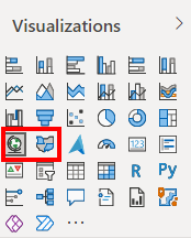
Then just use one of the map visuals:
There you can use either Longitude and Latitude or put the country in the location field.
Here a few more details about the visuals:
Tips and Tricks for maps (including Bing Maps integration) - Power BI | Microsoft Docs
- Mark as New
- Bookmark
- Subscribe
- Mute
- Subscribe to RSS Feed
- Permalink
- Report Inappropriate Content
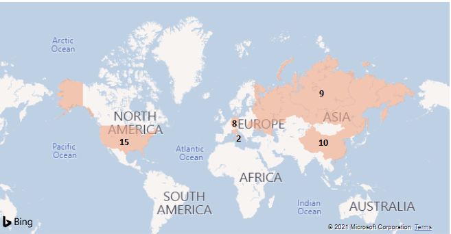
Thanks, @selimovd ! probably did not explain my question correctly.
I did a map without any problem. But now I want to highlight the number of mentions of each country, like that (I added numbers in paint):

- Mark as New
- Bookmark
- Subscribe
- Mute
- Subscribe to RSS Feed
- Permalink
- Report Inappropriate Content
Hey @Anonymous ,
sadly, that is not possible at the moment for the filled map.
There is already an idea, but it needs more votes:
Microsoft Idea · Static value labels on filled maps (powerbi.com)
Otherwise you can use the "Size" in the map visual, but this doesn't have the nice shapes of the countries. Probably other custom visuals support that feature, but at the moment I'm not aware of such a visual.
Sorry about that.
Helpful resources

Power BI Monthly Update - April 2026
Check out the April 2026 Power BI update to learn about new features.

Data Days 2026 coming soon!
Sign up to receive a private message when registration opens and key events begin.

New to Fabric Survey
If you have recently started exploring Fabric, we'd love to hear how it's going. Your feedback can help with product improvements.

| User | Count |
|---|---|
| 36 | |
| 33 | |
| 31 | |
| 21 | |
| 16 |
| User | Count |
|---|---|
| 66 | |
| 55 | |
| 31 | |
| 24 | |
| 23 |

