FabCon is coming to Atlanta
Join us at FabCon Atlanta from March 16 - 20, 2026, for the ultimate Fabric, Power BI, AI and SQL community-led event. Save $200 with code FABCOMM.
Register now!- Power BI forums
- Get Help with Power BI
- Desktop
- Service
- Report Server
- Power Query
- Mobile Apps
- Developer
- DAX Commands and Tips
- Custom Visuals Development Discussion
- Health and Life Sciences
- Power BI Spanish forums
- Translated Spanish Desktop
- Training and Consulting
- Instructor Led Training
- Dashboard in a Day for Women, by Women
- Galleries
- Data Stories Gallery
- Themes Gallery
- Contests Gallery
- QuickViz Gallery
- Quick Measures Gallery
- Visual Calculations Gallery
- Notebook Gallery
- Translytical Task Flow Gallery
- TMDL Gallery
- R Script Showcase
- Webinars and Video Gallery
- Ideas
- Custom Visuals Ideas (read-only)
- Issues
- Issues
- Events
- Upcoming Events
View all the Fabric Data Days sessions on demand. View schedule
- Power BI forums
- Forums
- Get Help with Power BI
- Desktop
- Re: Multiple Slicers of same type in one graph
- Subscribe to RSS Feed
- Mark Topic as New
- Mark Topic as Read
- Float this Topic for Current User
- Bookmark
- Subscribe
- Printer Friendly Page
- Mark as New
- Bookmark
- Subscribe
- Mute
- Subscribe to RSS Feed
- Permalink
- Report Inappropriate Content
Multiple Slicers of same type in one graph
I want to insert two date slicers in one bar graph having two bars representing the total sales, each slicer will be used to filter one bar of total sales,so that i can compare total sales of two time period in one graph.
Solved! Go to Solution.
- Mark as New
- Bookmark
- Subscribe
- Mute
- Subscribe to RSS Feed
- Permalink
- Report Inappropriate Content
Hi @Thalbish ,
Please try the following methods and check if they can solve your problem:
1.Create the simple table.
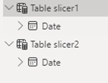
2.Create two tables with slicer fields for the two slicers.
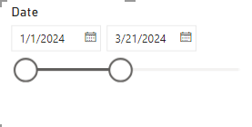
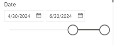
3.Drag the Date into the slicer 1 visual and drag the Date into slicer 2 visual.
4.Create two measures for the two slicers.
TotalSales1 =
VAR start_date = MIN('Table slicer1'[Date])
VAR end_date = MAX('Table slicer1'[Date])
RETURN
    CALCULATE(SUM('Table'[Sales]), FILTER('Table', [Date] >= start_date && [Date] <= end_date))
TotalSales2 =
VAR start_date = MIN('Table slicer2'[Date])
VAR end_date = MAX('Table slicer2'[Date])
RETURN
    CALCULATE(SUM('Table'[Sales]), FILTER('Table', [Date] >= start_date && [Date] <= end_date))
5.Create the Field table.
6.Create a measure to show a different measure.
Measure =
SWITCH(
    TRUE(),
    SELECTEDVALUE(Field[Sales Fields]) = "Sales 1", [TotalSales1],
    SELECTEDVALUE(Field[Sales Fields]) = "Sales 2", [TotalSales2]
)
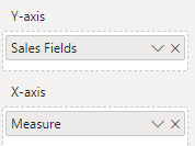
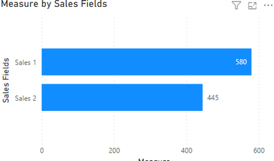
7.Select the bar chart, add the sales field into the Y-axis, drag the measure into the X-axis.
8.The result is shown below.
Best Regards,
Wisdom Wu
If this post helps, then please consider Accept it as the solution to help the other members find it more quickly.
- Mark as New
- Bookmark
- Subscribe
- Mute
- Subscribe to RSS Feed
- Permalink
- Report Inappropriate Content
Also can you please help me with applying this 2 date into a clustered bar graph which represent order type,i want one colour to represent the first date and another to other date as you have explained for sales
- Mark as New
- Bookmark
- Subscribe
- Mute
- Subscribe to RSS Feed
- Permalink
- Report Inappropriate Content
Hi! When you say two time periods are you wanting two random, unrelated time periods (i.e. maybe your user wants to compare sept and october to june and july) or are you wanting to do time intelligence (i.e. if the user selects January and February of 2024, you are comparing to Jan and Feb of 2023)?
Proud to be a Super User! |  |
- Mark as New
- Bookmark
- Subscribe
- Mute
- Subscribe to RSS Feed
- Permalink
- Report Inappropriate Content
Yes, I want two random time periods,that is in one graph i want to select jan 1st to Feb 31 of 2023,and in another i can select march 1 to april 31st in 2022,like wise random selection
Helpful resources

Power BI Monthly Update - November 2025
Check out the November 2025 Power BI update to learn about new features.

Fabric Data Days
Advance your Data & AI career with 50 days of live learning, contests, hands-on challenges, study groups & certifications and more!


