A new Data Days event is coming soon!
This time we’re going bigger than ever. Fabric, Power BI, SQL, AI and more. We're covering it all. You won't want to miss it.
Learn more- Power BI forums
- Get Help with Power BI
- Desktop
- Service
- Report Server
- Power Query
- Mobile Apps
- Developer
- DAX Commands and Tips
- Custom Visuals Development Discussion
- Health and Life Sciences
- Power BI Spanish forums
- Translated Spanish Desktop
- Training and Consulting
- Instructor Led Training
- Dashboard in a Day for Women, by Women
- Galleries
- Data Stories Gallery
- Themes Gallery
- Contests Gallery
- QuickViz Gallery
- Quick Measures Gallery
- Visual Calculations Gallery
- Notebook Gallery
- Translytical Task Flow Gallery
- TMDL Gallery
- R Script Showcase
- Webinars and Video Gallery
- Ideas
- Custom Visuals Ideas (read-only)
- Issues
- Issues
- Events
- Upcoming Events
Did you hear? There's a new SQL AI Developer certification (DP-800). Start preparing now and be one of the first to get certified. Register now
- Power BI forums
- Forums
- Get Help with Power BI
- Desktop
- Re: Multiple Line chart problem
- Subscribe to RSS Feed
- Mark Topic as New
- Mark Topic as Read
- Float this Topic for Current User
- Bookmark
- Subscribe
- Printer Friendly Page
- Mark as New
- Bookmark
- Subscribe
- Mute
- Subscribe to RSS Feed
- Permalink
- Report Inappropriate Content
Multiple Line chart problem
Hello Everyone
I want a line chart which gives for example C14 for 2 different years with value of each day on same line chart. It is somehow easy to make this type of chart in excel but not in power BI
Please also find attached image like whihc i want graph to be
I have data like below
Date C10 C14 C16 C5TC C8 C9
| 04-01-2016 | 2791.00 | 4405.00 | -1964.00 | 4811.00 | 6995.00 | 12070.00 |
| 05-01-2016 | 2882.00 | 4450.00 | -1984.00 | 4676.00 | 6345.00 | 12040.00 |
| 06-01-2016 | 2986.00 | 4473.00 | -1985.00 | 4760.00 | 6485.00 | 12180.00 |
| 07-01-2016 | 2741.00 | 4205.00 | -2175.00 | 4198.00 | 5315.00 | 11235.00 |
Solved! Go to Solution.
- Mark as New
- Bookmark
- Subscribe
- Mute
- Subscribe to RSS Feed
- Permalink
- Report Inappropriate Content
Hi @A_ksh ,
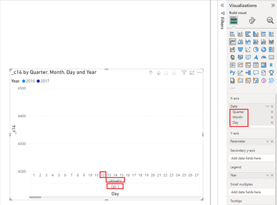
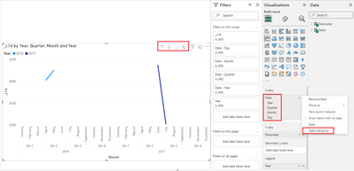
The hierarchy of the x-axis in the chart you have given is Quarter-Month-Day, and you can set up the same hierarchy as shown below.
Due to the design of PBI Desktop this is the closest you can get to an excel chart.
If you would like to suggest feature improvements, you may vote the idea and comment here to improve this feature. It is a place for customers provide feedback about Microsoft Office products . What’s more, if a feedback is high voted there by other customers, it will be promising that Microsoft Product Team will take it into consideration when designing the next version in the future.
Best Regards,
Neeko Tang
If this post helps, then please consider Accept it as the solution to help the other members find it more quickly.
- Mark as New
- Bookmark
- Subscribe
- Mute
- Subscribe to RSS Feed
- Permalink
- Report Inappropriate Content
Hi @A_ksh ,
According to your description, here are my steps you can follow as a solution.
(1) This is my test data.
(2) We can create a calculated column.
Year = YEAR('Table'[Date])(3) Then the result is as follows.
Best Regards,
Neeko Tang
If this post helps, then please consider Accept it as the solution to help the other members find it more quickly.
- Mark as New
- Bookmark
- Subscribe
- Mute
- Subscribe to RSS Feed
- Permalink
- Report Inappropriate Content
Thank you so muc for the reply
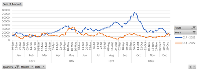
But as you can see in excel line chart below we can have fixed x axis from january to december and it gives you option to choose year and different values of C10, C14 etc. so i select lets say 2021 and 2022 it gives me 2 lines of same C14 over the span of january to december, so that its easy to compare on month basis.
But in power BI it just extends the x-axis for 2 different year and even if i create table for month or select x axis for month it provides sum value for that month not the individual values of everyday. But in excel even though x axis is from Jan to Dec it still provides you daily data and makes graph more smooth.
here is the comparison of 2 same data in excel and in power bi.
This is graph in Excel.
This is graph in Power Bi.
- Mark as New
- Bookmark
- Subscribe
- Mute
- Subscribe to RSS Feed
- Permalink
- Report Inappropriate Content
Hi @A_ksh ,
(1)We can create measures.
_c10 = SUM('Table'[C10])_c14 = SUM('Table'[C14])_c16 = SUM('Table'[C16])
...
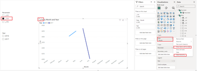
(2)Creating Field Parameter.
(3)Then the result is as follows.
Best Regards,
Neeko Tang
If this post helps, then please consider Accept it as the solution to help the other members find it more quickly.
- Mark as New
- Bookmark
- Subscribe
- Mute
- Subscribe to RSS Feed
- Permalink
- Report Inappropriate Content
Thank you for the reply but the Y axis data is showing monthly agrregated value whereas i have daily data and want daily data to be displyed instead of SUM data of month even though i have selected x axis to be month.
Is there you can help me on this.
- Mark as New
- Bookmark
- Subscribe
- Mute
- Subscribe to RSS Feed
- Permalink
- Report Inappropriate Content
Hi @A_ksh ,
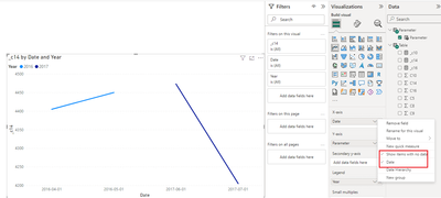
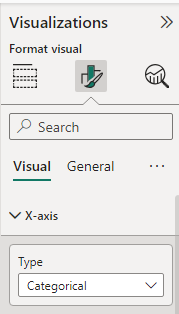
If you want to display daily data, set the x-axis as shown below.
Best Regards,
Neeko Tang
If this post helps, then please consider Accept it as the solution to help the other members find it more quickly.
- Mark as New
- Bookmark
- Subscribe
- Mute
- Subscribe to RSS Feed
- Permalink
- Report Inappropriate Content
Thank you
But i want X-Axis to be only from Jan-Dec as shown in above excel graph but even though the X-axis is month basis i want data to be of daily basis. For differerent years i can have years in legend so i can choose year.
Also Can we connect on Google meet or somewhere else so that we can discuss this because i am stuck on this for weeks now and i see no solutions.
Here is my email id - akashpandey9299@gmail.com, Please send a message if you will be able to connect Gmeet or somewhere else.
- Mark as New
- Bookmark
- Subscribe
- Mute
- Subscribe to RSS Feed
- Permalink
- Report Inappropriate Content
Hi @A_ksh ,
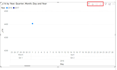
If you want the x-axis to be displayed in a date hierarchy, set the x-axis as shown below.
You can explore in-depth details about your data by using the drill-down, drill-up, and expand features on your visual.
Refer : Drill mode in the Power BI service - Power BI | Microsoft Learn
Best Regards,
Neeko Tang
If this post helps, then please consider Accept it as the solution to help the other members find it more quickly.
- Mark as New
- Bookmark
- Subscribe
- Mute
- Subscribe to RSS Feed
- Permalink
- Report Inappropriate Content
But you see 2016 and 2017 data is coming on x axis on your graph, i want x axis to be set from Jan-Dec and differerent year data should come differently.
And if i drill up/down data the comes agreegated which not ideal for me, i want even though the x axis is set data should be of everyday.
And please if you have time can we connect ? because i feel problem is very specific and you can udnerstand once we connect.
Thank you in advance.
- Mark as New
- Bookmark
- Subscribe
- Mute
- Subscribe to RSS Feed
- Permalink
- Report Inappropriate Content
Hi @A_ksh ,
The hierarchy of the x-axis in the chart you have given is Quarter-Month-Day, and you can set up the same hierarchy as shown below.
Due to the design of PBI Desktop this is the closest you can get to an excel chart.
If you would like to suggest feature improvements, you may vote the idea and comment here to improve this feature. It is a place for customers provide feedback about Microsoft Office products . What’s more, if a feedback is high voted there by other customers, it will be promising that Microsoft Product Team will take it into consideration when designing the next version in the future.
Best Regards,
Neeko Tang
If this post helps, then please consider Accept it as the solution to help the other members find it more quickly.
- Mark as New
- Bookmark
- Subscribe
- Mute
- Subscribe to RSS Feed
- Permalink
- Report Inappropriate Content
Sorry but i tried and it is not helping, excel provide 2 legend option where i can select different different years and it will show Value of lets say C10 for 2 different year with different line, doing that in power bi just expands the x-axis for 2 years and give continoues graph.
I want to recreate same what is there in excel and showed in my question.
- Mark as New
- Bookmark
- Subscribe
- Mute
- Subscribe to RSS Feed
- Permalink
- Report Inappropriate Content
Sample data with different years would help more but with this data :
Date on the x-axis, individual measures on the y-axis. If you want a quick chart just select the c10, c14 etc and add them to the y-axis
--
Or you can unpivot the C-columns and write one measure
Helpful resources

Power BI Monthly Update - April 2026
Check out the April 2026 Power BI update to learn about new features.

Data Days 2026 coming soon!
Sign up to receive a private message when registration opens and key events begin.

New to Fabric Survey
If you have recently started exploring Fabric, we'd love to hear how it's going. Your feedback can help with product improvements.

| User | Count |
|---|---|
| 37 | |
| 32 | |
| 27 | |
| 24 | |
| 17 |
| User | Count |
|---|---|
| 70 | |
| 50 | |
| 31 | |
| 26 | |
| 22 |
