FabCon is coming to Atlanta
Join us at FabCon Atlanta from March 16 - 20, 2026, for the ultimate Fabric, Power BI, AI and SQL community-led event. Save $200 with code FABCOMM.
Register now!- Power BI forums
- Get Help with Power BI
- Desktop
- Service
- Report Server
- Power Query
- Mobile Apps
- Developer
- DAX Commands and Tips
- Custom Visuals Development Discussion
- Health and Life Sciences
- Power BI Spanish forums
- Translated Spanish Desktop
- Training and Consulting
- Instructor Led Training
- Dashboard in a Day for Women, by Women
- Galleries
- Data Stories Gallery
- Themes Gallery
- Contests Gallery
- QuickViz Gallery
- Quick Measures Gallery
- Visual Calculations Gallery
- Notebook Gallery
- Translytical Task Flow Gallery
- TMDL Gallery
- R Script Showcase
- Webinars and Video Gallery
- Ideas
- Custom Visuals Ideas (read-only)
- Issues
- Issues
- Events
- Upcoming Events
The Power BI Data Visualization World Championships is back! Get ahead of the game and start preparing now! Learn more
- Power BI forums
- Forums
- Get Help with Power BI
- Desktop
- Re: Multiple Line Graph with one Dimension on each...
- Subscribe to RSS Feed
- Mark Topic as New
- Mark Topic as Read
- Float this Topic for Current User
- Bookmark
- Subscribe
- Printer Friendly Page
- Mark as New
- Bookmark
- Subscribe
- Mute
- Subscribe to RSS Feed
- Permalink
- Report Inappropriate Content
Multiple Line Graph with one Dimension on each Axis and 4 Measures
Hello All,
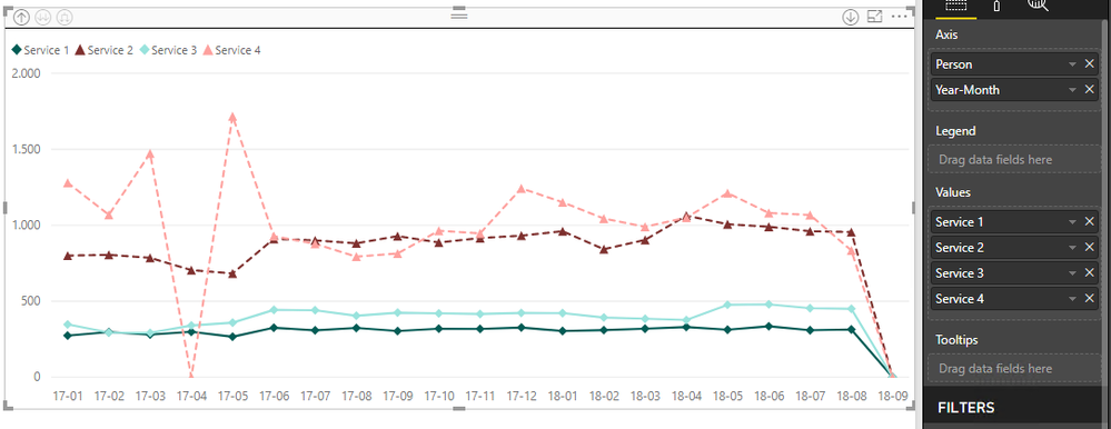
I have created a line graph which has the year month on X Axis and 4 measures displayed on Y Axis. See following Image:
I would like to take the analysis one step further and add another dimension (Person) to this graph.
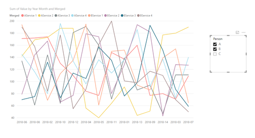
So essentially what i would like to achieve is select two or three persons from a filter and then the graph will show instead of 4 lines, 8 lines for the 2 persons (4 services for each one of them) and 12 lines for the 3 persons. This will help me compare the performance between the persons im looking at.
I tried to do that on PowerBi but with no luck. Is this functionality available on the software?
Attached on this link is a spreadsheet where on the first sheet i show the lines for one person and on the second sheet i have a sample dataset for 3 persons. Based on the data from the second sheet i would like to create the relevant line graph where i will show 12 lines.
Thank you
Solved! Go to Solution.
- Mark as New
- Bookmark
- Subscribe
- Mute
- Subscribe to RSS Feed
- Permalink
- Report Inappropriate Content
Hi themistoklis,
To achieve your requirement, click query editor-> transform->click on [service1], [service2], [service3] and [service4]-> unpivot columns.

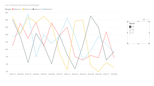
Then click add columns-> custom column to merge column [person] and [attribute] like below;

Then applied and close, create a line chart and a slicer on person column.

Regards,
Jimmy Tao
- Mark as New
- Bookmark
- Subscribe
- Mute
- Subscribe to RSS Feed
- Permalink
- Report Inappropriate Content
Hi themistoklis,
To achieve your requirement, click query editor-> transform->click on [service1], [service2], [service3] and [service4]-> unpivot columns.

Then click add columns-> custom column to merge column [person] and [attribute] like below;

Then applied and close, create a line chart and a slicer on person column.

Regards,
Jimmy Tao
- Mark as New
- Bookmark
- Subscribe
- Mute
- Subscribe to RSS Feed
- Permalink
- Report Inappropriate Content
Hello @v-yuta-msft
This indeed works great on the data and when the 4 services belong to an existing table
In my case these 4 services are calculated measures (4 fields) in PowerBi and they dont actually belong to an existing table.
Is there a way if these are calculated measures to display them on the graph, or they all need to be on an existing table?
Helpful resources

Power BI Dataviz World Championships
The Power BI Data Visualization World Championships is back! Get ahead of the game and start preparing now!

| User | Count |
|---|---|
| 38 | |
| 38 | |
| 37 | |
| 28 | |
| 28 |
| User | Count |
|---|---|
| 124 | |
| 89 | |
| 73 | |
| 66 | |
| 65 |


