A new Data Days event is coming soon!
This time we’re going bigger than ever. Fabric, Power BI, SQL, AI and more. We're covering it all. You won't want to miss it.
Learn more- Power BI forums
- Get Help with Power BI
- Desktop
- Service
- Report Server
- Power Query
- Mobile Apps
- Developer
- DAX Commands and Tips
- Custom Visuals Development Discussion
- Health and Life Sciences
- Power BI Spanish forums
- Translated Spanish Desktop
- Training and Consulting
- Instructor Led Training
- Dashboard in a Day for Women, by Women
- Galleries
- Data Stories Gallery
- Themes Gallery
- Contests Gallery
- QuickViz Gallery
- Quick Measures Gallery
- Visual Calculations Gallery
- Notebook Gallery
- Translytical Task Flow Gallery
- TMDL Gallery
- R Script Showcase
- Webinars and Video Gallery
- Ideas
- Custom Visuals Ideas (read-only)
- Issues
- Issues
- Events
- Upcoming Events
Level up your Power BI skills this month - build one visual each week and tell better stories with data! Get started
- Power BI forums
- Forums
- Get Help with Power BI
- Desktop
- Re: Multi variable scatter plot
- Subscribe to RSS Feed
- Mark Topic as New
- Mark Topic as Read
- Float this Topic for Current User
- Bookmark
- Subscribe
- Printer Friendly Page
- Mark as New
- Bookmark
- Subscribe
- Mute
- Subscribe to RSS Feed
- Permalink
- Report Inappropriate Content
Multi variable scatter plot
Hi Community,
I have a dataset of shipping voyages with columns for Date, Port, Shipping company, loading time, discharge time, etc.
One useful visual is a scatterplot with loading time and discharge time on the X and Y axis respectively, where each dot represents a single port. Power BI automatically averages the load/discharge time for each visit to a particular port to correctly place the dot, and the graph works perfectly with no issues. With this the end user can easily see which ports are the most and least efficient.
I have a second graph which is identical in every way including scale, but each dot represents a shipping company rather than a port. This also works perfectally with no issues.
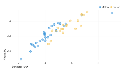
What I want to do is combine these into a single chart where each port dot shows up as blue, and each company dot is red. I see these kinds of graphs all the time (example from 30 second google search included below), but it appears to be impossible on Power Bi. In each case, the category ('port', 'company') shows up in the 'details' field on the visualizations pane. I am able to drag the second catagory in, but rather than displaying all the data at once, this creates a two level graph where I can toggle between the two- which is not what I want.
Given how often I see these kinds of graphs, I just can't imagine it's really not possible. What am I missing, or is there another visual I can download that allows this?
Thanks so much in advance.
(Example of what I'm trying to do)
Solved! Go to Solution.
- Mark as New
- Bookmark
- Subscribe
- Mute
- Subscribe to RSS Feed
- Permalink
- Report Inappropriate Content
Hi @lushd ,
Please try the following steps:
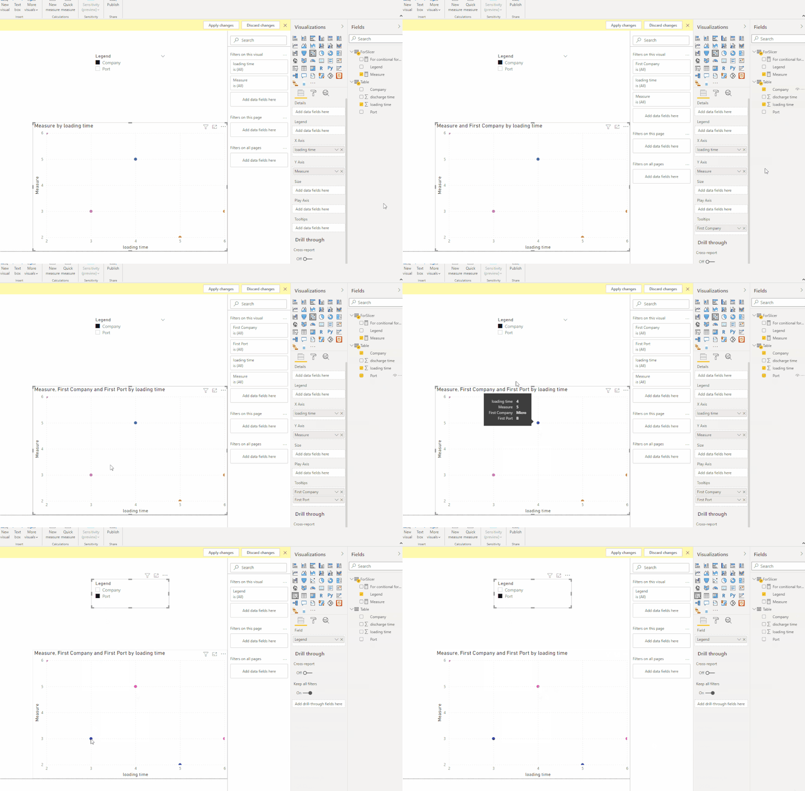
1. Createa a new table with Legend type (Port and Company) for slicer.
2. For dynamic Y-axis:
Measure =
SWITCH(MAX('ForSlicer'[Legend]),
"Port",CALCULATE(MAX('Table'[discharge time]),FILTER('Table','Table'[Port]=MAX('Table'[Port]))) ,
"Company", CALCULATE(MAX('Table'[discharge time]),FILTER('Table','Table'[Company]=MAX('Table'[Company]))))
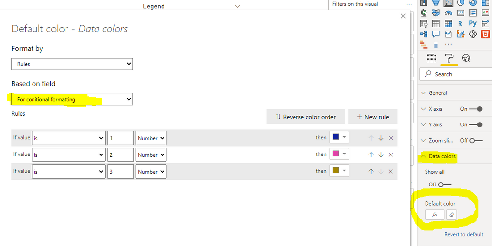
3. Create a rank measure for conditional formatting:
For conitional formatting =
SWITCH(MAX('ForSlicer'[Legend]),
"Port",RANKX(ALL('Table'), CALCULATE ( MAX ( ( 'Table'[Port]) ) ),,ASC,Dense) ,
"Company", RANKX(ALL('Table'), CALCULATE ( MAX ( ( 'Table'[Company]) ) ),,ASC,Dense))
4. Add Port and Company to tooltips field.
Or unpivot the table.
Best Regards,
Eyelyn Qin
If this post helps, then please consider Accept it as the solution to help the other members find it more quickly.
- Mark as New
- Bookmark
- Subscribe
- Mute
- Subscribe to RSS Feed
- Permalink
- Report Inappropriate Content
@lushd , if category and port are two different columns you can have one of them in legend or other on Details.
If you want these as legends, You need to unpivot the data
https://radacad.com/pivot-and-unpivot-with-power-bi
Helpful resources

Power BI Monthly Update - April 2026
Check out the April 2026 Power BI update to learn about new features.

Data Days 2026 coming soon!
Sign up to receive a private message when registration opens and key events begin.

New to Fabric Survey
If you have recently started exploring Fabric, we'd love to hear how it's going. Your feedback can help with product improvements.

| User | Count |
|---|---|
| 35 | |
| 27 | |
| 26 | |
| 22 | |
| 18 |
| User | Count |
|---|---|
| 67 | |
| 36 | |
| 32 | |
| 26 | |
| 23 |


