FabCon is coming to Atlanta
Join us at FabCon Atlanta from March 16 - 20, 2026, for the ultimate Fabric, Power BI, AI and SQL community-led event. Save $200 with code FABCOMM.
Register now!- Power BI forums
- Get Help with Power BI
- Desktop
- Service
- Report Server
- Power Query
- Mobile Apps
- Developer
- DAX Commands and Tips
- Custom Visuals Development Discussion
- Health and Life Sciences
- Power BI Spanish forums
- Translated Spanish Desktop
- Training and Consulting
- Instructor Led Training
- Dashboard in a Day for Women, by Women
- Galleries
- Data Stories Gallery
- Themes Gallery
- Contests Gallery
- Quick Measures Gallery
- Notebook Gallery
- Translytical Task Flow Gallery
- TMDL Gallery
- R Script Showcase
- Webinars and Video Gallery
- Ideas
- Custom Visuals Ideas (read-only)
- Issues
- Issues
- Events
- Upcoming Events
To celebrate FabCon Vienna, we are offering 50% off select exams. Ends October 3rd. Request your discount now.
- Power BI forums
- Forums
- Get Help with Power BI
- Desktop
- Re: Multi layer donut/multiple value donut
- Subscribe to RSS Feed
- Mark Topic as New
- Mark Topic as Read
- Float this Topic for Current User
- Bookmark
- Subscribe
- Printer Friendly Page
- Mark as New
- Bookmark
- Subscribe
- Mute
- Subscribe to RSS Feed
- Permalink
- Report Inappropriate Content
Multi layer donut/multiple value donut
Is there a way in powerbi to create a multi layered donut where the 2 layers would have the same groups, but different values. I am trying to use it for showing filtered vs unfiltered values og groups. The final visual would hopefully look somethings like this.
(https://datavizproject.com/data-type/multi-level-donut-chart/)
Solved! Go to Solution.
- Mark as New
- Bookmark
- Subscribe
- Mute
- Subscribe to RSS Feed
- Permalink
- Report Inappropriate Content
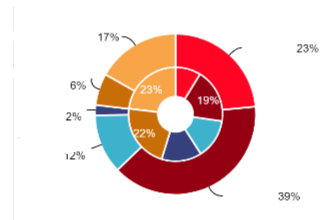
Hey svisswan2 I ended up not finding a single visual to do this, but rather stacking two of the same visual ontop of eachother. i ended up using the donut visual by Drill Down Visuals(formerly Zoomcharts). They have the neat ability to change the scale of the donut so you can stack two of them ontop of eachother and give them the exact same dimensions and just changing the scale of the donut. The bottom donuts title needs to be made white and the top donuts background transparent. The only drawback is interactiveness. Only the top donut will be 'clickable'.
Hope this helps 🙂
Edit: Picture of what i ended up with( labels are whited out which makes it look kinda wierd.)
- Mark as New
- Bookmark
- Subscribe
- Mute
- Subscribe to RSS Feed
- Permalink
- Report Inappropriate Content
I'm not sure these will match what you're looking for, but I do know donut charts can be frustrating to design and format. For anyone interested, we built some basic tips for building donut charts and have example Power BI donut charts for inspiration.
- Mark as New
- Bookmark
- Subscribe
- Mute
- Subscribe to RSS Feed
- Permalink
- Report Inappropriate Content
I think this visual might help you. You can also import it on Marketplace from Power BI Desktop.
- Mark as New
- Bookmark
- Subscribe
- Mute
- Subscribe to RSS Feed
- Permalink
- Report Inappropriate Content
Sadly the sunburst visual doesn't quite have the capability i'm looking for. I need something that would basically display two independent donuts inside eachother.
- Mark as New
- Bookmark
- Subscribe
- Mute
- Subscribe to RSS Feed
- Permalink
- Report Inappropriate Content
Hi raulallas - this is exactly the same issue i am having now. i am trying to show two different values nested which are connected by the same group (dimension) but sunburst is not allowing this. Did you ever figure out what visual will allow you to do this nesting two different sets of measures?
- Mark as New
- Bookmark
- Subscribe
- Mute
- Subscribe to RSS Feed
- Permalink
- Report Inappropriate Content
Hey svisswan2 I ended up not finding a single visual to do this, but rather stacking two of the same visual ontop of eachother. i ended up using the donut visual by Drill Down Visuals(formerly Zoomcharts). They have the neat ability to change the scale of the donut so you can stack two of them ontop of eachother and give them the exact same dimensions and just changing the scale of the donut. The bottom donuts title needs to be made white and the top donuts background transparent. The only drawback is interactiveness. Only the top donut will be 'clickable'.
Hope this helps 🙂
Edit: Picture of what i ended up with( labels are whited out which makes it look kinda wierd.)
- Mark as New
- Bookmark
- Subscribe
- Mute
- Subscribe to RSS Feed
- Permalink
- Report Inappropriate Content
@raulallas the idea you gave is really good. I tried setting the inner one with no background and the outer one with background. Place the inner one inside the donut chart with zero padding. This will allow both the visuals to interact individually.


