FabCon is coming to Atlanta
Join us at FabCon Atlanta from March 16 - 20, 2026, for the ultimate Fabric, Power BI, AI and SQL community-led event. Save $200 with code FABCOMM.
Register now!- Power BI forums
- Get Help with Power BI
- Desktop
- Service
- Report Server
- Power Query
- Mobile Apps
- Developer
- DAX Commands and Tips
- Custom Visuals Development Discussion
- Health and Life Sciences
- Power BI Spanish forums
- Translated Spanish Desktop
- Training and Consulting
- Instructor Led Training
- Dashboard in a Day for Women, by Women
- Galleries
- Data Stories Gallery
- Themes Gallery
- Contests Gallery
- Quick Measures Gallery
- Visual Calculations Gallery
- Notebook Gallery
- Translytical Task Flow Gallery
- TMDL Gallery
- R Script Showcase
- Webinars and Video Gallery
- Ideas
- Custom Visuals Ideas (read-only)
- Issues
- Issues
- Events
- Upcoming Events
Calling all Data Engineers! Fabric Data Engineer (Exam DP-700) live sessions are back! Starting October 16th. Sign up.
- Power BI forums
- Forums
- Get Help with Power BI
- Desktop
- Re: Monthly X-Axis with Weekly Data on Line Chart
- Subscribe to RSS Feed
- Mark Topic as New
- Mark Topic as Read
- Float this Topic for Current User
- Bookmark
- Subscribe
- Printer Friendly Page
- Mark as New
- Bookmark
- Subscribe
- Mute
- Subscribe to RSS Feed
- Permalink
- Report Inappropriate Content
Monthly X-Axis with Weekly Data on Line Chart
Hi folks!
I have weekly data over multiple years that I'm trying to display in a line chart. The goal is to show one line for each year, with 52 data points intact, but on an X-Axis that only shows the starting point for each month (January-December). Every attempt I've made to put Months in the X-Axis of the chart ends up summarizing/averaging the weekly data points. I can drill up/down, but that's not what I want - would like to see weekly data on a monthly x-axis. Any idea how to make this work? Excel can do it just fine, as shown in the example below:

Solved! Go to Solution.
- Mark as New
- Bookmark
- Subscribe
- Mute
- Subscribe to RSS Feed
- Permalink
- Report Inappropriate Content
hi, @AROBERT93
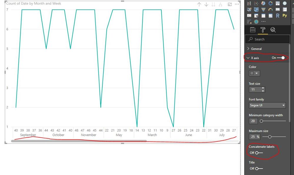
Just turn off Concatenate labels in Formatting->X axis->Concatenate labels
Result:
By the way: Please ensure the chart sort by x axis values.
https://community.powerbi.com/t5/Desktop/concatenate-Labels-does-not-work-properly/td-p/415010
Best Regards,
Lin
If this post helps, then please consider Accept it as the solution to help the other members find it more quickly.
- Mark as New
- Bookmark
- Subscribe
- Mute
- Subscribe to RSS Feed
- Permalink
- Report Inappropriate Content
hi, @AROBERT93
Just drag Month column into Axis and Year column into Legend.
If not your case, please share a simple sample pbix file for us have a test.
Best Regards,
Lin
If this post helps, then please consider Accept it as the solution to help the other members find it more quickly.
- Mark as New
- Bookmark
- Subscribe
- Mute
- Subscribe to RSS Feed
- Permalink
- Report Inappropriate Content
Hi Lin!
The data is weekly - putting Month in the X-Axis summarizes the data, which I don't want. I'm looking to preserve the weekly data in the lines, while only showing months on the chart.
This is the summarized view that I want to avoid:
- Mark as New
- Bookmark
- Subscribe
- Mute
- Subscribe to RSS Feed
- Permalink
- Report Inappropriate Content
hi, @AROBERT93
Drag WeekNum field into Axis as below, then Expand all and expand one field at a time.
https://docs.microsoft.com/en-us/power-bi/consumer/end-user-drill
Best Regards,
Lin
If this post helps, then please consider Accept it as the solution to help the other members find it more quickly.
- Mark as New
- Bookmark
- Subscribe
- Mute
- Subscribe to RSS Feed
- Permalink
- Report Inappropriate Content
Hi Lin!
We are getting much closer! The output now shows month and Week Number, but the Months repeat. Is there any way to group them so it only shows the Month Name once per Month?
Appreciate all the help!
- Mark as New
- Bookmark
- Subscribe
- Mute
- Subscribe to RSS Feed
- Permalink
- Report Inappropriate Content
hi, @AROBERT93
Just turn off Concatenate labels in Formatting->X axis->Concatenate labels
Result:
By the way: Please ensure the chart sort by x axis values.
https://community.powerbi.com/t5/Desktop/concatenate-Labels-does-not-work-properly/td-p/415010
Best Regards,
Lin
If this post helps, then please consider Accept it as the solution to help the other members find it more quickly.
- Mark as New
- Bookmark
- Subscribe
- Mute
- Subscribe to RSS Feed
- Permalink
- Report Inappropriate Content
Hi Lin!
That works! Many thanks for all your help - both X-Axes needed to be numbers (I had been formatting the Month names as text with 'MMM' as the format). I was able to achieve the result by switching back to "Date Hierarchy" for the CalDates and Keeping the Week Numbers as categorical numbers. It looks great!
- Mark as New
- Bookmark
- Subscribe
- Mute
- Subscribe to RSS Feed
- Permalink
- Report Inappropriate Content
Hi @AROBERT93 ,
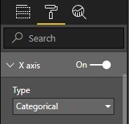
Assuming you are adding Week Ending/Week Starting date in Line Chart, consider changing X axis Type to "Categorical" using Format option of Visual, let me know if it works.
Also, you should look for options like showing last 16-24 weeks in single visual instead of 52 weeks). Adequate data points will make your visual better to understand for end users.
Thank you,
Sandeep
- Mark as New
- Bookmark
- Subscribe
- Mute
- Subscribe to RSS Feed
- Permalink
- Report Inappropriate Content
Thanks for the reply, Sandeep!
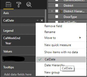
These are the settings I'm using:

Here is what I get when I set the X-Axis to Categorical (and standardize the weekly dates to all be in the same year - 2019):
What I'm hoping to achieve is the same view, but with only Months on the X-Axis, as in the original post's Excel example.
Helpful resources

FabCon Global Hackathon
Join the Fabric FabCon Global Hackathon—running virtually through Nov 3. Open to all skill levels. $10,000 in prizes!

Power BI Monthly Update - October 2025
Check out the October 2025 Power BI update to learn about new features.


